Thanks very much for pointing out. I have updated.
Thanks very much for pointing out. I have updated.
Thanks very much for pointing out. I have updated.
Pricing is a common problem faced by any e-commerce business, and one that can be addressed effectively by Bayesian statistical methods.
The Mercari Price Suggestion data set from Kaggle seems to be a good candidate for the Bayesian models I wanted to learn.
If you remember, the purpose of the data set is to build a model that automatically suggests the right price for any given product for Mercari website sellers. I am here to attempt to see whether we can solve this problem by Bayesian statistical methods, using PyStan.
And the following pricing analysis replicates the case study of home radon levels from Professor Fonnesbeck. In fact, the methodology and code were largely borrowed from his tutorial.
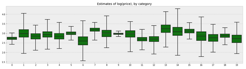
In this analysis, we will estimate parameters for individual product price that exist within categories. And the measured price is a function of the shipping condition (buyer pays shipping or seller pays shipping), and the overall price.
At the end, our estimate of the parameter of product price can be considered a prediction.
Simply put, the independent variables we are using are: category_name & shipping. And the dependent variable is: price.
from scipy import stats
import arviz as az
import numpy as np
import matplotlib.pyplot as plt
import pystan
import seaborn as sns
import pandas as pd
from theano import shared
from sklearn import preprocessing
plt.style.use('bmh')
df = pd.read_csv('train.tsv', sep = 't')
df = df.sample(frac=0.01, random_state=99)
df = df[pd.notnull(df['category_name'])]
df.category_name.nunique()

To make things more interesting, I will model all of these 689 product categories. If you want to produce better results quicker, you may want to model the top 10 or top 20 categories, to start.
shipping_0 = df.loc[df['shipping'] == 0, 'price']
shipping_1 = df.loc[df['shipping'] == 1, 'price']
fig, ax = plt.subplots(figsize=(10,5))
ax.hist(shipping_0, color='#8CB4E1', alpha=1.0, bins=50, range = [0, 100],
       label=0)
ax.hist(shipping_1, color='#007D00', alpha=0.7, bins=50, range = [0, 100],
       label=1)
plt.xlabel('price', fontsize=12)
plt.ylabel('frequency', fontsize=12)
plt.title('Price Distribution by Shipping Type', fontsize=15)
plt.tick_params(labelsize=12)
plt.legend()
plt.show();
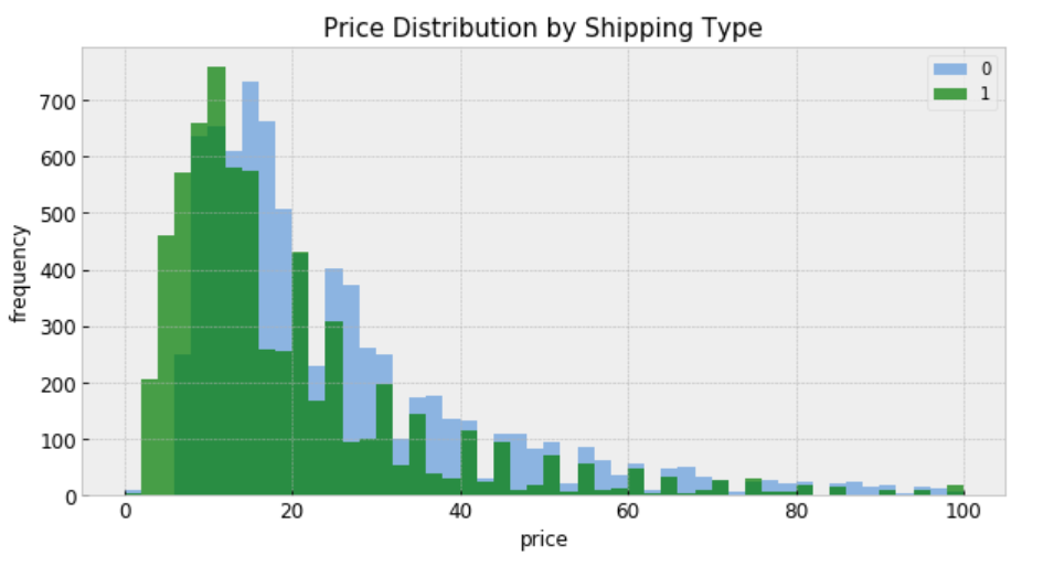
“shipping = 0” means shipping fee paid by buyer, and “shipping = 1” means shipping fee paid by seller. In general, price is higher when buyer pays shipping.
For construction of a Stan model, it is convenient to have the relevant variables as local copies — this aids readability.
le = preprocessing.LabelEncoder()
df['category_code'] = le.fit_transform(df['category_name'])
category_names = df.category_name.unique()
categories = len(category_names)
category = df['category_code'].values
price = df.price
df['log_price'] = log_price = np.log(price + 0.1).values
shipping = df.shipping.values
category_lookup = dict(zip(category_names, range(len(category_names))))
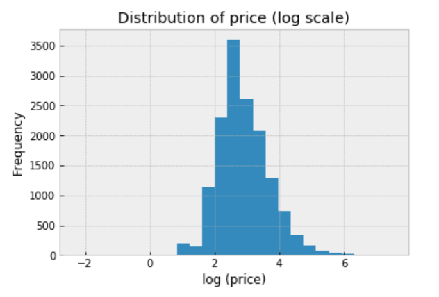
We should always explore the distribution of price (log scale) in the data:
df.price.apply(lambda x: np.log(x+0.1)).hist(bins=25)
plt.title('Distribution of price (log scale)')
plt.xlabel('log (price)')
plt.ylabel('Frequency');
There are two conventional approaches to modeling price represent the two extremes of the bias-variance tradeoff:
Treat all categories the same, and estimate a single price level, with the equation:
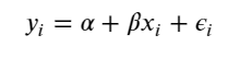
To specify this model in Stan, we begin by constructing the data block, which includes vectors of log-price measurements (y) and who pays shipping covariates (x), as well as the number of samples (N).
The complete pooling model is:
https://medium.com/media/51a3101eb6118ee17ae87ea25bc4edb0/href
When passing the code, data, and parameters to the Stan function, we specify sampling 2 chains of length 1000:
https://medium.com/media/c57be4f2144e862403f9dc722036fd0e/href
Inspecting the fit
Once the fit has been run, the method extract and specifying permuted=True extracts samples into a dictionary of arrays so that we can conduct visualization and summarization.
We are interested in the mean values of these estimates for parameters from the sample.
We can now visualize how well this pooled model fits the observed data.
pooled_sample = pooled_fit.extract(permuted=True)
b0, m0 = pooled_sample['beta'].T.mean(1)
plt.scatter(df.shipping, np.log(df.price+0.1))
xvals = np.linspace(-0.2, 1.2)
plt.xticks([0, 1])
plt.plot(xvals, m0*xvals+b0, 'r--')
plt.title("Fitted model")
plt.xlabel("Shipping")
plt.ylabel("log(price)");
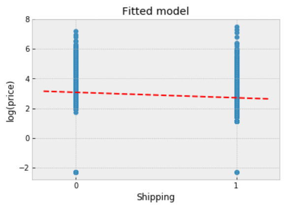
Observations:
When unpooling, we model price in each category independently, with the equation:
where j = 1, … , 689
The unpooled model is:
https://medium.com/media/17665e2ecce7247121bde96788c0f169/href
When running the unpooled model in Stan, We again map Python variables to those used in the Stan model, then pass the data, parameters and the model to Stan. We again specify 1000 iterations of 2 chains.
https://medium.com/media/0255b96493f2197f098e598785e6bb50/href
Inspecting the fit
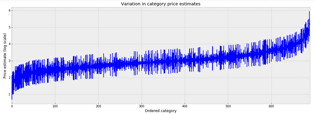
To inspect the variation in predicted price at category level, we plot the mean of each estimate with its associated standard error. To structure this visually, we’ll reorder the categories such that we plot categories from the lowest to the highest.
unpooled_estimates = pd.Series(unpooled_fit['a'].mean(0), index=category_names)
order = unpooled_estimates.sort_values().index
plt.figure(figsize=(18, 6))
plt.scatter(range(len(unpooled_estimates)), unpooled_estimates[order])
for i, m, se in zip(range(len(unpooled_estimates)), unpooled_estimates[order], unpooled_se[order]):
    plt.plot([i,i], [m-se, m+se], 'b-')
    plt.xlim(-1,690);
plt.ylabel('Price estimate (log scale)');plt.xlabel('Ordered category');plt.title('Variation in category price estimates');
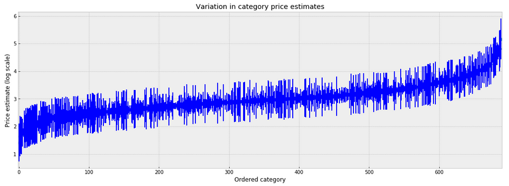
Observations:
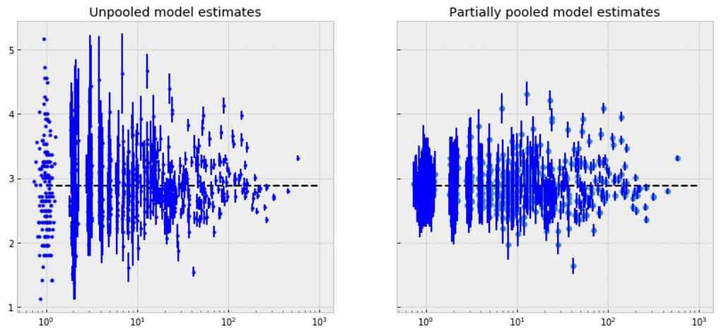
Comparison of pooled and unpooled estimates
We can make direct visual comparisons between pooled and unpooled estimates for all categories, and we are going to show several examples, and I purposely select some categories with many products, and other categories with very few products.
https://medium.com/media/2470950a8e5c243beeb1acebee519701/href
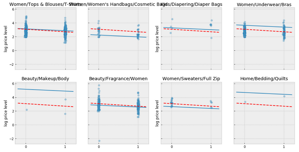
Let me try to explain what the above visualizations tell us:
The simplest possible partial pooling model for the e-commerce price data set is one that simply estimates prices, with no other predictors (i.e. ignoring the effect of shipping). This is a compromise between pooled (mean of all categories) and unpooled (category-level means), and approximates a weighted average (by sample size) of unpooled category estimates, and the pooled estimates, with the equation:
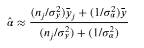
The simplest partial pooling model:
https://medium.com/media/66824a405e17c27e56dcb4bb92ff8830/href
Now we have two standard deviations, one describing the residual error of the observations, and another describing the variability of the category means around the average.
https://medium.com/media/73b49d1cd60ce693f146761352779f89/href
We’re interested primarily in the category-level estimates of price, so we obtain the sample estimates for “a”:
https://medium.com/media/e17f1f478ee3f3b2d6785917db1e316b/href
Observations:
Simply put, the multilevel modeling shares strength among categories, allowing for more reasonable inference in categories with little data, with the equation:
The varying intercept model:
https://medium.com/media/7e6b2af5c74e7d7e9ee8c34e0135ff2e/href
Fitting the model:
https://medium.com/media/b1ba4fcf65194d4cc1eebad8a1dddd0a/href
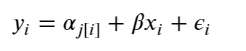
There is no way to visualize all of these 689 categories together, so I will visualize 20 of them.
a_sample = pd.DataFrame(varying_intercept_fit['a'])
plt.figure(figsize=(20, 5))
g = sns.boxplot(data=a_sample.iloc[:,0:20], whis=np.inf, color="g")
# g.set_xticklabels(df.category_name.unique(), rotation=90)  # label counties
g.set_title("Estimates of log(price), by category")
g;
Observations:
We can visualize the distribution of parameter estimates for 𝜎 and β.
az.plot_trace(varying_intercept_fit, var_names = ['sigma_a', 'b']);
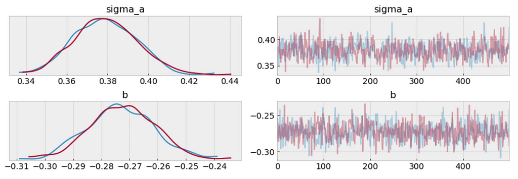
varying_intercept_fit['b'].mean()
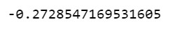
The estimate for the shipping coefficient is approximately -0.27, which can be interpreted as products which shipping fee paid by seller at about 0.76 of (exp(−0.27)=0.76) the price of those shipping paid by buyer, after accounting for category.
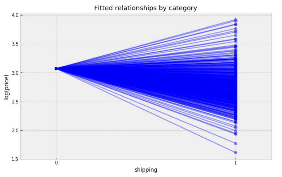
Visualize the fitted model
plt.figure(figsize=(12, 6))
xvals = np.arange(2)
bp = varying_intercept_fit['a'].mean(axis=0) # mean a (intercept) by category
mp = varying_intercept_fit['b'].mean()      # mean b (slope/shipping effect)
for bi in bp:
    plt.plot(xvals, mp*xvals + bi, 'bo-', alpha=0.4)
plt.xlim(-0.1,1.1)
plt.xticks([0, 1])
plt.title('Fitted relationships by category')
plt.xlabel("shipping")
plt.ylabel("log(price)");
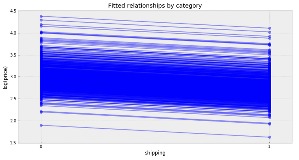
Observations:
We can see whether partial pooling of category-level price estimate has provided more reasonable estimates than pooled or unpooled models, for categories with small sample sizes.
We can also build a model that allows the categories to vary according to shipping arrangement (paid by buyer or paid by seller) influences the price. With the equation:
The varying slope model:
https://medium.com/media/410f626d1b3edc5f64a95b8d5d6c5875/href
Fitting the model:
https://medium.com/media/c46f1284c4d604f1a809af03d0920c50/href
Following the process earlier, we will visualize 20 categories.
b_sample = pd.DataFrame(varying_slope_fit['b'])
plt.figure(figsize=(20, 5))
g = sns.boxplot(data=b_sample.iloc[:,0:20], whis=np.inf, color="g")
# g.set_xticklabels(df.category_name.unique(), rotation=90)  # label counties
g.set_title("Estimate of shipping effect, by category")
g;
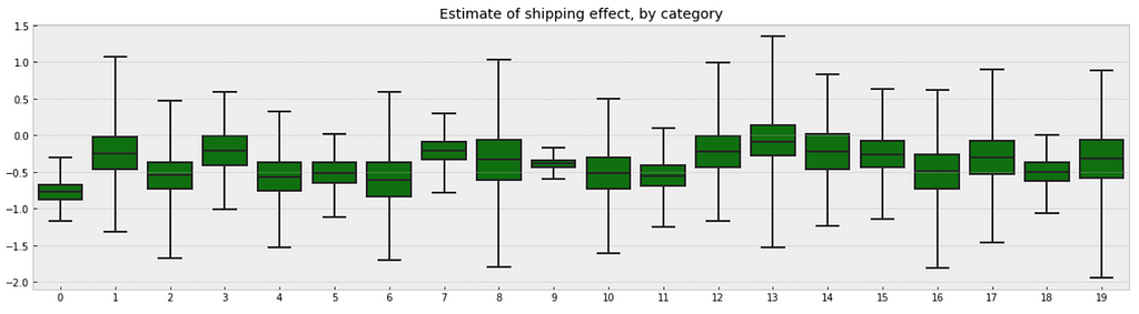
Observations:
Visualize the fitted model:
plt.figure(figsize=(10, 6))
xvals = np.arange(2)
b = varying_slope_fit['a'].mean()
m = varying_slope_fit['b'].mean(axis=0)
for mi in m:
    plt.plot(xvals, mi*xvals + b, 'bo-', alpha=0.4)
plt.xlim(-0.2, 1.2)
plt.xticks([0, 1])
plt.title("Fitted relationships by category")
plt.xlabel("shipping")
plt.ylabel("log(price)");
Observations:
The most general way to allow both slope and intercept to vary by category. With the equation:
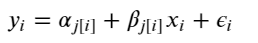
The varying slope and intercept model:
https://medium.com/media/99f0024765a13153517815289c68ed0f/href
Fitting the model:
https://medium.com/media/2b2e35474baef1997aa31d66cf469bb7/href
Visualize the fitted model:
plt.figure(figsize=(10, 6))
xvals = np.arange(2)
b = varying_intercept_slope_fit['a'].mean(axis=0)
m = varying_intercept_slope_fit['b'].mean(axis=0)
for bi,mi in zip(b,m):
    plt.plot(xvals, mi*xvals + bi, 'bo-', alpha=0.4)
plt.xlim(-0.1, 1.1);
plt.xticks([0, 1])
plt.title("fitted relationships by category")
plt.xlabel("shipping")
plt.ylabel("log(price)");
While these relationships are all very similar, we can see that by allowing both shipping effect and price to vary, we seem to be capturing more of the natural variation, compare with varying intercept model.
In some instances, having predictors at multiple levels can reveal correlation between individual-level variables and group residuals. We can account for this by including the average of the individual predictors as a covariate in the model for the group intercept.
Contextual effect model:
https://medium.com/media/7c604f58453416f772d0c991ee56a12d/href
Fitting the model:
https://medium.com/media/6b84784f1d5a7f049d18afc5e84f18dd/href
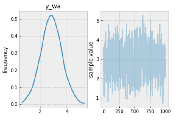
we wanted to make a prediction for a new product in “Women/Athletic Apparel/Pants, Tights, Leggings” category, which shipping paid by seller, we just need to sample from the model with the appropriate intercept.
category_lookup['Women/Athletic Apparel/Pants, Tights, Leggings']

The prediction model:
https://medium.com/media/a65424df0289f71c90c9e6bf88374c61/href
Making the prediction:
https://medium.com/media/7e5baafd8775536b65d5be80b0650606/href
The prediction:
contextual_pred_fit.plot('y_wa');
Observations:
Jupyter notebook can be found on Github. Enjoy the rest of the weekend.
References:

Twitter conducted a study recently in the US, found that customers were willing to pay nearly $20 more to travel with an airline that had responded to their tweet in under six minutes. When they got a response over 67 minutes after their tweet, they would only pay $2 more to fly with that airline.
When I came across Customer Support on Twitter dataset, I couldn’t help but wanted to model and compare airlines customer service twitter response time.
I wanted to be able to answer questions like:
It is a large dataset contains hundreds of companies from all kinds of industries. The following data wrangling process will accomplish:
https://medium.com/media/9d8cc66aa77dae417cd2246b510ddf2b/href
plt.figure(figsize=(10,5))
sns.distplot(df['response_time'], kde=False)
plt.title('Frequency of response by response time')
plt.xlabel('Response time (minutes)')
plt.ylabel('Number of responses');
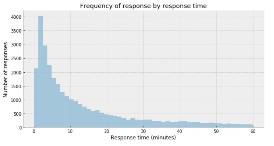
My immediate impression is that a Gaussian distribution is not a proper description of the data.
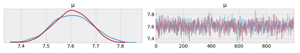
One useful option when dealing with outliers and Gaussian distributions is to replace the Gaussian likelihood with a Student’s t-distribution. This distribution has three parameters: the mean (𝜇), the scale (𝜎) (analogous to the standard deviation), and the degrees of freedom (𝜈).
https://medium.com/media/c927243a9e1b9abe286dc505c48653d1/href
az.plot_trace(trace_t[:1000], var_names = ['μ']);
df.response_time.mean()

One way to visualize is to look if the model can reproduce the patterns observed in the real data. For example, how close are the inferred means to the actual sample mean:
ppc = pm.sample_posterior_predictive(trace_t, samples=1000, model=model_t)
_, ax = plt.subplots(figsize=(10, 5))
ax.hist([n.mean() for n in ppc['y']], bins=19, alpha=0.5)
ax.axvline(df['response_time'].mean())
ax.set(title='Posterior predictive of the mean', xlabel='mean(x)', ylabel='Frequency');
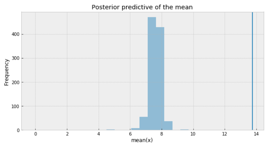
The inferred mean is so far away from the actual sample mean. This confirms that Student’s t-distribution is not a proper choice for our data.
Poisson distribution is generally used to describe the probability of a given number of events occurring on a fixed time/space interval. Thus, the Poisson distribution assumes that the events occur independently of each other and at a fixed interval of time and/or space. This discrete distribution is parametrized using only one value 𝜇, which corresponds to the mean and also the variance of the distribution.
https://medium.com/media/88200a01173117a5fe4003d8ceeb2f0b/href
az.plot_trace(trace_p);
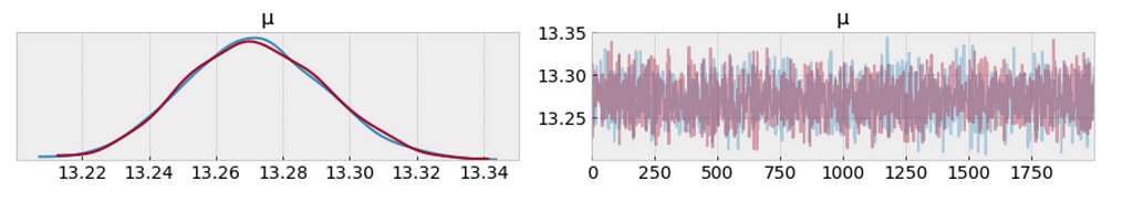
The measure of uncertainty and credible values of 𝜇 is between 13.22 and 13.34 minutes. It sounds way better already.
We want the autocorrelation drops with increasing x-axis in the plot. Because this indicates a low degree of correlation between our samples.
_ = pm.autocorrplot(trace_p, var_names=['μ'])
Our samples from the Poisson model has dropped to low values of autocorrelation, which is a good sign.
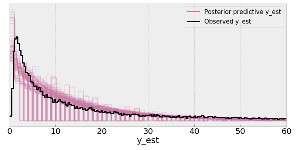
We use posterior predictive check to “look for systematic discrepancies between real and simulated data”. There are multiple ways to do posterior predictive check, and I’d like to check if my model makes sense in various ways.
y_ppc_p = pm.sample_posterior_predictive(
    trace_p, 100, model_p, random_seed=123)
y_pred_p = az.from_pymc3(trace=trace_p, posterior_predictive=y_ppc_p)
az.plot_ppc(y_pred_p, figsize=(10, 5), mean=False)
plt.xlim(0, 60);
Interpretation:
ppc = pm.sample_posterior_predictive(trace_p, samples=1000, model=model_p)
_, ax = plt.subplots(figsize=(10, 5))
ax.hist([n.mean() for n in ppc['y']], bins=19, alpha=0.5)
ax.axvline(df['response_time'].mean())
ax.set(title='Posterior predictive of the mean', xlabel='mean(x)', ylabel='Frequency');
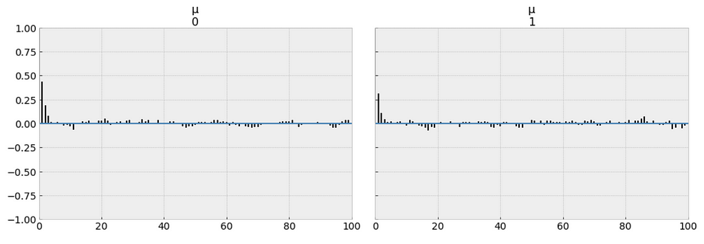
Negative binomial distribution has very similar characteristics to the Poisson distribution except that it has two parameters (𝜇 and 𝛼) which enables it to vary its variance independently of its mean.
https://medium.com/media/5979510cd27f69dc726e5eeba9574b01/href
az.plot_trace(trace_n, var_names=['μ', 'α']);
The measure of uncertainty and credible values of 𝜇 is between 13.0 and 13.6 minutes, and it is very closer to the target sample mean.
y_ppc_n = pm.sample_posterior_predictive(
trace_n, 100, model_n, random_seed=123)
y_pred_n = az.from_pymc3(trace=trace_n, posterior_predictive=y_ppc_n)
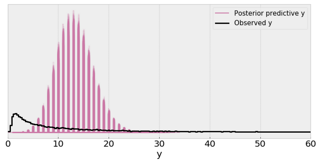
az.plot_ppc(y_pred_n, figsize=(10, 5), mean=False)
plt.xlim(0, 60);
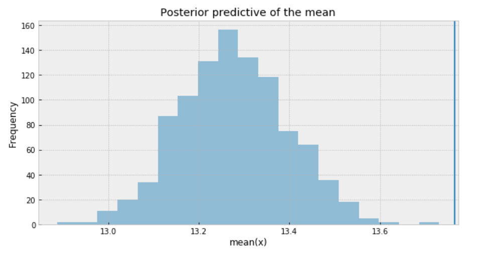
Using the Negative binomial distribution in our model leads to predictive samples that seem to better fit the data in terms of the location of the peak of the distribution and also its spread.
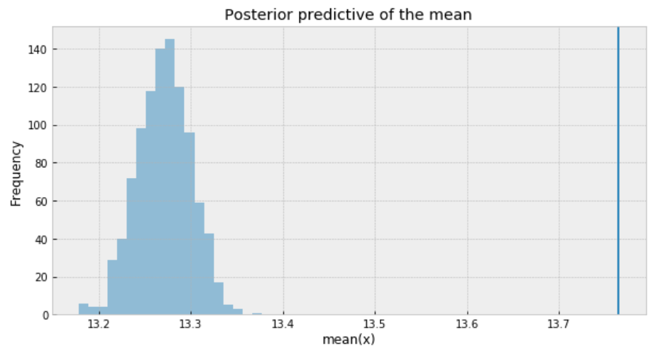
ppc = pm.sample_posterior_predictive(trace_n, samples=1000, model=model_n)
_, ax = plt.subplots(figsize=(10, 5))
ax.hist([n.mean() for n in ppc['y_est']], bins=19, alpha=0.5)
ax.axvline(df['response_time'].mean())
ax.set(title='Posterior predictive of the mean', xlabel='mean(x)', ylabel='Frequency');
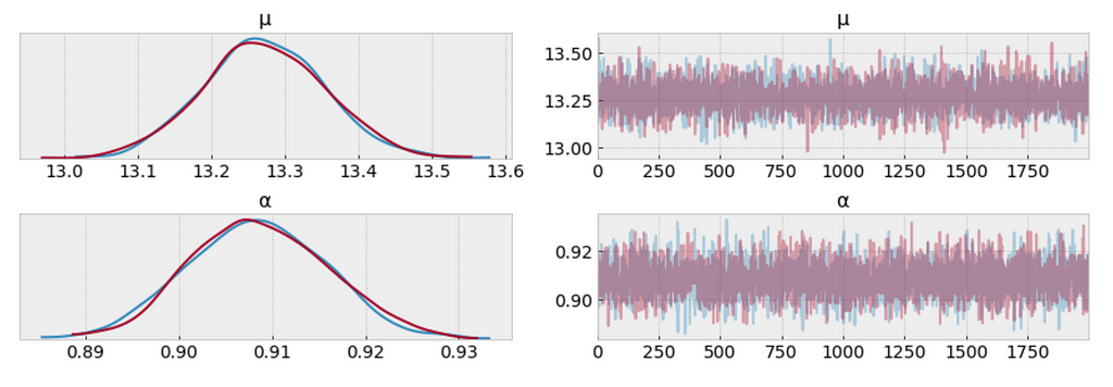
To sum it up, the following are what we get for the measure of uncertainty and credible values of (𝜇):
https://medium.com/media/30e11e4826d9d4b8cc3d54e91077daec/href
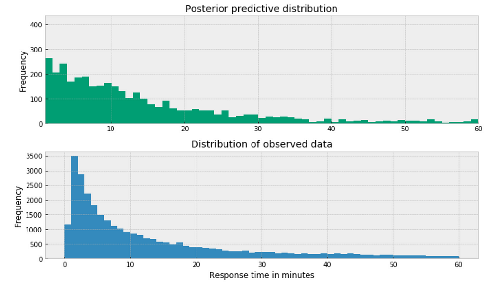
The posterior predictive distribution somewhat resembles the distribution of the observed data, suggesting that the Negative binomial model is a more appropriate fit for the underlying data.
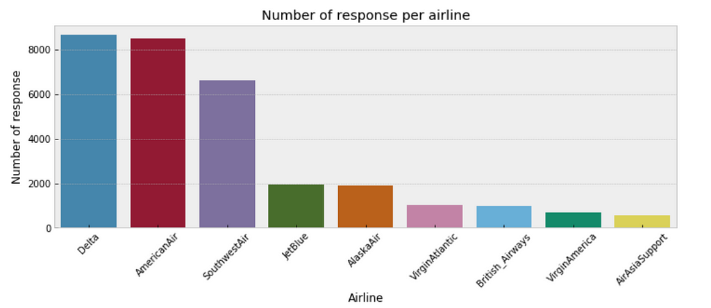
plt.figure(figsize=(12,4))
sns.countplot(x="author_id_y", data=df, order = df['author_id_y'].value_counts().index)
plt.xlabel('Airline')
plt.ylabel('Number of response')
plt.title('Number of response per airline')
plt.xticks(rotation=45);
https://medium.com/media/4cdc4a72b3aede34b23dbb275d318aa4/href
https://medium.com/media/139d5455997414082cd04ff48a930649/href
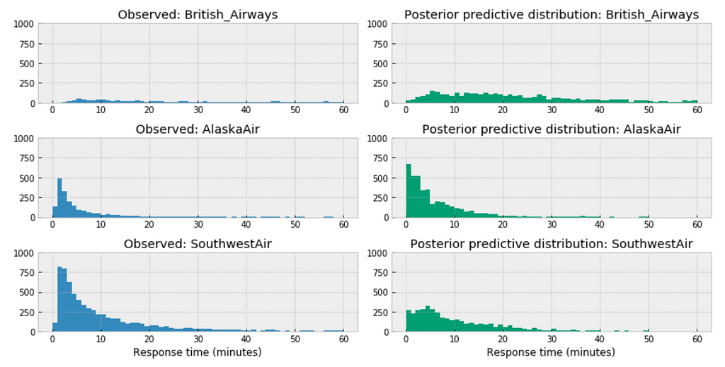
Observations:
https://medium.com/media/a44e953f4ed2177f1b19ba489bcb0bc7/href
Similar here, among the above three airlines, the distribution of AirAsia towards right, this could accurately reflect the characteristics of its customer service twitter response time, means in general, it takes longer for AirAsia to respond than those of Delta or VirginAmerica. Or it could be incomplete due to small sample size.
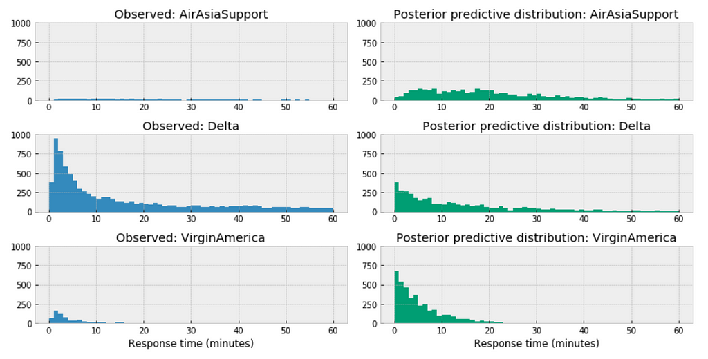
https://medium.com/media/0c0a9ee55f4bd298907e0d10f79f1f71/href
For the airlines we have relative sufficient data, for example, when we compare the above three large airlines in the United States, the posterior predictive distribution do not seem to vary significantly.
The variables for the model:
df = df[['response_time', 'author_id_y', 'created_at_y_is_weekend', 'word_count']]
formula = 'response_time ~ ' + ' + '.join(['%s' % variable for variable in df.columns[1:]])
formula

In the following code snippet, we:
https://medium.com/media/3076b071ea036ac663f5e91609ca1cb3/href
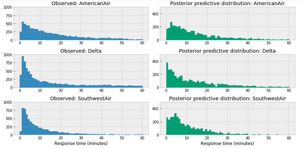
az.plot_trace(trace_hr);
Observations:
_, ax = pm.forestplot(trace_hr, var_names=['intercept'])
ax[0].set_yticklabels(airlines.tolist());
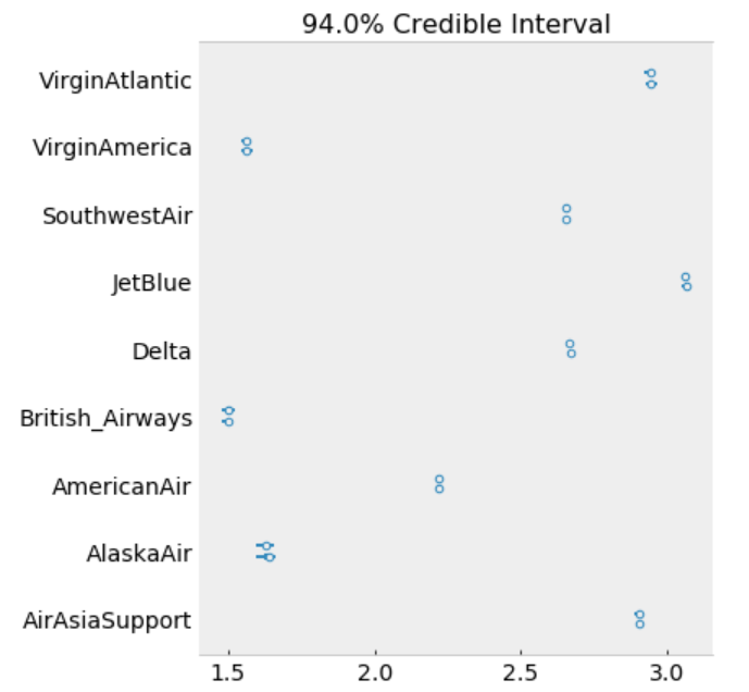
The model estimates the above β0 (intercept) parameters for every airline. The dot is the most likely value of the parameter for each airline. It look like our model has very little uncertainty for every airline.
ppc = pm.sample_posterior_predictive(trace_hr, samples=2000, model=model_hr)
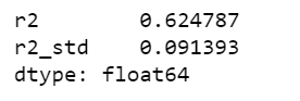
az.r2_score(df.response_time.values, ppc['y_est'])
Jupyter notebook can be located on the Github. Have a productive week!
References:
The book: Bayesian Analysis with Python
The book: Doing Bayesian Data Analysis
The book: Statistical Rethinking
https://docs.pymc.io/notebooks/GLM-poisson-regression.html
https://docs.pymc.io/notebooks/hierarchical_partial_pooling.html
GLM: Hierarchical Linear Regression – PyMC3 3.6 documentation
https://docs.pymc.io/notebooks/GLM-negative-binomial-regression.html
https://www.kaggle.com/psbots/customer-support-meets-spacy-universe
Bayesian Modeling Airlines Customer Service Twitter Response Time was originally published in Towards Data Science on Medium, where people are continuing the conversation by highlighting and responding to this story.
Thanks for letting me know.
I have loaded a small set here: https://raw.githubusercontent.com/susanli2016/Machine-Learning-with-Python/master/data/renfe_small.csv
Feel free to use it.
That part shouldn’t be there. I have updated Github. Thanks for letting me know.
In this post, we will explore using Bayesian Logistic Regression in order to predict whether or not a customer will subscribe a term deposit after the marketing campaign the bank performed.
We want to be able to accomplish:
I am sure you are familiar with the dataset. We built a logistic regression model using standard machine learning methods with this dataset a while ago. And today we are going to apply Bayesian methods to fit a logistic regression model and then interpret the resulting model parameters. Let’s get started!
The goal of this dataset is to create a binary classification model that predicts whether or not a customer will subscribe a term deposit after a marketing campaign the bank performed, based on many indicators. The target variable is given as y and takes on a value of 1 if the customer has subscribed and 0 otherwise.
This is an imbalanced class problem because there are significantly more customers did not subscribe the term deposit than the ones did.
import pandas as pd
import numpy as np
import seaborn as sns
import matplotlib.pyplot as plt
import pymc3 as pm
import arviz as az
import matplotlib.lines as mlines
import warnings
warnings.filterwarnings('ignore')
from collections import OrderedDict
import theano
import theano.tensor as tt
import itertools
from IPython.core.pylabtools import figsize
pd.set_option('display.max_columns', 30)
from sklearn.metrics import accuracy_score, f1_score, confusion_matrix
df = pd.read_csv('banking.csv')
As part of EDA, we will plot a few visualizations.
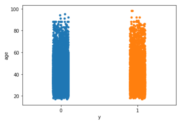
sns.stripplot(x="y", y="age", data=df, jitter=True)
plt.show();
sns.stripplot(x="y", y="euribor3m", data=df, jitter=True)
plt.show();
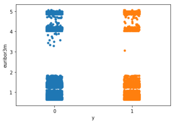
Nothing particularly interesting here.
The following is my way of making all of the variables numeric. You may have a better way of doing it.
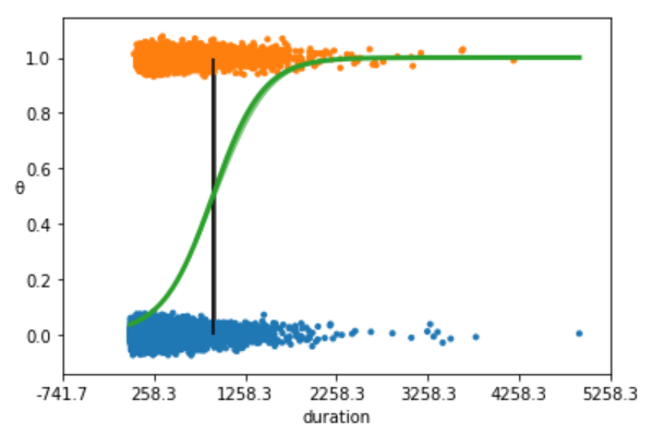
We are going to begin with the simplest possible logistic model, using just one independent variable or feature, the duration.
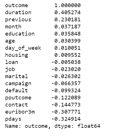
outcome = df['y']
data = df[['age', 'job', 'marital', 'education', 'default', 'housing', 'loan', 'contact', 'month', 'day_of_week', 'duration', 'campaign', 'pdays', 'previous', 'poutcome', 'euribor3m']]
data['outcome'] = outcome
data.corr()['outcome'].sort_values(ascending=False)
With the data in the right format, we can start building our first and simplest logistic model with PyMC3:
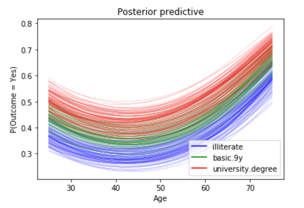
We are going to plot the fitted sigmoid curve and the decision boundary:
We summarize the inferred parameters values for easier analysis of the results and check how well the model did:
az.summary(trace_simple, var_names=['α', 'β'])
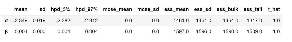
As you can see, the values of α and β are very narrowed defined. This is totally reasonable, given that we are fitting a binary fitted line to a perfectly aligned set of points.
Let’s run a posterior predictive check to explore how well our model captures the data. We can let PyMC3 do the hard work of sampling from the posterior for us:
ppc = pm.sample_ppc(trace_simple, model=model_simple, samples=500)
preds = np.rint(ppc['y_1'].mean(axis=0)).astype('int')
print('Accuracy of the simplest model:', accuracy_score(preds, data['outcome']))
print('f1 score of the simplest model:', f1_score(preds, data['outcome']))

We plot a heat map to show the correlations between each variables.
plt.figure(figsize=(15, 15))
corr = data.corr()
mask = np.tri(*corr.shape).T
sns.heatmap(corr.abs(), mask=mask, annot=True, cmap='viridis');
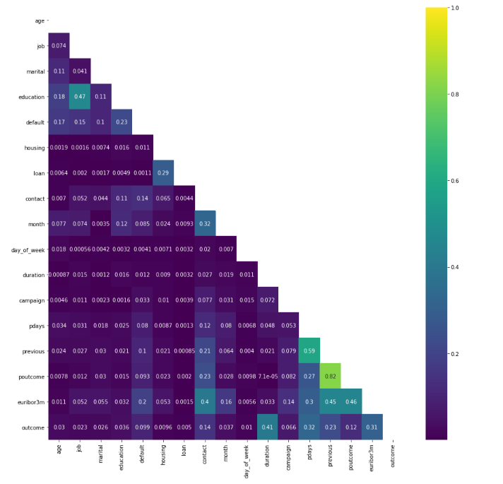
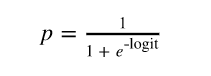
logit = β0 + β1(age) + β2(age)2 + β3(job) + β4(marital) + β5(education) + β6(default) + β7(housing) + β8(loan) + β9(contact) + β10(month) + β11(day_of_week) + β12(duration) + β13(campaign) + β14(campaign) + β15(pdays) + β16(previous) + β17(poutcome) + β18(euribor3m) and y = 1 if outcome is yes and y = 0 otherwise.
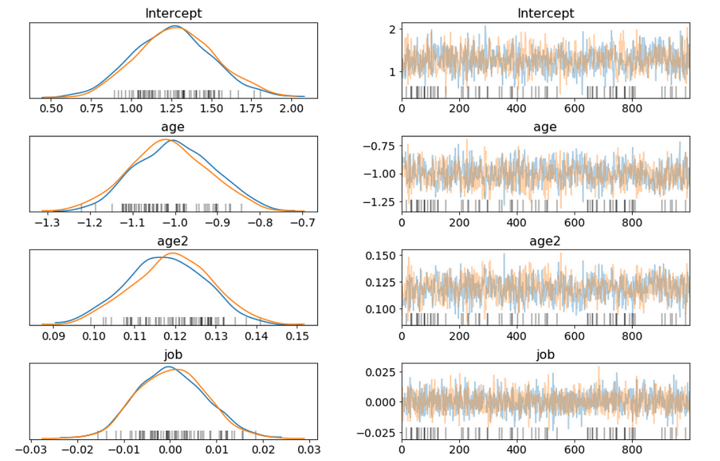
Above I only show part of the trace plot.
I want to be able to answer questions like:
b = trace['education']
plt.hist(np.exp(b), bins=20, normed=True)
plt.xlabel("Odds Ratio")
plt.show();
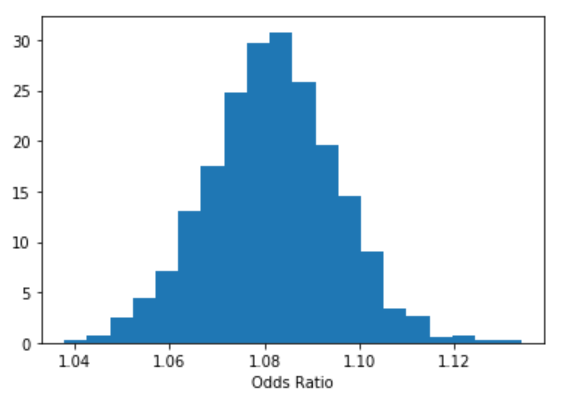
lb, ub = np.percentile(b, 2.5), np.percentile(b, 97.5)
print("P(%.3f < Odds Ratio < %.3f) = 0.95" % (np.exp(lb), np.exp(ub)))

stat_df = pm.summary(trace)
stat_df['odds_ratio'] = np.exp(stat_df['mean'])
stat_df['percentage_effect'] = 100 * (stat_df['odds_ratio'] - 1)
stat_df
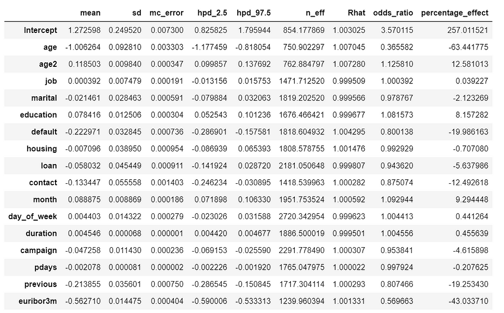

Its hard to show the entire forest plot, I only show part of it, but its enough for us to say that there’s a baseline probability of subscribing a term deposit. Beyond that, age has the biggest effect on subscribing, followed by contact.
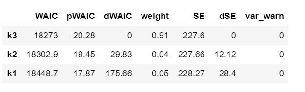
model_trace_dict = dict()
for nm in ['k1', 'k2', 'k3']:
    models_lin[nm].name = nm
    model_trace_dict.update({models_lin[nm]: traces_lin[nm]})
dfwaic = pm.compare(model_trace_dict, ic='WAIC')
dfwaic
pm.compareplot(dfwaic);
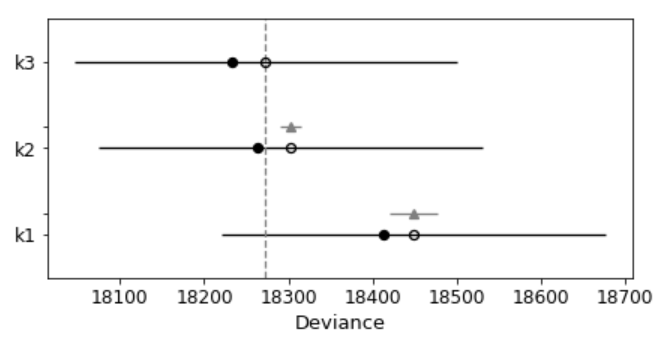
This confirms that the model that includes square of age is better than the model without.
Unlike standard machine learning, Bayesian focused on model interpretability around a prediction. But I’am curious to know what we will get if we calculate the standard machine learning metrics.
We are going to calculate the metrics using the mean value of the parameters as a “most likely” estimate.
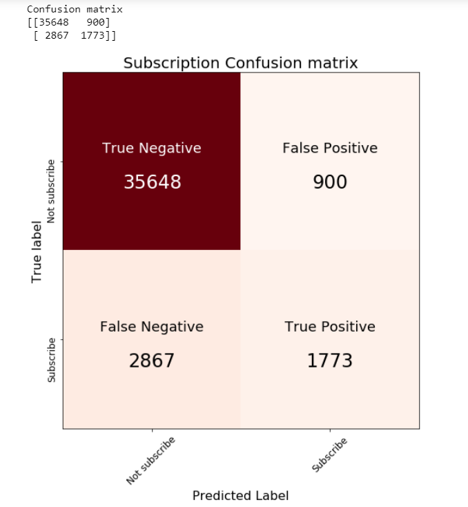
print('Accuracy of the full model: ', accuracy_score(preds, data['outcome']))
print('f1 score of the full model: ', f1_score(preds, data['outcome']))

Jupyter notebook can be found on Github. Have a great week!
References:
The book: Bayesian Analysis with Python, Second Edition
Building a Bayesian Logistic Regression with Python and PyMC3 was originally published in Towards Data Science on Medium, where people are continuing the conversation by highlighting and responding to this story.
Sounds like automatically categorize product description into its respective category (multi-class text classification problem). 300 classes sound too many, you may want to consolidate, or if the classes are imbalanced, you may want to take care of some more important classes first. Do you have other features, such as price or date time features, you may want to use them too.
If you think Bayes’ theorem is counter-intuitive and Bayesian statistics, which builds upon Baye’s theorem, can be very hard to understand. I am with you.
There are countless reasons why we should learn Bayesian statistics, in particular, Bayesian statistics is emerging as a powerful framework to express and understand next-generation deep neural networks.
I believe that for the things we have to learn before we can do them, we learn by doing them. And nothing in life is so hard that we can’t make it easier by the way we take it.
So, this is my way of making it easier: Rather than too much of theories or terminologies at the beginning, let’s focus on the mechanics of Bayesian analysis, in particular, how to do Bayesian analysis and visualization with PyMC3 & ArviZ. Prior to memorizing the endless terminologies, we will code the solutions and visualize the results, and using the terminologies and theories to explain the models along the way.
PyMC3 is a Python library for probabilistic programming with a very simple and intuitive syntax. ArviZ, a Python library that works hand-in-hand with PyMC3 and can help us interpret and visualize posterior distributions.
And we will apply Bayesian methods to a practical problem, to show an end-to-end Bayesian analysis that move from framing the question to building models to eliciting prior probabilities to implementing in Python the final posterior distribution.
Before we start, let’s get some basic intuitions out of the way:
Bayesian models are also known as probabilistic models because they are built using probabilities. And Bayesian’s use probabilities as a tool to quantify uncertainty. Therefore, the answers we get are distributions not point estimates.
Step 1: Establish a belief about the data, including Prior and Likelihood functions.
Step 2, Use the data and probability, in accordance with our belief of the data, to update our model, check that our model agrees with the original data.
Step 3, Update our view of the data based on our model.
Since I am interested in using machine learning for price optimization, I decide to apply Bayesian methods to a Spanish High Speed Rail tickets pricing data set that can be found here. Appreciate The Gurus team for scraping the data set.
from scipy import stats
import arviz as az
import numpy as np
import matplotlib.pyplot as plt
import pymc3 as pm
import seaborn as sns
import pandas as pd
from theano import shared
from sklearn import preprocessing
print('Running on PyMC3 v{}'.format(pm.__version__))
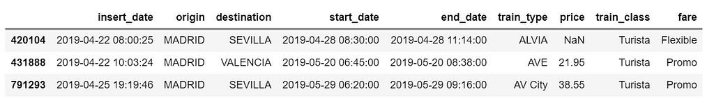
data = pd.read_csv('renfe.csv')
data.drop('Unnamed: 0', axis = 1, inplace=True)
data = data.sample(frac=0.01, random_state=99)
data.head(3)
data.isnull().sum()/len(data)
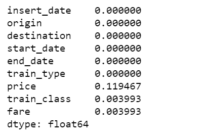
There are 12% of values in price column are missing, I decide to fill them with the mean of the respective fare types. Also fill the other two categorical columns with the most common values.
data['train_class'] = data['train_class'].fillna(data['train_class'].mode().iloc[0])
data['fare'] = data['fare'].fillna(data['fare'].mode().iloc[0])
data['price'] = data.groupby('fare').transform(lambda x: x.fillna(x.mean()))
az.plot_kde(data['price'].values, rug=True)
plt.yticks([0], alpha=0);
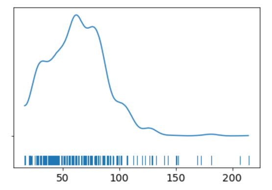
The KDE plot of the rail ticket price shows a Gaussian-like distribution, except for about several dozens of data points that are far away from the mean.
Let’s assume that a Gaussian distribution is a proper description of the rail ticket price. Since we do not know the mean or the standard deviation, we must set priors for both of them. Therefore, a reasonable model could be as follows.
We will perform Gaussian inferences on the ticket price data. Here’s some of the modelling choices that go into this.
Choices of priors:
Choices for ticket price likelihood function:
Using PyMC3, we can write the model as follows:
The y specifies the likelihood. This is the way in which we tell PyMC3 that we want to condition for the unknown on the knows (data).
We plot the gaussian model trace. This runs on a Theano graph under the hood.
az.plot_trace(trace_g);
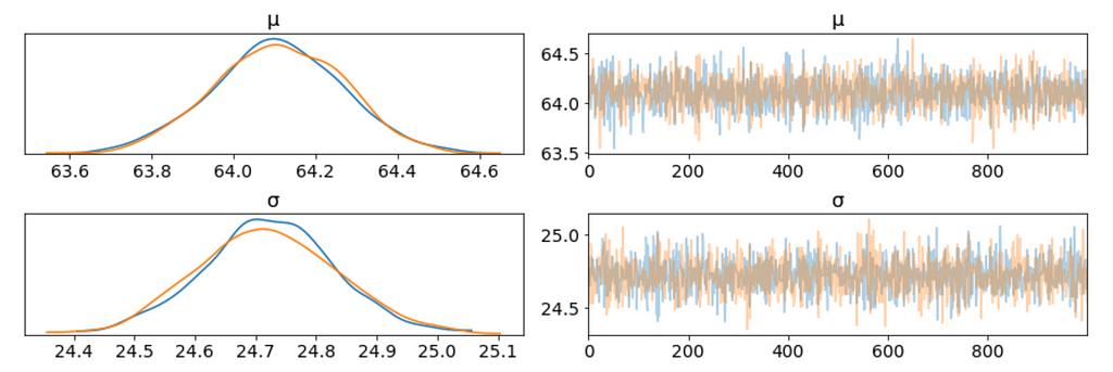
There are a couple of things to notice here:
We can plot a joint distributions of parameters.
az.plot_joint(trace_g, kind='kde', fill_last=False);
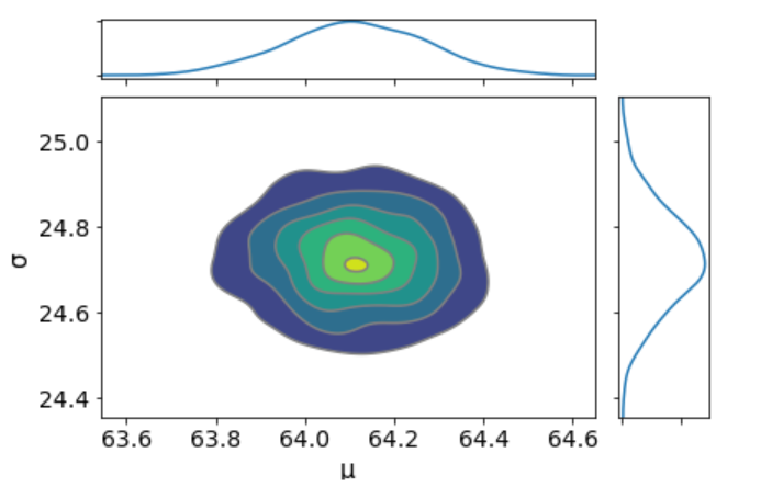
I don’t see any correlation between these two parameters. This means we probably do not have collinearity in the model. This is good.
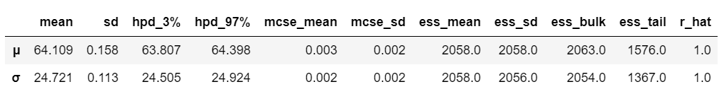
We can also have a detailed summary of the posterior distribution for each parameter.
az.summary(trace_g)
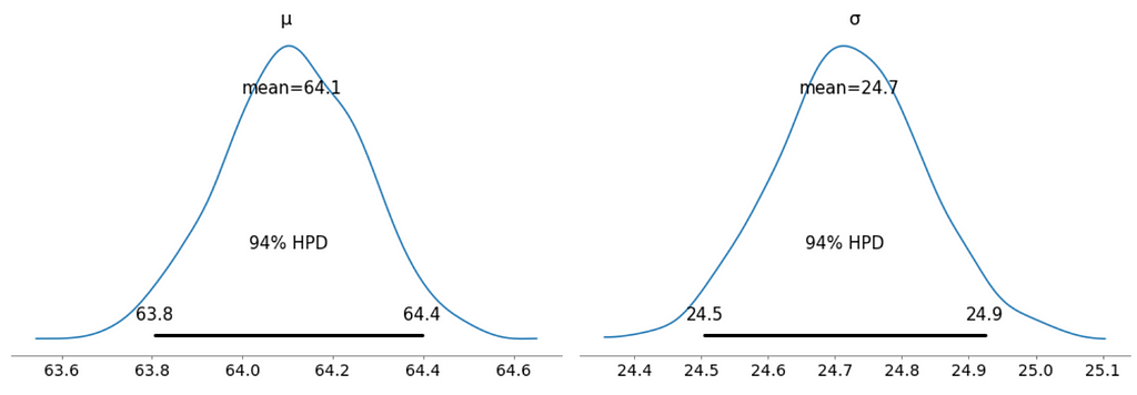
We can also see the above summary visually by generating a plot with the mean and Highest Posterior Density (HPD) of a distribution, and to interpret and report the results of a Bayesian inference.
az.plot_posterior(trace_g);
We can verify the convergence of the chains formally using the Gelman Rubin test. Values close to 1.0 mean convergence.
pm.gelman_rubin(trace_g)

bfmi = pm.bfmi(trace_g)
max_gr = max(np.max(gr_stats) for gr_stats in pm.gelman_rubin(trace_g).values())
(pm.energyplot(trace_g, legend=False, figsize=(6, 4)).set_title("BFMI = {}nGelman-Rubin = {}".format(bfmi, max_gr)));
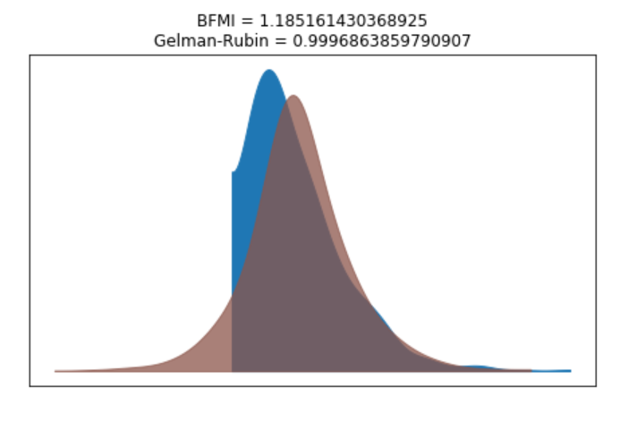
Our model has converged well and the Gelman-Rubin statistic looks fine.
ppc = pm.sample_posterior_predictive(trace_g, samples=1000, model=model_g)
np.asarray(ppc['y']).shape

Now, ppc contains 1000 generated data sets (containing 25798 samples each), each using a different parameter setting from the posterior.
_, ax = plt.subplots(figsize=(10, 5))
ax.hist([y.mean() for y in ppc['y']], bins=19, alpha=0.5)
ax.axvline(data.price.mean())
ax.set(title='Posterior predictive of the mean', xlabel='mean(x)', ylabel='Frequency');
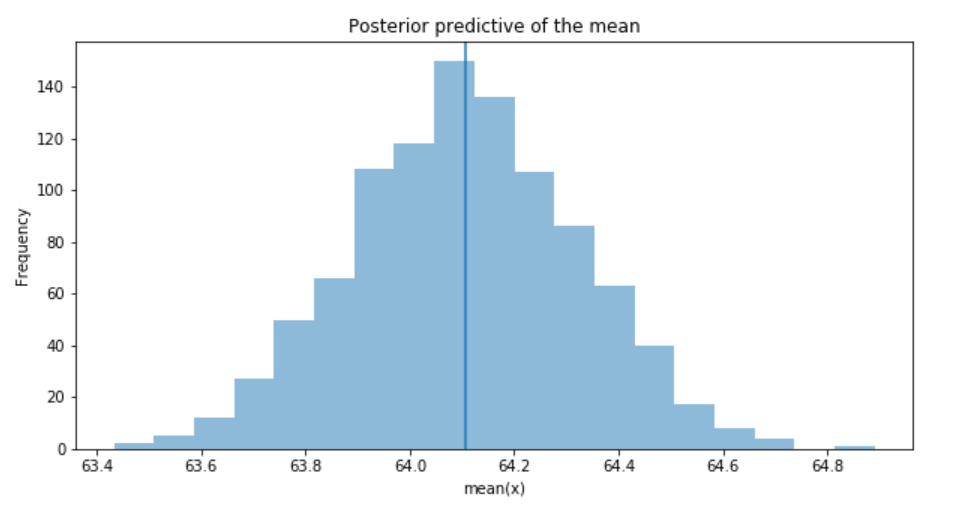
The inferred mean is very close to the actual rail ticket price mean.
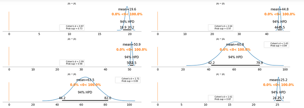
We may be interested in how price compare under different fare types. We are going to focus on estimating the effect size, that is, quantifying the difference between two fare categories. To compare fare categories, we are going to use the mean of each fare type. Because we are Bayesian, we will work to obtain a posterior distribution of the differences of means between fare categories.
We create three variables:
price = data['price'].values
idx = pd.Categorical(data['fare'],
                     categories=['Flexible', 'Promo', 'Promo +', 'Adulto ida', 'Mesa', 'Individual-Flexible']).codes
groups = len(np.unique(idx))
The model for the group comparison problem is almost the same as the previous model. the only difference is that μ and σ are going to be vectors instead of scalar variables. This means that for the priors, we pass a shape argument and for the likelihood, we properly index the means and sd variables using the idx variable:
With 6 groups (fare categories), its a little hard to plot trace plot for μ and σ for every group. So, we create a summary table:
flat_fares = az.from_pymc3(trace=trace_groups)
fares_gaussian = az.summary(flat_fares)
fares_gaussian
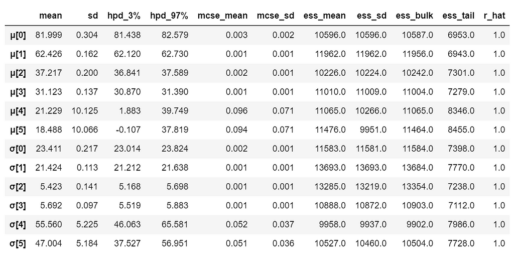
It is obvious that there are significant differences between groups (i.e. fare categories) on the mean.
To make it clearer, we plot the difference between each fare category without repeating the comparison.
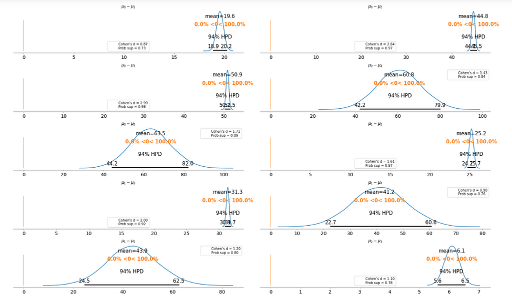
Basically, the above plot tells us that none of the above comparison cases where the 94% HPD includes the reference value of zero. This means for all the examples, we can rule out a difference of zero. The average differences range of 6.1 euro to 63.5 euro are large enough that it can justify for customers to purchase tickets according to different fare categories.
We want to build a model to estimate the rail ticket price of each train type, and, at the same time, estimate the price of all the train types. This type of model is known as a hierarchical model or multilevel model.
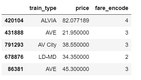
The relevant part of the data we will model looks as above. And we are interested in whether different train types affect the ticket price.
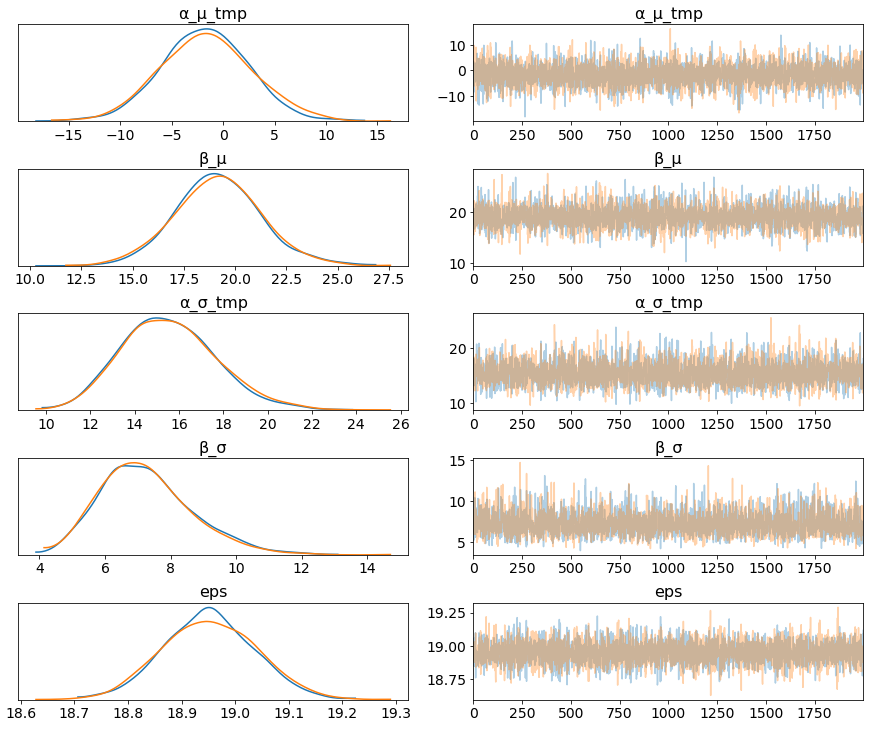
The marginal posteriors in the left column are highly informative, “α_μ_tmp” tells us the group mean price levels, “β_μ” tells us that purchasing fare category “Promo +” increases price significantly compare to fare type “Adulto ida”, and purchasing fare category “Promo” increases price significantly compare to fare type “Promo +”, and so on (no mass under zero).
pm.traceplot(hierarchical_trace, var_names=['α_tmp'], coords={'α_tmp_dim_0': range(5)});
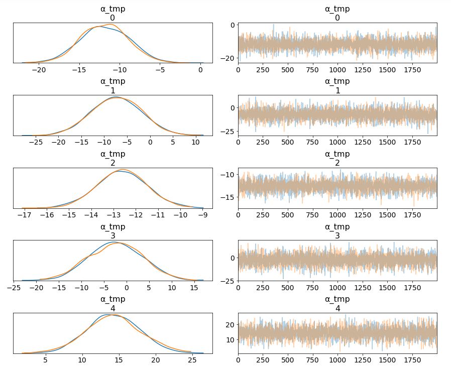
Among 16 train types, we may want to look at how 5 train types compare in terms of the ticket price. We can see by looking at the marginals for “α_tmp” that there is quite some difference in prices between train types; the different widths are related to how much confidence we have in each parameter estimate — the more measurements per train type, the higher our confidence will be.
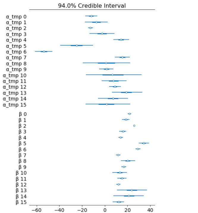
Having uncertainty quantification of some of our estimates is one of the powerful things about Bayesian modelling. We’ve got a Bayesian credible interval for the price of different train types.
az.plot_forest(hierarchical_trace, var_names=['α_tmp', 'β'], combined=True);
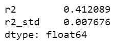
Lastly, we may want to compute r squared:
ppc = pm.sample_posterior_predictive(hierarchical_trace, samples=2000, model=hierarchical_model)
az.r2_score(data.price.values, ppc['fare_like'])
The objective of this post is to learn, practice and explain Bayesian, not to produce the best possible results from the data set. Otherwise, we would have gone with XGBoost directly.
Jupyter notebook can be found on Github, enjoy the rest of the week.
References:
The book: Bayesian Analysis with Python
Hands On Bayesian Statistics with Python, PyMC3 & ArviZ was originally published in Towards Data Science on Medium, where people are continuing the conversation by highlighting and responding to this story.
Last week, I gave a talk on “Hands-on Feature Engineering for NLP” at QCon New York. As a very small part of the presentation, I gave a brief demo on how LIME & SHAP work in terms of text classification explainability.
I decided to write a blog post about them because they are fun, easy to use and visually compelling.
All machine learning models that operate in higher dimensions than what can be directly visualized by the human mind can be referred as black box models which come down to the interpretability of the models. In particular in the field of NLP, it’s always the case that the dimension of the features are very huge, explaining feature importance is getting much more complicated.
LIME & SHAP help us provide an explanation not only to end users but also ourselves about how a NLP model works.
Using the Stack Overflow questions tags classification data set, we are going to build a multi-class text classification model, then applying LIME & SHAP separately to explain the model. Because we have done text classification many times before, we will quickly build the NLP models and focus on the models interpretability.

Our objective here is not to produce the highest results. I wanted to dive into LIME & SHAP as soon as possible and that’s what happened next.
From now on, it’s the fun part. The following code snippets were largely borrowed from LIME tutorial.
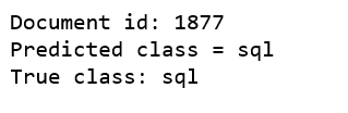
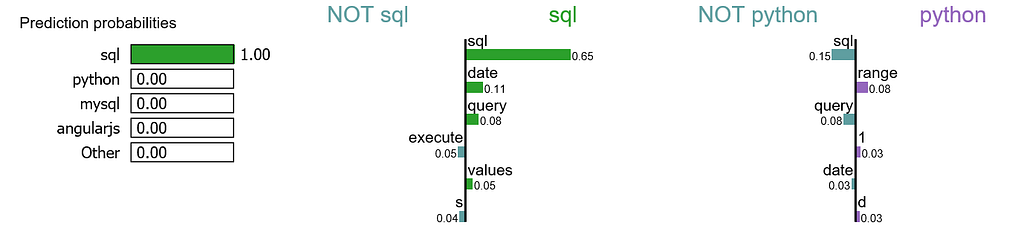
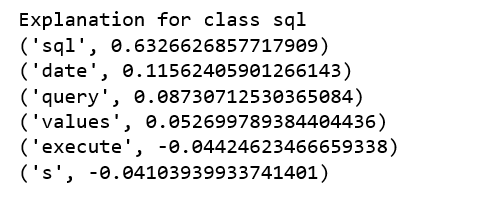
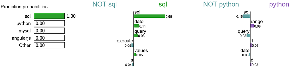
We randomly select a document in test set, it happens to be a document that labeled as sql, and our model predicts it as sql as well. Using this document, we generate explanations for label 4 which is sql and label 8 which is python.
print ('Explanation for class %s' % class_names[4])
print ('n'.join(map(str, exp.as_list(label=4))))
print ('Explanation for class %s' % class_names[8])
print ('n'.join(map(str, exp.as_list(label=8))))
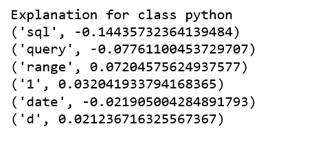
It is obvious that this document has the highest explanation for label sql. We also notice that the positive and negative signs are with respect to a particular label, such as word “sql” is positive towards class sql while negative towards class python, and vice versa.
We are going to generate labels for the top 2 classes for this document.
exp = explainer.explain_instance(X_test[idx], c.predict_proba, num_features=6, top_labels=2)
print(exp.available_labels())
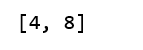
It gives us sql and python.
exp.show_in_notebook(text=False)
Let me try to explain this visualization:
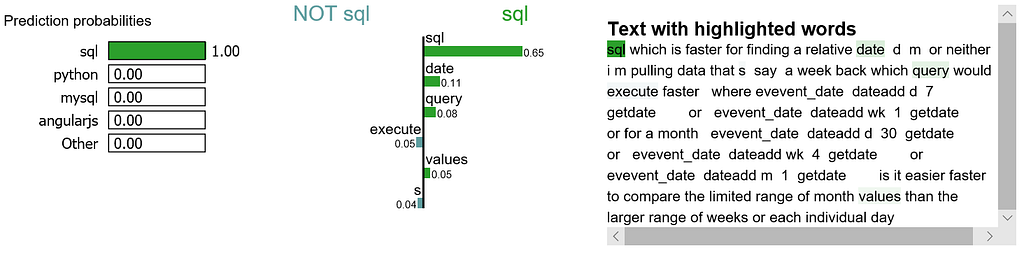
We may want to zoom in and study the explanations for class sql, as well as the document itself.
exp.show_in_notebook(text=y_test[idx], labels=(4,))
The following process were learned from this tutorial.
attrib_data = X_train[:200]
explainer = shap.DeepExplainer(model, attrib_data)
num_explanations = 20
shap_vals = explainer.shap_values(X_test[:num_explanations])
words = processor._tokenizer.word_index
word_lookup = list()
for i in words.keys():
  word_lookup.append(i)
word_lookup = [''] + word_lookup
shap.summary_plot(shap_vals, feature_names=word_lookup, class_names=tag_encoder.classes_)
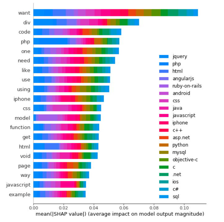
There are a lot to learn in terms of machine learning interpretability with LIME & SHAP. I have only covered a tiny piece for NLP. Jupyter notebook can be found on Github. Enjoy the fun!
Explain NLP models with LIME & SHAP was originally published in Towards Data Science on Medium, where people are continuing the conversation by highlighting and responding to this story.

Anomaly detection is the process of identifying unexpected items or events in data sets, which differ from the norm. And anomaly detection is often applied on unlabeled data which is known as unsupervised anomaly detection. Anomaly detection has two basic assumptions:
Before we get to Multivariate anomaly detection, I think its necessary to work through a simple example of Univariate anomaly detection method in which we detect outliers from a distribution of values in a single feature space.
We are using the Super Store Sales data set that can be downloaded from here, and we are going to find patterns in Sales and Profit separately that do not conform to expected behavior. That is, spotting outliers for one variable at a time.
import pandas as pd
import numpy as np
import matplotlib.pyplot as plt
import seaborn as sns
import matplotlib
from sklearn.ensemble import IsolationForest
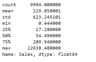
df = pd.read_excel("Superstore.xls")
df['Sales'].describe()
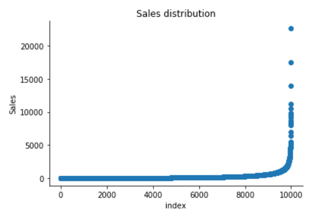
plt.scatter(range(df.shape[0]), np.sort(df['Sales'].values))
plt.xlabel('index')
plt.ylabel('Sales')
plt.title("Sales distribution")
sns.despine()
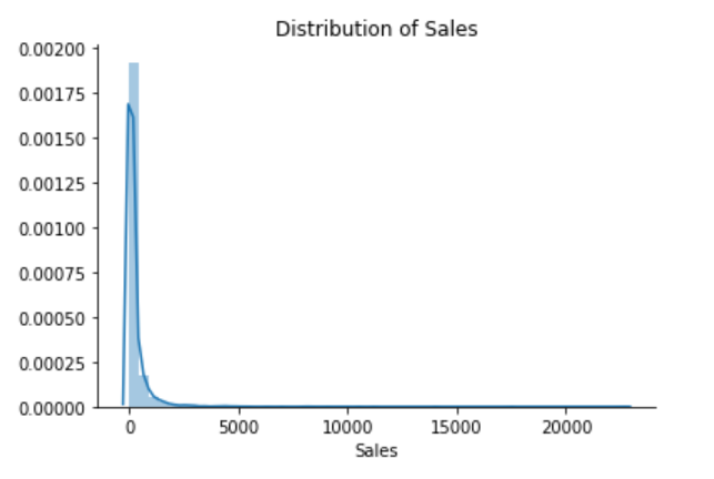
sns.distplot(df['Sales'])
plt.title("Distribution of Sales")
sns.despine()
print("Skewness: %f" % df['Sales'].skew())
print("Kurtosis: %f" % df['Sales'].kurt())

The Superstore’s sales distribution is far from a normal distribution, and it has a positive long thin tail, the mass of the distribution is concentrated on the left of the figure. And the tail sales distribution far exceeds the tails of the normal distribution.
There are one region where the data has low probability to appear which is on the right side of the distribution.
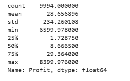
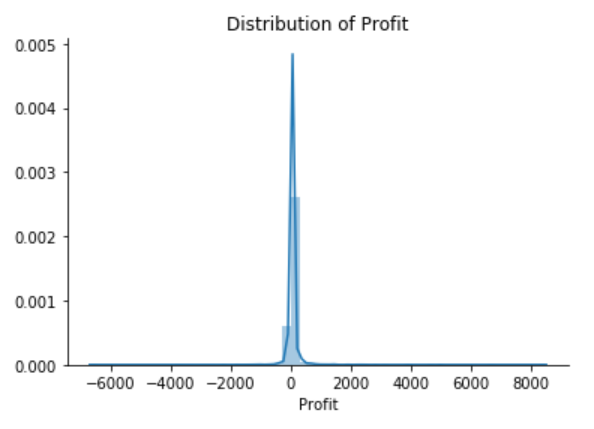
df['Profit'].describe()
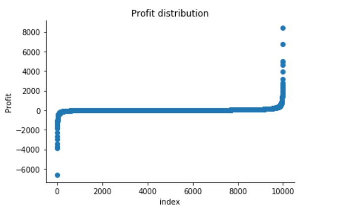
plt.scatter(range(df.shape[0]), np.sort(df['Profit'].values))
plt.xlabel('index')
plt.ylabel('Profit')
plt.title("Profit distribution")
sns.despine()
sns.distplot(df['Profit'])
plt.title("Distribution of Profit")
sns.despine()
print("Skewness: %f" % df['Profit'].skew())
print("Kurtosis: %f" % df['Profit'].kurt())

The Superstore’s Profit distribution has both a positive tail and negative tail. However, the positive tail is longer than the negative tail. So the distribution is positive skewed, and the data are heavy-tailed or profusion of outliers.
There are two regions where the data has low probability to appear: one on the right side of the distribution, another one on the left.
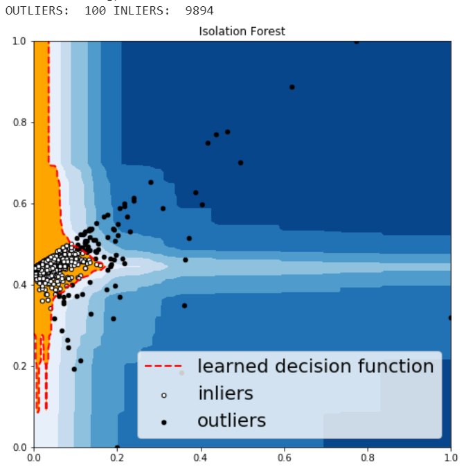
Isolation Forest is an algorithm to detect outliers that returns the anomaly score of each sample using the IsolationForest algorithm which is based on the fact that anomalies are data points that are few and different. Isolation Forest is a tree-based model. In these trees, partitions are created by first randomly selecting a feature and then selecting a random split value between the minimum and maximum value of the selected feature.
The following process shows how IsolationForest behaves in the case of the Susperstore’s sales, and the algorithm was implemented in Sklearn and the code was largely borrowed from this tutorial
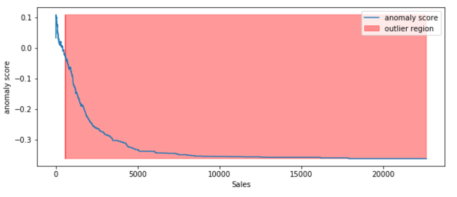
According to the above results and visualization, It seems that Sales that exceeds 1000 would be definitely considered as an outlier.
df.iloc[10]
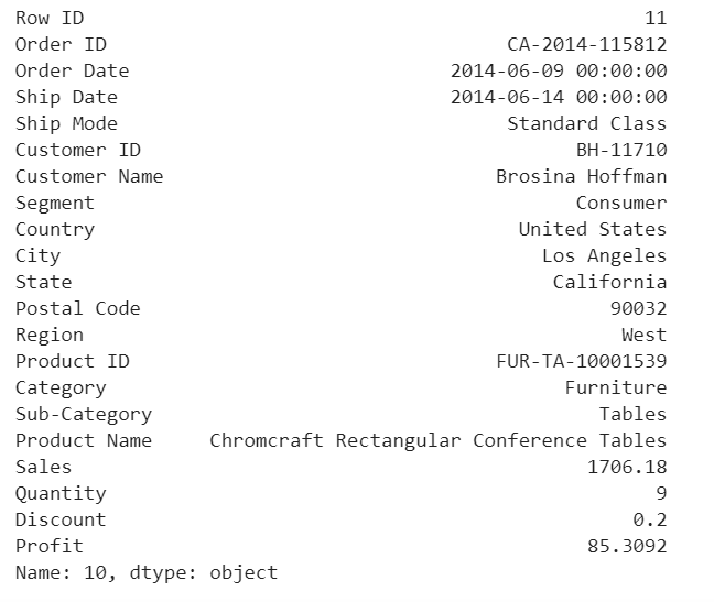
This purchase seems normal to me expect it was a larger amount of sales compared with the other orders in the data.
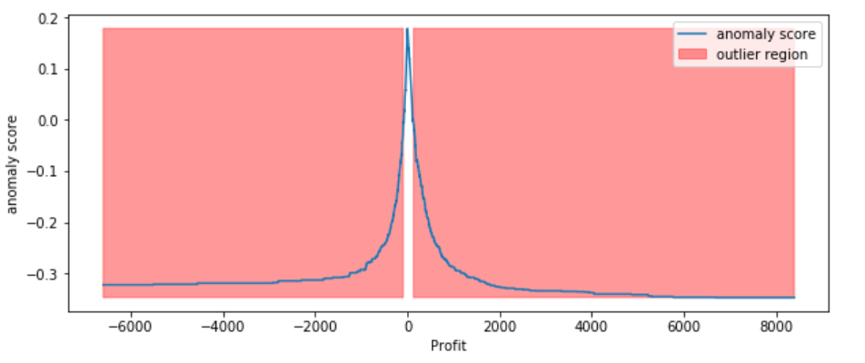
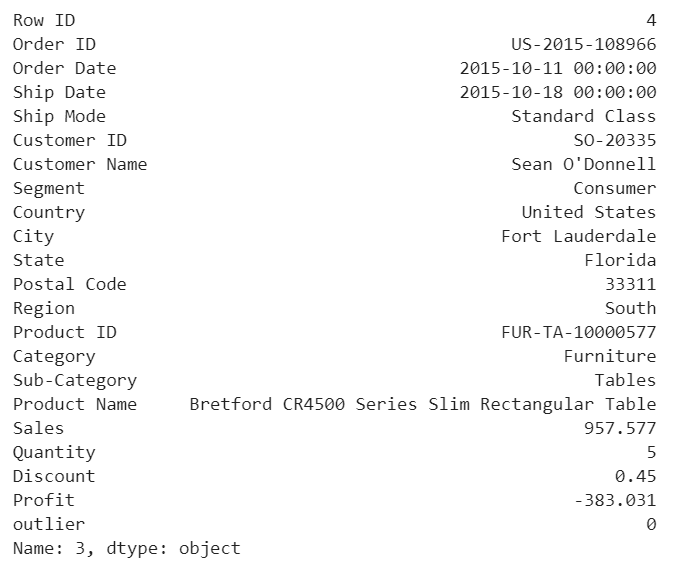
According to the above results and visualization, It seems that Profit that below -100 or exceeds 100 would be considered as an outlier, let’s visually examine one example each that determined by our model and to see whether they make sense.
df.iloc[3]
Any negative profit would be an anomaly and should be further investigate, this goes without saying
df.iloc[1]
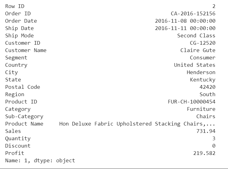
Our model determined that this order with a large profit is an anomaly. However, when we investigate this order, it could be just a product that has a relatively high margin.
The above two visualizations show the anomaly scores and highlighted the regions where the outliers are. As expected, the anomaly score reflects the shape of the underlying distribution and the outlier regions correspond to low probability areas.
However, Univariate analysis can only get us thus far. We may realize that some of these anomalies that determined by our models are not the anomalies we expected. When our data is multidimensional as opposed to univariate, the approaches to anomaly detection become more computationally intensive and more mathematically complex.
Most of the analysis that we end up doing are multivariate due to complexity of the world we are living in. In multivariate anomaly detection, outlier is a combined unusual score on at least two variables.
So, using the Sales and Profit variables, we are going to build an unsupervised multivariate anomaly detection method based on several models.
We are using PyOD which is a Python library for detecting anomalies in multivariate data. The library was developed by Yue Zhao.
When we are in business, we expect that Sales & Profit are positive correlated. If some of the Sales data points and Profit data points are not positive correlated, they would be considered as outliers and need to be further investigated.
sns.regplot(x="Sales", y="Profit", data=df)
sns.despine();
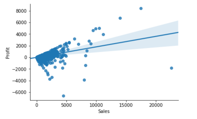
From the above correlation chart, we can see that some of the data points are obvious outliers such as extreme low and extreme high values.
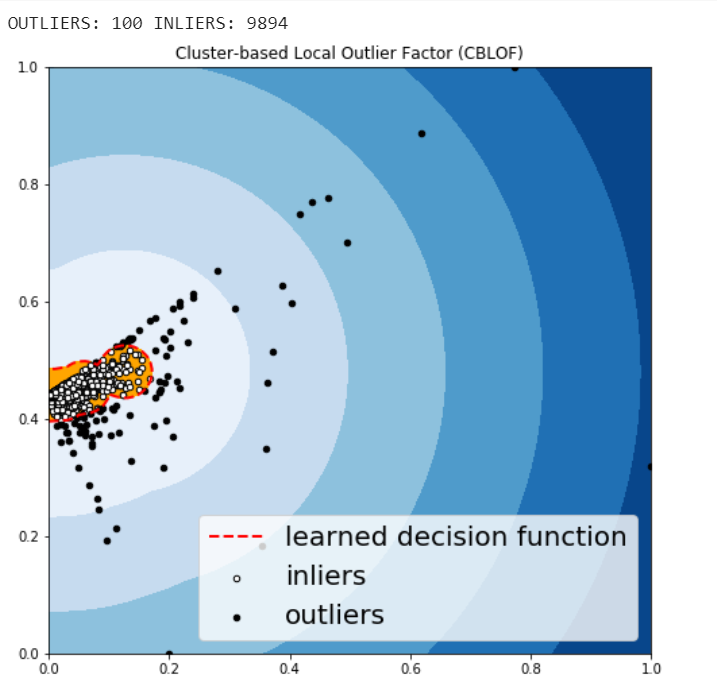
The CBLOF calculates the outlier score based on cluster-based local outlier factor. An anomaly score is computed by the distance of each instance to its cluster center multiplied by the instances belonging to its cluster. PyOD library includes the CBLOF implementation.
The following code are borrowed from PyOD tutorial combined with this article.
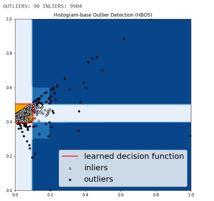
HBOS assumes the feature independence and calculates the degree of anomalies by building histograms. In multivariate anomaly detection, a histogram for each single feature can be computed, scored individually and combined at the end. When using PyOD library, the code are very similar with the CBLOF.
Isolation Forest is similar in principle to Random Forest and is built on the basis of decision trees. Isolation Forest isolates observations by randomly selecting a feature and then randomly selecting a split value between the maximum and minimum values of that selected feature.
The PyOD Isolation Forest module is a wrapper of Scikit-learn Isolation Forest with more functionalities.
KNN is one of the simplest methods in anomaly detection. For a data point, its distance to its kth nearest neighbor could be viewed as the outlier score.
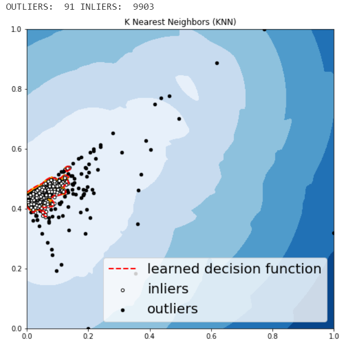
The anomalies predicted by the above four algorithms were not very different.
We may want to investigate each of the outliers that determined by our model, for example, let’s look in details for a couple of outliers that determined by KNN, and try to understand what make them anomalies.
df.iloc[1995]
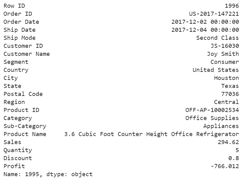
For this particular order, a customer purchased 5 products with total price at 294.62 and profit at lower than -766, with 80% discount. It seems like a clearance. We should be aware of the loss for each product we sell.
df.iloc[9649]
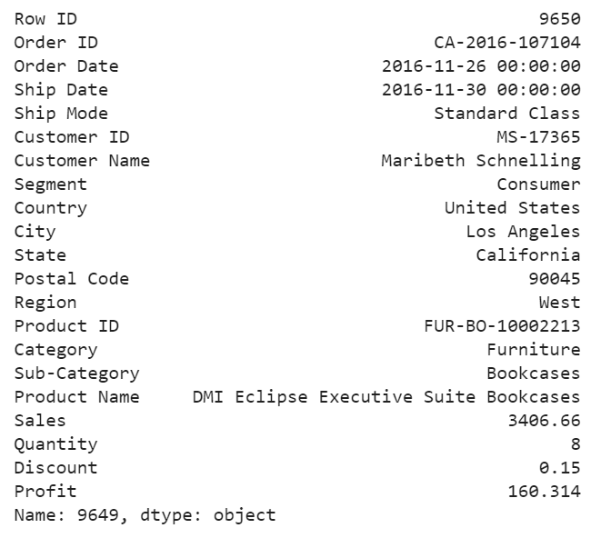
For this purchase, it seems to me that the profit at around 4.7% is too small and the model determined that this order is an anomaly.
df.iloc[9270]
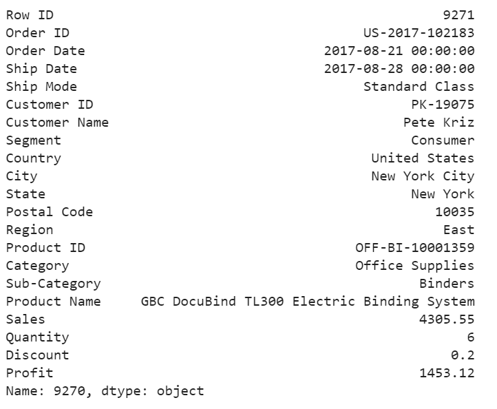
For the above order, a customer purchased 6 product at 4305 in total price, after 20% discount, we still get over 33% of the profit. We would love to have more of these kind of anomalies.
Jupyter notebook for the above analysis can be found on Github. Enjoy the rest of the week.
Anomaly Detection for Dummies was originally published in Towards Data Science on Medium, where people are continuing the conversation by highlighting and responding to this story.