Bayesian Strategy for Modeling Retail Price with PyStan
Statistical modeling, partial pooling, Multilevel modeling, hierarchical modeling
Pricing is a common problem faced by any e-commerce business, and one that can be addressed effectively by Bayesian statistical methods.
The Mercari Price Suggestion data set from Kaggle seems to be a good candidate for the Bayesian models I wanted to learn.
If you remember, the purpose of the data set is to build a model that automatically suggests the right price for any given product for Mercari website sellers. I am here to attempt to see whether we can solve this problem by Bayesian statistical methods, using PyStan.
And the following pricing analysis replicates the case study of home radon levels from Professor Fonnesbeck. In fact, the methodology and code were largely borrowed from his tutorial.
The Data
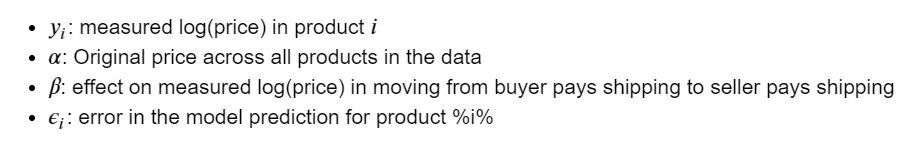
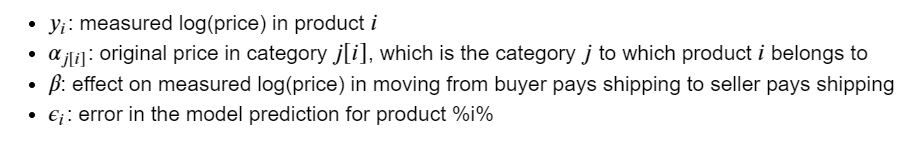
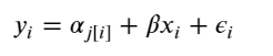
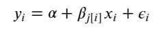
In this analysis, we will estimate parameters for individual product price that exist within categories. And the measured price is a function of the shipping condition (buyer pays shipping or seller pays shipping), and the overall price.
At the end, our estimate of the parameter of product price can be considered a prediction.
Simply put, the independent variables we are using are: category_name & shipping. And the dependent variable is: price.
from scipy import stats
import arviz as az
import numpy as np
import matplotlib.pyplot as plt
import pystan
import seaborn as sns
import pandas as pd
from theano import shared
from sklearn import preprocessing
plt.style.use('bmh')
df = pd.read_csv('train.tsv', sep = 't')
df = df.sample(frac=0.01, random_state=99)
df = df[pd.notnull(df['category_name'])]
df.category_name.nunique()

To make things more interesting, I will model all of these 689 product categories. If you want to produce better results quicker, you may want to model the top 10 or top 20 categories, to start.
shipping_0 = df.loc[df['shipping'] == 0, 'price']
shipping_1 = df.loc[df['shipping'] == 1, 'price']
fig, ax = plt.subplots(figsize=(10,5))
ax.hist(shipping_0, color='#8CB4E1', alpha=1.0, bins=50, range = [0, 100],
       label=0)
ax.hist(shipping_1, color='#007D00', alpha=0.7, bins=50, range = [0, 100],
       label=1)
plt.xlabel('price', fontsize=12)
plt.ylabel('frequency', fontsize=12)
plt.title('Price Distribution by Shipping Type', fontsize=15)
plt.tick_params(labelsize=12)
plt.legend()
plt.show();
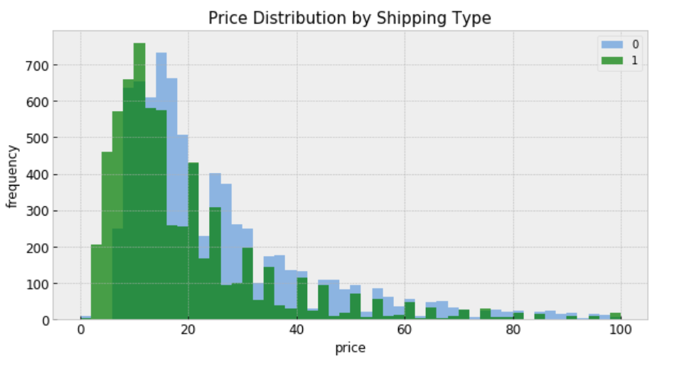
“shipping = 0” means shipping fee paid by buyer, and “shipping = 1” means shipping fee paid by seller. In general, price is higher when buyer pays shipping.
Modeling
For construction of a Stan model, it is convenient to have the relevant variables as local copies — this aids readability.
- category: index code for each category name
- price: price
- category_names: unique category names
- categories: number of categories
- log_price: log price
- shipping: who pays shipping
- category_lookup: index categories with a lookup dictionary
le = preprocessing.LabelEncoder()
df['category_code'] = le.fit_transform(df['category_name'])
category_names = df.category_name.unique()
categories = len(category_names)
category = df['category_code'].values
price = df.price
df['log_price'] = log_price = np.log(price + 0.1).values
shipping = df.shipping.values
category_lookup = dict(zip(category_names, range(len(category_names))))
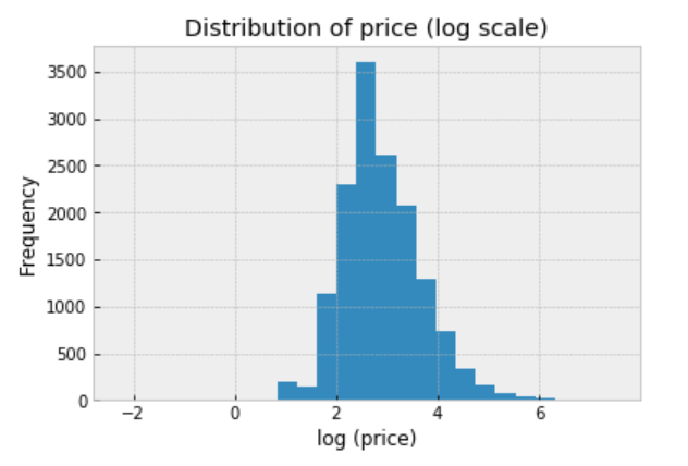
We should always explore the distribution of price (log scale) in the data:
df.price.apply(lambda x: np.log(x+0.1)).hist(bins=25)
plt.title('Distribution of price (log scale)')
plt.xlabel('log (price)')
plt.ylabel('Frequency');
Conventional Approaches
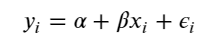
There are two conventional approaches to modeling price represent the two extremes of the bias-variance tradeoff:
Complete pooling:
Treat all categories the same, and estimate a single price level, with the equation:
To specify this model in Stan, we begin by constructing the data block, which includes vectors of log-price measurements (y) and who pays shipping covariates (x), as well as the number of samples (N).
The complete pooling model is:
https://medium.com/media/51a3101eb6118ee17ae87ea25bc4edb0/href
When passing the code, data, and parameters to the Stan function, we specify sampling 2 chains of length 1000:
https://medium.com/media/c57be4f2144e862403f9dc722036fd0e/href
Inspecting the fit
Once the fit has been run, the method extract and specifying permuted=True extracts samples into a dictionary of arrays so that we can conduct visualization and summarization.
We are interested in the mean values of these estimates for parameters from the sample.
- b0 = alpha = mean price across category
- m0 = beta = mean variation in price with change on who pays shipping
We can now visualize how well this pooled model fits the observed data.
pooled_sample = pooled_fit.extract(permuted=True)
b0, m0 = pooled_sample['beta'].T.mean(1)
plt.scatter(df.shipping, np.log(df.price+0.1))
xvals = np.linspace(-0.2, 1.2)
plt.xticks([0, 1])
plt.plot(xvals, m0*xvals+b0, 'r--')
plt.title("Fitted model")
plt.xlabel("Shipping")
plt.ylabel("log(price)");
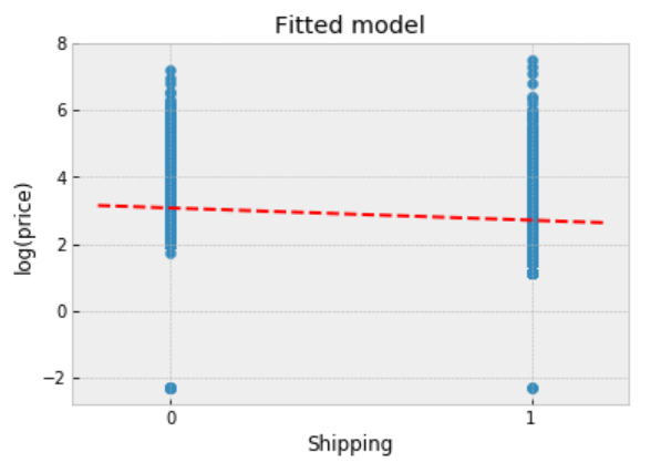
Observations:
- The fitted line runs through the centre of the data, and it describes the trend.
- However, the observed points vary widely about the fitted model, and there are multiple outliers indicating that the original price varies quite widely.
- We might expect different gradients if we chose different subsets of the data.
Unpooling
When unpooling, we model price in each category independently, with the equation:
where j = 1, … , 689
The unpooled model is:
https://medium.com/media/17665e2ecce7247121bde96788c0f169/href
When running the unpooled model in Stan, We again map Python variables to those used in the Stan model, then pass the data, parameters and the model to Stan. We again specify 1000 iterations of 2 chains.
https://medium.com/media/0255b96493f2197f098e598785e6bb50/href
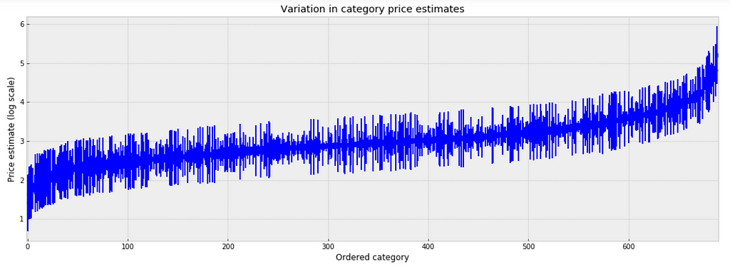
Inspecting the fit
To inspect the variation in predicted price at category level, we plot the mean of each estimate with its associated standard error. To structure this visually, we’ll reorder the categories such that we plot categories from the lowest to the highest.
unpooled_estimates = pd.Series(unpooled_fit['a'].mean(0), index=category_names)
order = unpooled_estimates.sort_values().index
plt.figure(figsize=(18, 6))
plt.scatter(range(len(unpooled_estimates)), unpooled_estimates[order])
for i, m, se in zip(range(len(unpooled_estimates)), unpooled_estimates[order], unpooled_se[order]):
    plt.plot([i,i], [m-se, m+se], 'b-')
    plt.xlim(-1,690);
plt.ylabel('Price estimate (log scale)');plt.xlabel('Ordered category');plt.title('Variation in category price estimates');
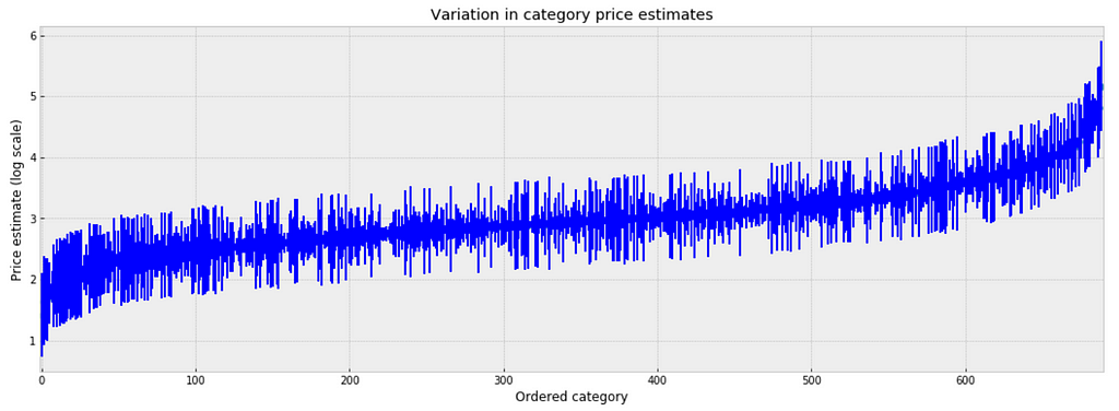
Observations:
- There are multiple categories with relatively low predicted price levels, and multiple categories with a relatively high predicted price levels. Their distance can be large.
- A single all-category estimate of all price level could not represent this variation well.
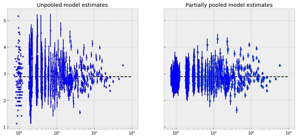
Comparison of pooled and unpooled estimates
We can make direct visual comparisons between pooled and unpooled estimates for all categories, and we are going to show several examples, and I purposely select some categories with many products, and other categories with very few products.
https://medium.com/media/2470950a8e5c243beeb1acebee519701/href
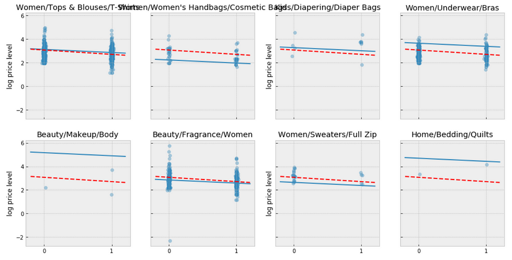
Let me try to explain what the above visualizations tell us:
- The pooled models (red dashed line) in every category are the same, meaning all categories are modeled the same, indicating pooling is useless.
- For categories with few observations, the fitted estimates track the observations very closely, suggesting that there has been overfitting. So that we can’t trust the estimates produced by models using few observations.
Multilevel and Hierarchical Models
Partial Pooling — simplest
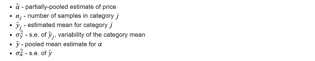
The simplest possible partial pooling model for the e-commerce price data set is one that simply estimates prices, with no other predictors (i.e. ignoring the effect of shipping). This is a compromise between pooled (mean of all categories) and unpooled (category-level means), and approximates a weighted average (by sample size) of unpooled category estimates, and the pooled estimates, with the equation:
The simplest partial pooling model:
https://medium.com/media/66824a405e17c27e56dcb4bb92ff8830/href
Now we have two standard deviations, one describing the residual error of the observations, and another describing the variability of the category means around the average.
https://medium.com/media/73b49d1cd60ce693f146761352779f89/href
We’re interested primarily in the category-level estimates of price, so we obtain the sample estimates for “a”:
https://medium.com/media/e17f1f478ee3f3b2d6785917db1e316b/href
Observations:
- There are significant differences between unpooled and partially-pooled estimates of category-level price, The partially pooled estimates looks way less extreme.
Partial Pooling — Varying Intercept
Simply put, the multilevel modeling shares strength among categories, allowing for more reasonable inference in categories with little data, with the equation:
The varying intercept model:
https://medium.com/media/7e6b2af5c74e7d7e9ee8c34e0135ff2e/href
Fitting the model:
https://medium.com/media/b1ba4fcf65194d4cc1eebad8a1dddd0a/href
There is no way to visualize all of these 689 categories together, so I will visualize 20 of them.
a_sample = pd.DataFrame(varying_intercept_fit['a'])
plt.figure(figsize=(20, 5))
g = sns.boxplot(data=a_sample.iloc[:,0:20], whis=np.inf, color="g")
# g.set_xticklabels(df.category_name.unique(), rotation=90)  # label counties
g.set_title("Estimates of log(price), by category")
g;
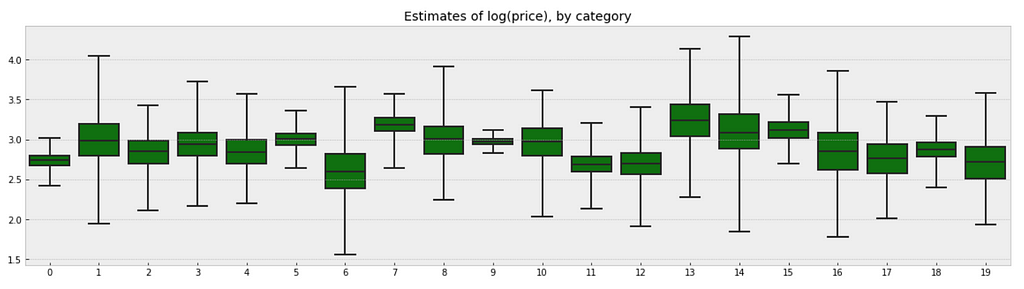
Observations:
- There are quite some variations in prices by category, and we can see that for example, category Beauty/Fragrance/Women (index at 9) with a large number of samples (225) also has one of the tightest range of estimated values.
- While category Beauty/Hair Care/Shampoo Plus Conditioner (index at 16) with the smallest number of sample (one only) also has one of the widest range of estimates.
We can visualize the distribution of parameter estimates for 𝜎 and β.
az.plot_trace(varying_intercept_fit, var_names = ['sigma_a', 'b']);
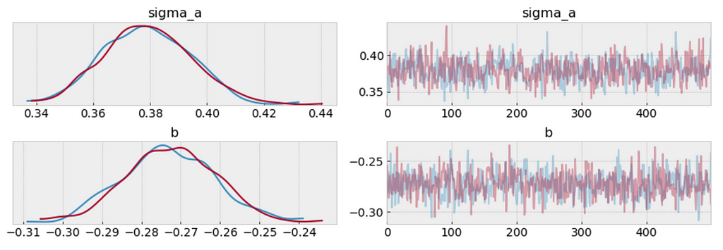
varying_intercept_fit['b'].mean()
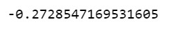
The estimate for the shipping coefficient is approximately -0.27, which can be interpreted as products which shipping fee paid by seller at about 0.76 of (exp(−0.27)=0.76) the price of those shipping paid by buyer, after accounting for category.
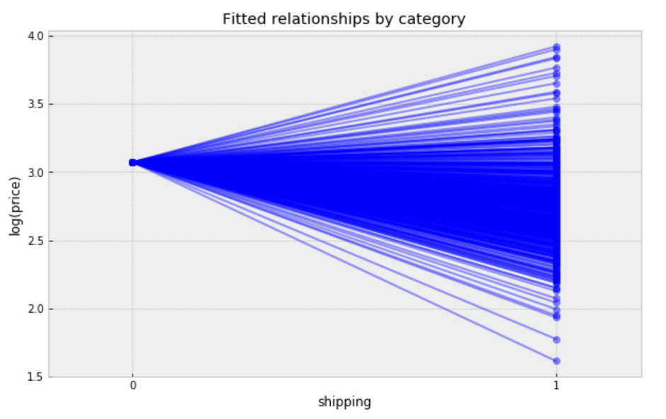
Visualize the fitted model
plt.figure(figsize=(12, 6))
xvals = np.arange(2)
bp = varying_intercept_fit['a'].mean(axis=0) # mean a (intercept) by category
mp = varying_intercept_fit['b'].mean()      # mean b (slope/shipping effect)
for bi in bp:
    plt.plot(xvals, mp*xvals + bi, 'bo-', alpha=0.4)
plt.xlim(-0.1,1.1)
plt.xticks([0, 1])
plt.title('Fitted relationships by category')
plt.xlabel("shipping")
plt.ylabel("log(price)");
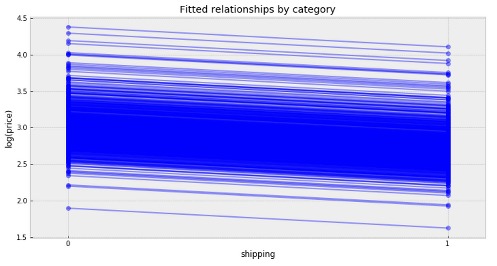
Observations:
- It is clear from this plot that we have fitted the same shipping effect to each category, but with a different price level in each category.
- There is one category with very low fitted price estimates, and several categories with relative lower fitted price estimates.
- There are multiple categories with relative higher fitted price estimates.
- The bulk of categories form a majority set of similar fits.
We can see whether partial pooling of category-level price estimate has provided more reasonable estimates than pooled or unpooled models, for categories with small sample sizes.
Partial Pooling — Varying Slope model
We can also build a model that allows the categories to vary according to shipping arrangement (paid by buyer or paid by seller) influences the price. With the equation:
The varying slope model:
https://medium.com/media/410f626d1b3edc5f64a95b8d5d6c5875/href
Fitting the model:
https://medium.com/media/c46f1284c4d604f1a809af03d0920c50/href
Following the process earlier, we will visualize 20 categories.
b_sample = pd.DataFrame(varying_slope_fit['b'])
plt.figure(figsize=(20, 5))
g = sns.boxplot(data=b_sample.iloc[:,0:20], whis=np.inf, color="g")
# g.set_xticklabels(df.category_name.unique(), rotation=90)  # label counties
g.set_title("Estimate of shipping effect, by category")
g;
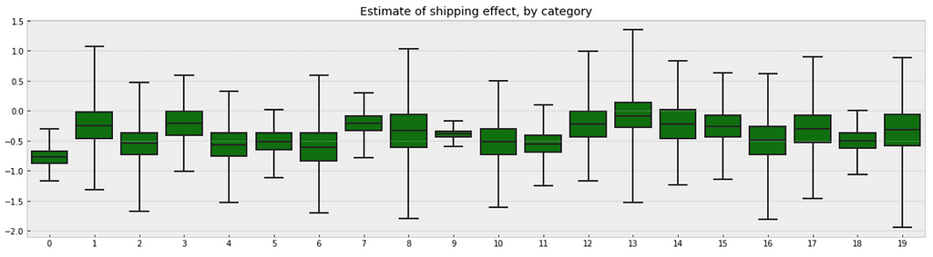
Observations:
- From the first glance, we may not see any difference between these two boxplots. But if you look deeper, you will find that the variation in median estimates between categories in varying slope model becomes smaller than those in varying intercept model, though the range of uncertainty is still greatest in the categories with fewest products, and least in the categories with the most products.
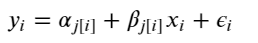
Visualize the fitted model:
plt.figure(figsize=(10, 6))
xvals = np.arange(2)
b = varying_slope_fit['a'].mean()
m = varying_slope_fit['b'].mean(axis=0)
for mi in m:
    plt.plot(xvals, mi*xvals + b, 'bo-', alpha=0.4)
plt.xlim(-0.2, 1.2)
plt.xticks([0, 1])
plt.title("Fitted relationships by category")
plt.xlabel("shipping")
plt.ylabel("log(price)");
Observations:
- It is clear from this plot that we have fitted the same price level to every category, but with a different shipping effect in each category.
- There are two categories with very small shipping effects, but the majority bulk of categories form a majority set of similar fits.
Partial Pooling — Varying Slope and Intercept
The most general way to allow both slope and intercept to vary by category. With the equation:
The varying slope and intercept model:
https://medium.com/media/99f0024765a13153517815289c68ed0f/href
Fitting the model:
https://medium.com/media/2b2e35474baef1997aa31d66cf469bb7/href
Visualize the fitted model:
plt.figure(figsize=(10, 6))
xvals = np.arange(2)
b = varying_intercept_slope_fit['a'].mean(axis=0)
m = varying_intercept_slope_fit['b'].mean(axis=0)
for bi,mi in zip(b,m):
    plt.plot(xvals, mi*xvals + bi, 'bo-', alpha=0.4)
plt.xlim(-0.1, 1.1);
plt.xticks([0, 1])
plt.title("fitted relationships by category")
plt.xlabel("shipping")
plt.ylabel("log(price)");
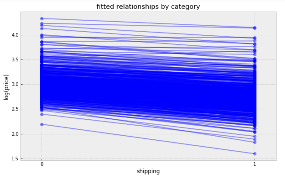
While these relationships are all very similar, we can see that by allowing both shipping effect and price to vary, we seem to be capturing more of the natural variation, compare with varying intercept model.
Contextual Effects
In some instances, having predictors at multiple levels can reveal correlation between individual-level variables and group residuals. We can account for this by including the average of the individual predictors as a covariate in the model for the group intercept.
Contextual effect model:
https://medium.com/media/7c604f58453416f772d0c991ee56a12d/href
Fitting the model:
https://medium.com/media/6b84784f1d5a7f049d18afc5e84f18dd/href
Prediction
we wanted to make a prediction for a new product in “Women/Athletic Apparel/Pants, Tights, Leggings” category, which shipping paid by seller, we just need to sample from the model with the appropriate intercept.
category_lookup['Women/Athletic Apparel/Pants, Tights, Leggings']

The prediction model:
https://medium.com/media/a65424df0289f71c90c9e6bf88374c61/href
Making the prediction:
https://medium.com/media/7e5baafd8775536b65d5be80b0650606/href
The prediction:
contextual_pred_fit.plot('y_wa');
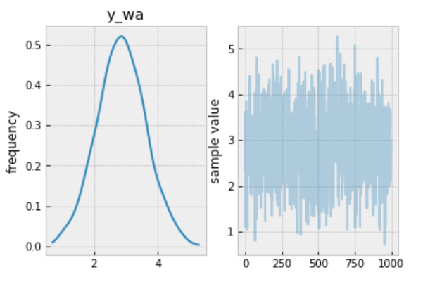
Observations:
- The mean value sampled from this fit is ≈3, so we should expect the measured price in a new product in “Women/Athletic Apparel/Pants, Tights, Leggings” category, when shipping paid by seller, to be ≈exp(3) ≈ 20.09, though the range of predicted values is rather wide.
Jupyter notebook can be found on Github. Enjoy the rest of the weekend.
References: