The concept TF-IDF stands for term frequency-inverse document frequency. This is in the field of numerical statistics. With this concept, we will be able to decide how important a word is to a given document in the present dataset or corpus.
Frequency
What is TF-IDF?
TF-IDF indicates what the importance of the word is in order to understand the document or dataset. Let us understand with an example. Suppose you have a dataset where students write an essay on the topic, My House. In this dataset, the word a appears many times; it’s a high frequency word compared to other words in the dataset. The dataset contains other words like home, house, rooms and so on that appear less often, so their frequency are lower and they carry more information compared to the word. This is the intuition behind TF-IDF.
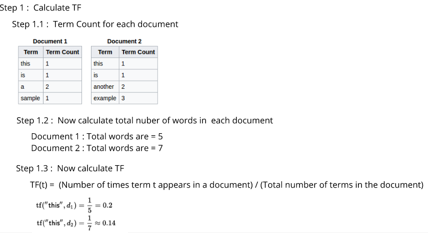
Let us dive deep into the mathematical aspect of TF-IDF. It has two parts: Term Frequency(TF) and Inverse Document Frequency(IDF). The term frequency indicates the frequency of each of the words present in the document or dataset.
So, its equation is given as follows:
TF(t) = (Number of times term t appears in a document) / (Total number of terms in the document)
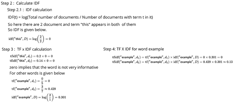
The second part is — inverse document frequency. IDF actually tells us how important the word is to the document. This is because when we calculate TF, we give equal importance to every single word. If the word appears in the dataset more frequently, then its term frequency (TF) value is high while not being that important to the document.
So, if the word the appears in the document 100 times, then it’s not carrying that much information compared to words that are less frequent in the dataset. Thus, we need to define some weighing down of the frequent terms while scaling up the rare ones, which decides the importance of each word. We will achieve this with the following equation:
IDF(t) = log10(Total number of documents / Number of documents with term t in it).
Hence, equation is calculate TF-IDF is as follows.
TF * IDF = [ (Number of times term t appears in a document) / (Total number of terms in the document) ] * log10(Total number of documents / Number of documents with term t in it).
In reality, TF-IDF is the multiplication of TF and IDF, such as TF * IDF.
Now, let’s take an example where you have two sentences and are considering those sentences as different documents in order to understand the concept of TF-IDF:
Thanks for reading! 😊 If you enjoyed it, test how many times can you hit 👏 in 5 seconds. It’s great cardio for your fingers AND will help other people see the story.
I decided to write a blog post about them because they are fun, easy to use and visually compelling.
All machine learning models that operate in higher dimensions than what can be directly visualized by the human mind can be referred as black box models which come down to the interpretability of the models. In particular in the field of NLP, it’s always the case that the dimension of the features are very huge, explaining feature importance is getting much more complicated.
LIME & SHAP help us provide an explanation not only to end users but also ourselves about how a NLP model works.
Using the Stack Overflow questions tags classification data set, we are going to build a multi-class text classification model, then applying LIME & SHAP separately to explain the model. Because we have done text classification many times before, we will quickly build the NLP models and focus on the models interpretability.
Data Pre-processing, Feature Engineering and Logistic Regression
Our objective here is not to produce the highest results. I wanted to dive into LIME & SHAP as soon as possible and that’s what happened next.
Interpreting text predictions with LIME
From now on, it’s the fun part. The following code snippets were largely borrowed from LIME tutorial.
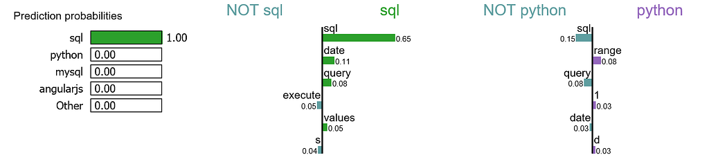
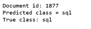
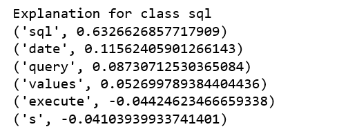
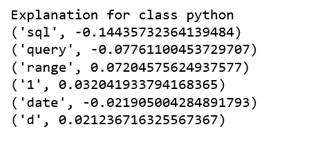
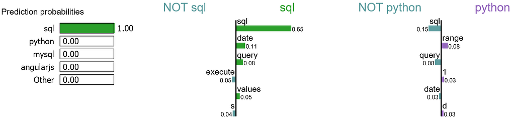
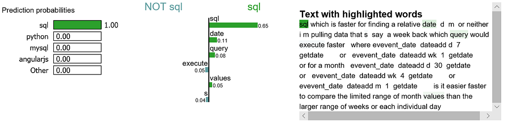
We randomly select a document in test set, it happens to be a document that labeled as sql, and our model predicts it as sql as well. Using this document, we generate explanations for label 4 which is sql and label 8 which is python.
print ('Explanation for class %s' % class_names[4])
print ('n'.join(map(str, exp.as_list(label=4))))
print ('Explanation for class %s' % class_names[8])
print ('n'.join(map(str, exp.as_list(label=8))))
It is obvious that this document has the highest explanation for label sql.We also notice that the positive and negative signs are with respect to a particular label, such as word “sql” is positive towards class sql while negative towards class python, and vice versa.
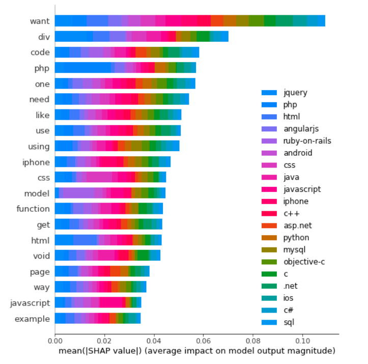
We are going to generate labels for the top 2 classes for this document.
Word “want” is the biggest signal word used by our model, contribute most to class jquery predictions.
Word “php” is the 4th biggest signal word used by our model, contributing most to class php of course.
On the other hand, word “php” is likely to have a negative signal to the other class because it is unlikely to see word “php” to appear in a python document.
There are a lot to learn in terms of machine learning interpretability with LIME & SHAP. I have only covered a tiny piece for NLP. Jupyter notebook can be found on Github. Enjoy the fun!
Unsupervised Anomaly Detection for Univariate & Multivariate Data.
Anomaly detection is the process of identifying unexpected items or events in data sets, which differ from the norm. And anomaly detection is often applied on unlabeled data which is known as unsupervised anomaly detection. Anomaly detection has two basic assumptions:
Anomalies only occur very rarely in the data.
Their features differ from the normal instances significantly.
Univariate Anomaly Detection
Before we get to Multivariate anomaly detection, I think its necessary to work through a simple example of Univariate anomaly detection method in which we detect outliers from a distribution of values in a single feature space.
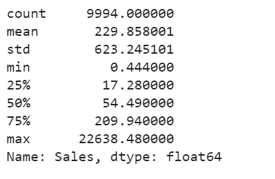
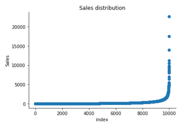
We are using the Super Store Sales data set that can be downloaded from here, and we are going to find patterns in Sales and Profit separately that do not conform to expected behavior. That is, spotting outliers for one variable at a time.
import pandas as pd
import numpy as np
import matplotlib.pyplot as plt
import seaborn as sns
import matplotlib
from sklearn.ensemble import IsolationForest
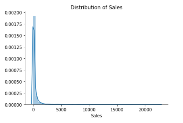
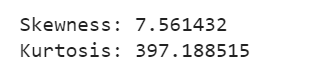
The Superstore’s sales distribution is far from a normal distribution, and it has a positive long thin tail, the mass of the distribution is concentrated on the left of the figure. And the tail sales distribution far exceeds the tails of the normal distribution.
There are one region where the data has low probability to appear which is on the right side of the distribution.
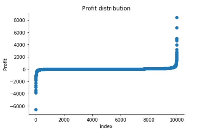
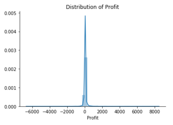
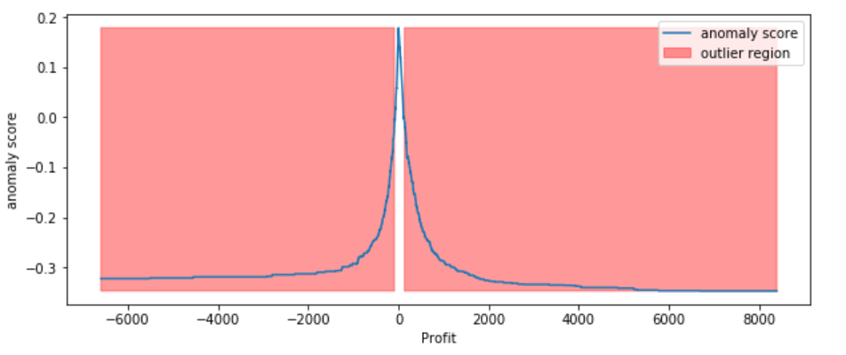
The Superstore’s Profit distribution has both a positive tail and negative tail. However, the positive tail is longer than the negative tail. So the distribution is positive skewed, and the data are heavy-tailed or profusion of outliers.
There are two regions where the data has low probability to appear: one on the right side of the distribution, another one on the left.
Univariate Anomaly Detection on Sales
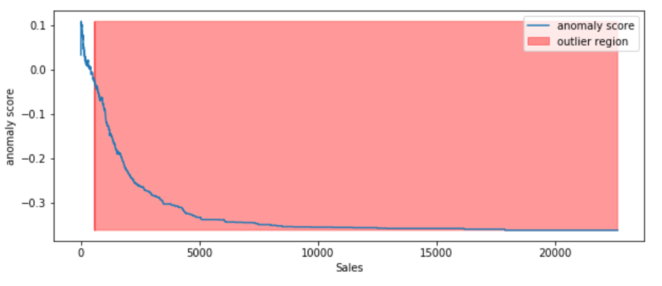
Isolation Forest is an algorithm to detect outliers that returns the anomaly score of each sample using the IsolationForest algorithm which is based on the fact that anomalies are data points that are few and different. Isolation Forest is a tree-based model. In these trees, partitions are created by first randomly selecting a feature and then selecting a random split value between the minimum and maximum value of the selected feature.
The following process shows how IsolationForest behaves in the case of the Susperstore’s sales, and the algorithm was implemented in Sklearn and the code was largely borrowed from this tutorial
Trained IsolationForest using the Sales data.
Store the Sales in the NumPy array for using in our models later.
Computed the anomaly score for each observation. The anomaly score of an input sample is computed as the mean anomaly score of the trees in the forest.
Classified each observation as an outlier or non-outlier.
The visualization highlights the regions where the outliers fall.
Figure 7
According to the above results and visualization, It seems that Sales that exceeds 1000 would be definitely considered as an outlier.
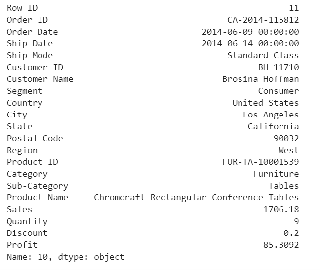
Visually investigate one anomaly
df.iloc[10]
Figure 8
This purchase seems normal to me expect it was a larger amount of sales compared with the other orders in the data.
Univariate Anomaly Detection on Profit
Trained IsolationForest using the Profit variable.
Store the Profit in the NumPy array for using in our models later.
Computed the anomaly score for each observation. The anomaly score of an input sample is computed as the mean anomaly score of the trees in the forest.
Classified each observation as an outlier or non-outlier.
The visualization highlights the regions where the outliers fall.
Figure 9
Visually investigate some of the anomalies
According to the above results and visualization, It seems that Profit that below -100 or exceeds 100 would be considered as an outlier, let’s visually examine one example each that determined by our model and to see whether they make sense.
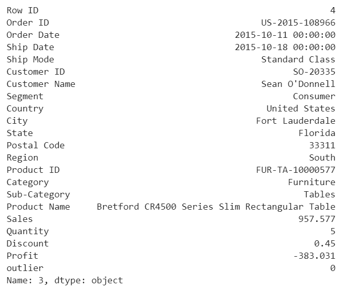
df.iloc[3]
Figure 10
Any negative profit would be an anomaly and should be further investigate, this goes without saying
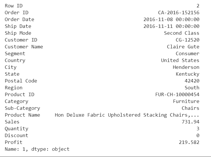
df.iloc[1]
Figure 11
Our model determined that this order with a large profit is an anomaly. However, when we investigate this order, it could be just a product that has a relatively high margin.
The above two visualizations show the anomaly scores and highlighted the regions where the outliers are. As expected, the anomaly score reflects the shape of the underlying distribution and the outlier regions correspond to low probability areas.
However, Univariate analysis can only get us thus far. We may realize that some of these anomalies that determined by our models are not the anomalies we expected. When our data is multidimensional as opposed to univariate, the approaches to anomalydetection become more computationally intensive and more mathematically complex.
Multivariate Anomaly Detection
Most of the analysis that we end up doing are multivariate due to complexity of the world we are living in. In multivariate anomaly detection, outlier is a combined unusual score on at least two variables.
So, using the Sales and Profit variables, we are going to build an unsupervised multivariate anomaly detection method based on several models.
We are using PyOD which is a Python library for detecting anomalies in multivariate data. The library was developed by Yue Zhao.
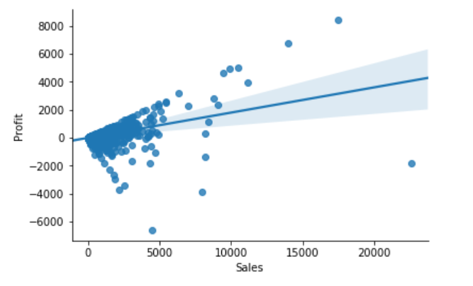
Sales & Profit
When we are in business, we expect that Sales & Profit are positive correlated. If some of the Sales data points and Profit data points are not positive correlated, they would be considered as outliers and need to be further investigated.
From the above correlation chart, we can see that some of the data points are obvious outliers such as extreme low and extreme high values.
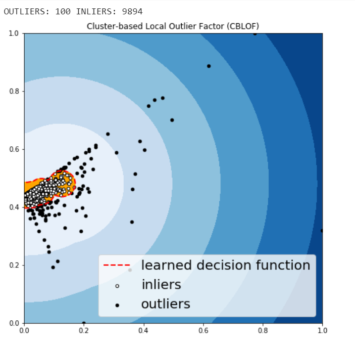
Cluster-based Local Outlier Factor (CBLOF)
The CBLOF calculates the outlier score based on cluster-based local outlier factor. An anomaly score is computed by the distance of each instance to its cluster center multiplied by the instances belonging to its cluster. PyOD library includes the CBLOF implementation.
Arbitrarily set outliers fraction as 1% based on trial and best guess.
Fit the data to the CBLOF model and predict the results.
Use threshold value to consider a data point is inlier or outlier.
Use decision function to calculate the anomaly score for every point.
Figure 13
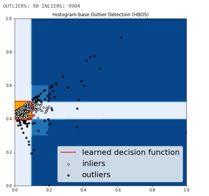
Histogram-based Outlier Detection (HBOS)
HBOS assumes the feature independence and calculates the degree of anomalies by building histograms. In multivariate anomaly detection, a histogram for each single feature can be computed, scored individually and combined at the end. When using PyOD library, the code are very similar with the CBLOF.
Figure 14
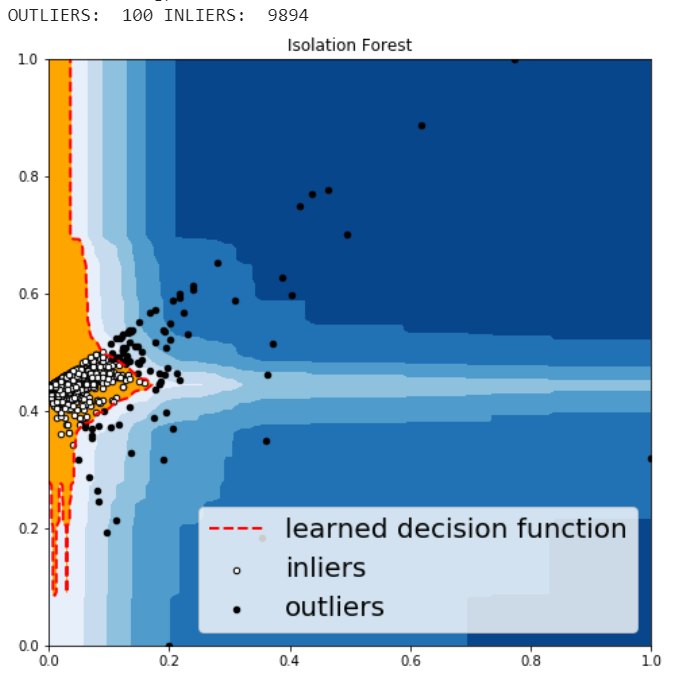
Isolation Forest
Isolation Forest is similar in principle to Random Forest and is built on the basis of decision trees. Isolation Forest isolates observations by randomly selecting a feature and then randomly selecting a split value between the maximum and minimum values of that selected feature.
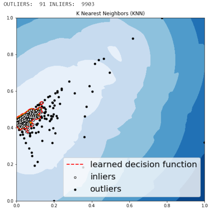
KNN is one of the simplest methods in anomaly detection. For a data point, its distance to its kth nearest neighbor could be viewed as the outlier score.
Figure 16
The anomalies predicted by the above four algorithms were not very different.
Visually investigate some of the anomalies
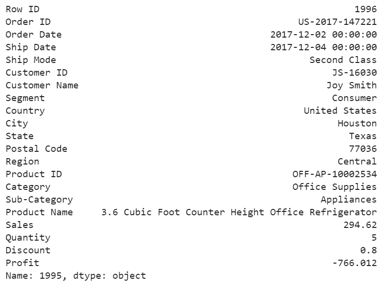
We may want to investigate each of the outliers that determined by our model, for example, let’s look in details for a couple of outliers that determined by KNN, and try to understand what make them anomalies.
df.iloc[1995]
Figure 17
For this particular order, a customer purchased 5 products with total price at 294.62 and profit at lower than -766, with 80% discount. It seems like a clearance. We should be aware of the loss for each product we sell.
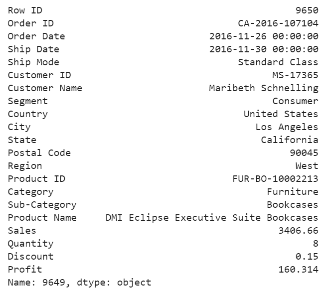
df.iloc[9649]
Figure 18
For this purchase, it seems to me that the profit at around 4.7% is too small and the model determined that this order is an anomaly.
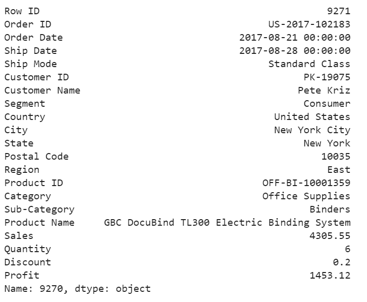
df.iloc[9270]
Figure 19
For the above order, a customer purchased 6 product at 4305 in total price, after 20% discount, we still get over 33% of the profit. We would love to have more of these kind of anomalies.
Jupyter notebook for the above analysis can be found on Github. Enjoy the rest of the week.
Churn Analytics: Data Analysis to Machine learning
Customer is one of the most precious resources in any business, acquiring clients can time consuming and expensive. Retaining the most profitable clients can be one of the best strategies businesses can have. Identifying the clients before they leave would be crucial. that’s were the churn analysis comes very handy in the Data Science.
The business or organizations are interested in know the cluster/segment/group of the clients who is like to leave. retention is more cost-effective than acquiring a new customer. there is always a cost & risk involved in acquiring a new client. here is an example of churn analytics & Applied Machine Learning on a banking client dataset.
Data
The dataset comes from the Kaggle, and it is related to European banking clients of counties like France, Germany, and Spain. The classification goal is to predict whether the client will churn (1) or stay (0). The dataset can be downloaded from here.
Input Variables
RowNumber: each row consist of one client information (numeric)
CustomerId: unique identifier for customers (numeric)
Surname: last name of the client (categorical)
CreditScore: Credit score of the client(numeric)
Geography: the territory of the customers (categorical)
Gender: male or female (categorical)
Age: age of the client (numeric)
Tenure: the time with the bank as a client (numeric)
Balance: balance (numeric)
NumOfProducts: How many accounts, bank account affiliated products the person has (numeric)
HasCrCard: the person has a credit card or not (categorical)
IsActiveMember: active product user with transaction vs no activity or transaction (categorical)
EstimatedSalary: estimated salary income or each client (numeric)
Exited: attrition, Did they leave the bank after all? Yes (1), No (0) (categorical)
Predict variable (desired target):
Exited Yes (1)— has the client churned? (binary: “1”, means “Yes”, “0” means “No”)
Data Preprocessing
I have used pandas for data preprocessing, the data set came with column labels and each row represents single client data. In terms of missing values or duplicates (a rare case in real-world data) came pretty clean. besides python, pandas, and sk-learn, Cloud AWS S3, EC2, Linux, Excel & Tableau public is being used for this end to end project
AWS Steps:
Start an EC2 instance, install all relevant libs with anaconda distribution & Jupyter notebook (use Linux CentOS)
Open S3 bucket
Export the Data to S3
Mount Data on EC2
Clean, Explore Analyse, model the data using Python
Connect Tableau to S3 for Dashboarding and Reporting/ alternatively AWS Quicksight can be used
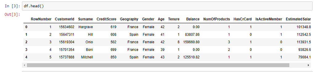
Pandas Dataframe
Pandas dataframe
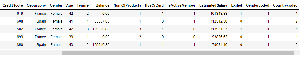
Snapshot of the Data
First 5 rows of the data with labels
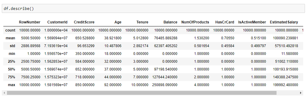
Statistical Summary
Feature Engineering:
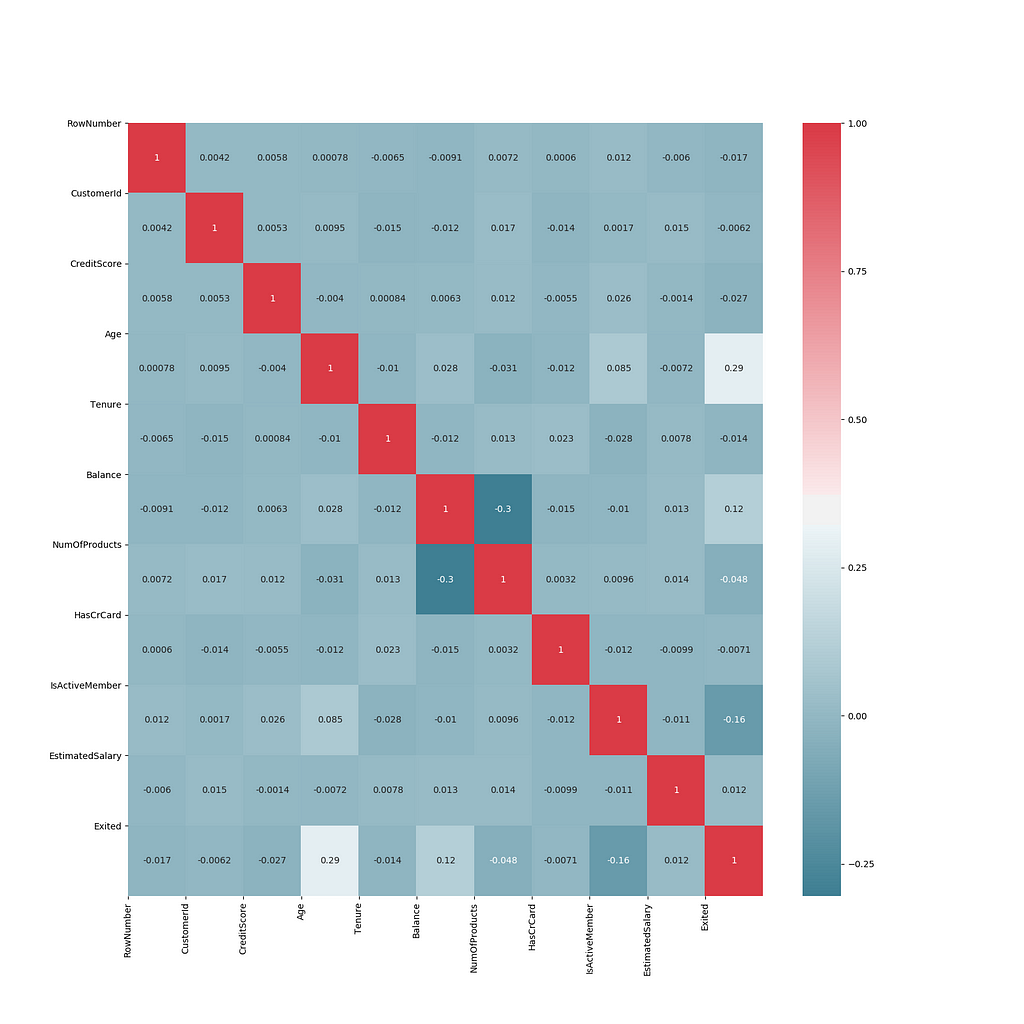
Finding Correlated Features
It shows that none of the features are highly correlated with each other
Some of the features Geography, Gender, Surname came of as pandas object, some rowNumber, CustomerId, Creditscore, Age, Tenure, NumOfProducts, HasCrCard, IsActiveMember came as an integer. those columns need to be feature engineered for machine learning. Transformed objects & int features into floats & also created new encoded features for Geography, Gender.
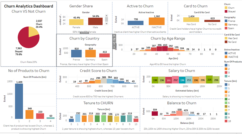
Insights & Analytics:
Here are some of the Insights drawn from the dataset (using Tableau public)
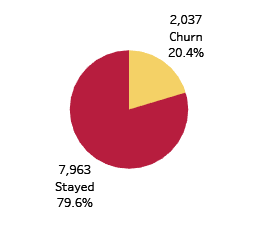
The proportion of Churn to Non-Churn
20% Churn /Attrition
Approx. 20% churn/attrition rate
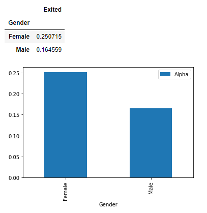
2. Gender Proportion to Churn
Female churners are higher, the mean of female churn 0.250715 where the male is 0.164559Female customer is more likely to churn compared to male
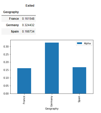
3. Countrywise churn
Mean of country wise churn shows Germany has a higher churn compared to France and Spain
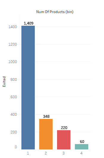
4. Does the Number of Products affect Churn?
A client with multiple products are less likely to churn where a single product holder has the highest churn
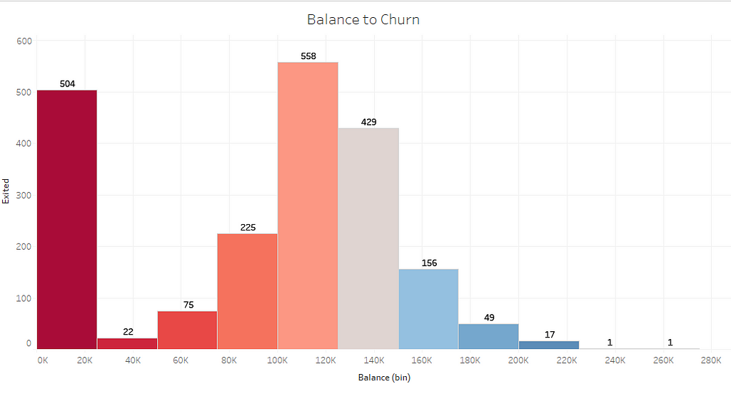
5. Does the Balance have any influence on Churn?
Customer with higher balances showing a less likelihood of Churn
Dashboard:
The dashboard shows overall presentation/summary of the features influencing the attrition rate, some of the most influential features which affecting the churn are number of products, credit card, inactive, country, credit score, balance, Gender, age range
Training set uses 80% of the data, rest for test set
Testing the model
20% of the data is used for test set
Prediction using Machine Learning
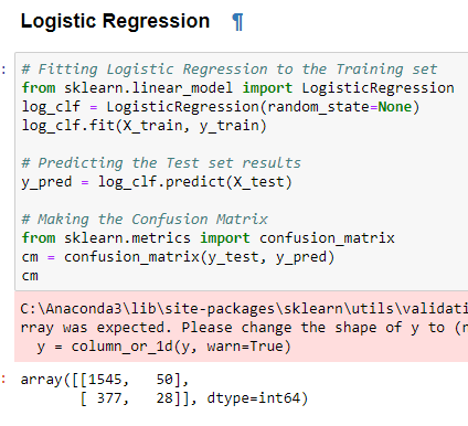
Logistic Regression
It is a classification algorithm that is used to predicting the probability of a categorical dependent variable in Machine Learning. In logistic regression, the dependent variable is a binary variable that contains data coded as 1 (yes, churn) or 0 (no Churn.). In other words, the logistic regression model predicts P(Y=1) as a function of X.
We are trying to predict whether the clients are like to leave or stay, the outcome is binary. here the logistic algorithm statistically analyzing the features to determine whether a client will churn or not
Here is the application of the algorithm
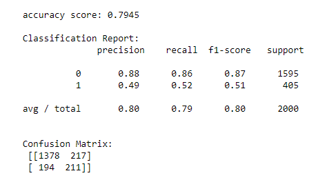
DecisionTree
Decision Trees (DTs) are a non-parametric supervised learning method used for classification and regression. The goal is to create a model that predicts the value of a target variable by learning simple decision rules inferred from the data features.
Here the decision tree representing boolean function (Y/N) as binary whether the client will churn or not
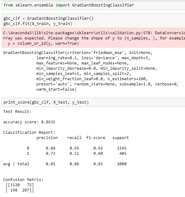
Here Gradient boostingclassifying the outcome to whether a client will churn or not, it is a predictive model in the form of an ensemble uses decision trees.
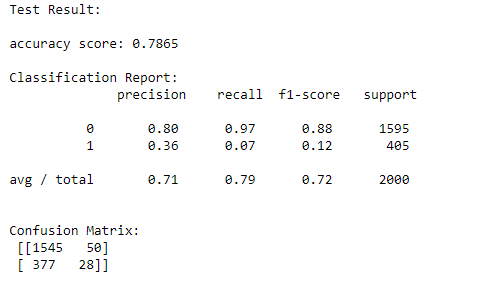
Model Performance:
Modeling was applied on multiple machine learning algorithms with fine-tuning, here are some of the outcome of the model in terms of accuracy scores
•Logistic Regression 78.65%
•Decision Tree 79.45%
•Random Forest 84.85%
•SVM accuracy 79.80%
•Gradient Boosting 86.35%
•AdaBoost 86.35%
The algorithms gave the higher accuracy score are Gradient Boosting, AdaBoost compared to Decision Tree & Logistic regression
Few weeks ago, I started wrote about ROC curves. The purpose was to provide a basic primer on ROC curves. As a follow up, this article talks about AUC.
AUC stands for Area Under the Curve. ROC can be quantified using AUC. The way it is done is to see how much area has been covered by the ROC curve. If we obtain a perfect classifier, then the AUC score is 1.0. If the classifier is random in its guesses, then the AUC score is 0.5. In the real world, we don’t expect an AUC score of 1.0, but if the AUC score for the classifier is in the range of 0.6 to 0.9, then it is considered to be a good classifier.
AUC for the ROC curve
In the preceding figure, the area under the curve which has been covered becomes our AUC score. This gives us an indication of how good or bad our classifier is performing. ROC and AUC are the two indicators that can provide us with insights on how our classifier performs.
Subscribe to our Acing AI newsletter, I promise not to spam and its FREE!
Thanks for reading! 😊 If you enjoyed it, test how many times can you hit 👏 in 5 seconds. It’s great cardio for your fingers AND will help other people see the story.
What is AUC? was originally published in Acing AI on Medium, where people are continuing the conversation by highlighting and responding to this story.
There are 37 million Expedia members across 32 countries.
Expedia has covered 534 billion miles in air travel, this is enough for 72 round trips (in passenger miles flown) from the sun to Pluto and back. Expedia is a travel company like Booking.com which we have covered at Acing AI previously. It has sold enough hotel room nights in the last 20 years to account for every person living in the United States. The amount of data Expedia accumulates by having so many travellers every year leads to huge investment in technology. Expedia has invested over $850M trailing year over year in tech spend. A mature tech stack helps Data Scientists at their job. This is a great opportunity for any Data Scientist to build their career.
If you are short-listed after resume screening, there is first interview with the manager of the data science team. These include technical questions about machine learning and statistics. After clearing that, there is a technical coding interview. The third round is an interview with HR more classic and typical job interview.
How can we do price optimization for properties on Expedia?
Predict Hotel prices in a given dataset.
Explain a Machine Learning project on your resume.
Develop a recommendation system based on a provided dataset.
Which flight path is more profitable for London-Lisbon or London-Milan?
Should we invest on buying more property in X city?
Explain linear and logistic regression.
Give pros and cons of SVM.
Explain the meaning of overfitting to non technical people.
Reflecting on the Question
The data science team at Expedia is geographically dispersed. The technical team has build a very mature data science architecture that enables the Data Science team. The questions are based on the questions the data science team at Expedia answers day to day. Great product sense about the Expedia product and its business can surely land you a job at one of the world’s largest travel sites!
Subscribe to our Acing AI newsletter, I promise not to spam and its FREE!
Thanks for reading! 😊 If you enjoyed it, test how many times can you hit 👏 in 5 seconds. It’s great cardio for your fingers AND will help other people see the story.
The sole motivation of this blog article is to learn about Expedia and its technologies helping people to get into it. All data is sourced from online public sources. I aim to make this a living document, so any updates and suggested changes can always be included. Please provide relevant feedback.
As of January 2018, Lyft could count 23 million users.
Lyft currently offers services in 350 US cities, and Toronto and Ottawa in Canada. It was launched in 2012, as a part of long-distance car-pooling business Zimride — the largest such app in the US (named for transportation culture in Zimbabwe). It was renamed as Lyft later. Launched in Silicon Valley, Lyft spread from 60 US cities in April 2014 to 300 in January 2017, to 350 today — plus the two aforementioned Canadian cities. With 350 cities, millions of users and billions of rides the data generated at Lyft is huge. The product achieves economies of scale deploying Data Science. Hence, data science is a core part of the product and not just an added feature.
The interview process starts with a phone interview with a Data Scientist. It is around an in depth conversation about your resume and past projects. That interview is followed by a take home test which is usually around a ride sharing data set. As part of the take home test, there is a presentation which has to be created for the onsite interview. The onsite interview consists of 4–5 interviews. One of those is presentation of the take home test. It also includes a SQL test, stats and probability and business case. There is a final core values interview to know if you fit within the Lyft culture. The interview is challenge but the reward when you clear the interview is totally worth it.
Find expectations of a random variable with basic distribution. How would you construct a confidence interval? How would you estimate a probability of ordering a ride? What assumptions do you need in order to estimate this probability?
What optimization techniques are you familiar with and how do they work? How would you find the optimal price given a linear demand function?
Coin got x heads during y flips. How can we test if this is a fair coin?
What are some metrics for monitoring supply and demand in Lyft market?
Explain correlation and variance.
What is the lifetime value of a driver?
Implement k nearest neighbour using a quad tree.
What are the different factors that could influence a rise in average wait time of a driver?
Explain what are the best ways to achieve pool matching?
How do you reduce churn on the supply side?
Reflecting on the Questions
The Data Science team at Lyft moves very quickly. The Data sets are huge and problems so wide in nature that the team explores different types of models which can provide higher precision for same recall and feature set. The questions reflect the tough problems which the team faces day to day. There is a mix of model building along with complex coding questions. As I mentioned before the interviews are tough but they are well worth it for getting to work in an excellent team. Hard work can surely get you a job in one of the world’s largest transportation companies!
Subscribe to our Acing AI newsletter, I promise not to spam and its FREE!
Thanks for reading! 😊 If you enjoyed it, test how many times can you hit 👏 in 5 seconds. It’s great cardio for your fingers AND will help other people see the story.
The sole motivation of this blog article is to learn about Lyft and its technologies helping people to get into it. All data is sourced from online public sources. I aim to make this a living document, so any updates and suggested changes can always be included. Please provide relevant feedback.
There are 28 Million+ listings to stay on Booking.com.
Booking.com is the travel E-Commerce part of Booking Holdings. They have over 140,000+ destinations in 230 countries all over the world. They also have over 1.5 Million+ nights reserved every day on their platform. From a data science perspective, this translates into over 300 TB of data. A robust data engineering infrastructure coupled with huge amounts of data makes Booking.com one of the best places for a Data Scientist to build their career.
The interview process starts with MCQ based test on machine learning and statistics questions.That is followed by the HR phone interview. Once you clear both of those, there is a technical phone interview with data scientists. This is based around your projects and also includes a case study discussion. Finally there is an onsite interview which consists of technical interviews, behavioural interview and hiring manager interview.
What is the difference between L1 and L2 regularization?
What is gradient decent?
Why did you use Random Forests instead of Clustering on a particular problem?(case study)
How to deal with new hotels that do not have an official rating?
If the training error and the testing error are both high, as the number of data points increase, what measures will you take to fix the model?
How would you optimize the advertising that directs people to your site? How do you evaluate how much to spend on each channel?
What do you do to make sure your model is not over fitting?
Given a business case as such, how would you handle this with a Machine Learning solution?
How did you validate your model?
What are the parameters of decision trees and random forests, and how would you choose them?
Reflecting on the Questions
Booking.com is headquartered in Amsterdam but has offices all over the globe. Data dictates the spending and drives efficiency in their business. It is a critical component of their product. The questions are about deep data science fundamentals and also about the different situations within their business where they deploy data science. A good knowledge of Data Science fundamentals coupled with know how about their business can surely land you a job with one of the world’s largest booking sites!
Subscribe to our Acing AI newsletter, I promise not to spam and its FREE!
Thanks for reading! 😊 If you enjoyed it, test how many times can you hit 👏 in 5 seconds. It’s great cardio for your fingers AND will help other people see the story.
The sole motivation of this blog article is to learn about Booking.com and its technologies helping people to get into it. All data is sourced from online public sources. I aim to make this a living document, so any updates and suggested changes can always be included. Please provide relevant feedback.