Workday is a leading provider of enterprise cloud applications for finance and human resources. It was founded in 2005. Workday delivers financial management, human capital management, planning, and analytics applications designed for the world’s largest companies, educational institutions, and government agencies. In January 2018, Workday announced that it acquired SkipFlag, makers of an AI knowledge base that builds itself from a company’s internal communications. In July 2018, they acquired Stories.bi to boost augmented analytics. These two acquisitions point towards an increased investment in the data science domain.
The process starts with a phone screen with a recruiter. That is followed by a technical phone interview with hiring manager. The questions are typical machine learning and data science questions — with some data structures and algorithms questions. If both of those go well, there is an onsite interview. The onsite consists of five interviews with different team members, hiring managers, and executives. The questions are about programming skills, algorithmic skills, data structures, and anything related to machine learning techniques.
Given data from the world bank, provide insights on a small CSV file.
Write a C++ class to perform garbage collection.
Given 2 sorted arrays, merge them into 1 array. If the first array has enough space for 2, how do you merge the 2 without using extra space?
Given a huge collection of books, how would you tag each book based on genre?
Compare the classification algorithms
Logistic regression vs neural network
Integer array — get pairs of values that equal a certain target value.
How would you improve the complexity of a list merging algorithm from quadratic to linear?
What is p-value?
Perform a tweet correlation analysis and tweet prediction for the given dataset.
Reflecting on the Questions
The questions are highly technical in nature. They point towards a very strong requirement of having Data Scientists who can code very well. Workday is the employee directory in the cloud and there are interesting things that could be done based on data. A good inclination of a Data Scientists in coding can surely land a job with Workday!
Subscribe to our Acing Data Science newsletter. A new course to ace data science interviews is coming soon. Sign up below to join the waitlist!
Thanks for reading! 😊 If you enjoyed it, test how many times can you hit 👏 in 5 seconds. It’s great cardio for your fingers AND will help other people see the story.
Workday Data Science Interviews was originally published in Acing AI on Medium, where people are continuing the conversation by highlighting and responding to this story.
When I came across Customer Support on Twitter dataset, I couldn’t help but wanted to model and compare airlines customer service twitter response time.
I wanted to be able to answer questions like:
Are there significant differences on customer service twitter response time among all the airlines in the data?
Is the weekend affect response time?
Do longer tweets take longer time to respond?
Which airline has the shortest customer service twitter response time and vice versa?
The data
It is a large dataset contains hundreds of companies from all kinds of industries. The following data wrangling process will accomplish:
Get customer inquiry, and corresponding response from the company in every row.
Convert datetime columns to datetime data type.
Calculate response time to minutes.
Select only airline companies in the data.
Any customer inquiry that takes longer than 60 minutes will be filtered out. We are working on requests that get response in 60 minutes.
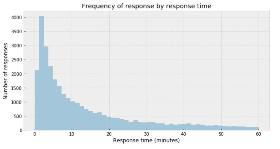
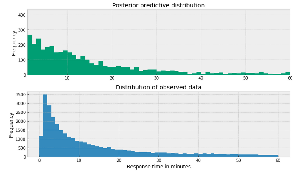
plt.figure(figsize=(10,5))
sns.distplot(df['response_time'], kde=False)
plt.title('Frequency of response by response time')
plt.xlabel('Response time (minutes)')
plt.ylabel('Number of responses');
Figure 1
My immediate impression is that a Gaussian distribution is not a proper description of the data.
Student’s t-distribution
One useful option when dealing with outliers and Gaussian distributions is to replace the Gaussian likelihood with a Student’s t-distribution. This distribution has three parameters: the mean (𝜇), the scale (𝜎) (analogous to the standard deviation), and the degrees of freedom (𝜈).
Set the boundaries of the uniform distribution of the mean to be 0 and 60.
𝜎 can only be positive, therefore use HalfNormal distribution.
set 𝜈 as an exponential distribution with a mean of 1.
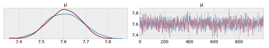
From the following trace plot, we can visually get the plausible values of 𝜇 from the posterior.
We should compare this result with those from the the result we obtained analytically.
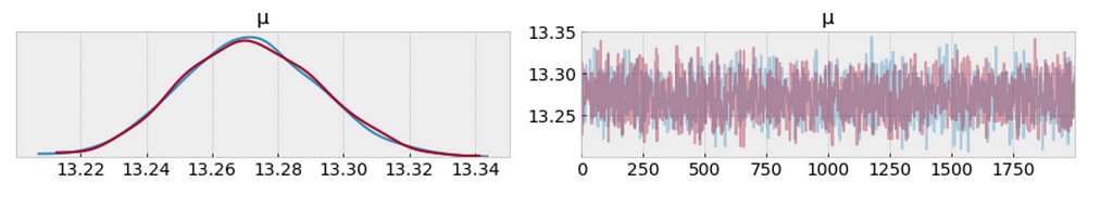
az.plot_trace(trace_t[:1000], var_names = ['μ']);
Figure 2
df.response_time.mean()
The left plot shows the distribution of values collected for 𝜇. What we get is a measure of uncertainty and credible values of 𝜇 between 7.4 and 7.8 minutes.
It is obvious that samples that have been drawn from distributions that are significantly different from the target distribution.
Posterior predictive check
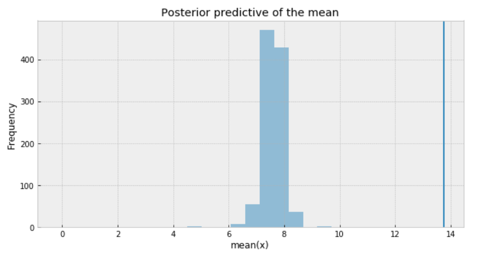
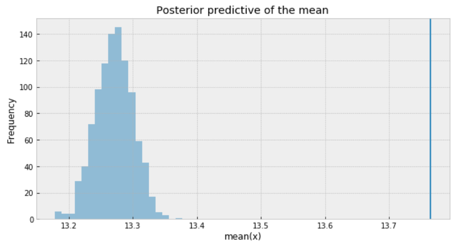
One way to visualize is to look if the model can reproduce the patterns observed in the real data. For example, how close are the inferred means to the actual sample mean:
ppc = pm.sample_posterior_predictive(trace_t, samples=1000, model=model_t)
_, ax = plt.subplots(figsize=(10, 5))
ax.hist([n.mean() for n in ppc['y']], bins=19, alpha=0.5)
ax.axvline(df['response_time'].mean())
ax.set(title='Posterior predictive of the mean', xlabel='mean(x)', ylabel='Frequency');
Figure 3
The inferred mean is so far away from the actual sample mean. This confirms that Student’s t-distribution is not a proper choice for our data.
Poisson distribution
Poisson distribution is generally used to describe the probability of a given number of events occurring on a fixed time/space interval. Thus, the Poisson distribution assumes that the events occur independently of each other and at a fixed interval of time and/or space. This discrete distribution is parametrized using only one value 𝜇, which corresponds to the mean and also the variance of the distribution.
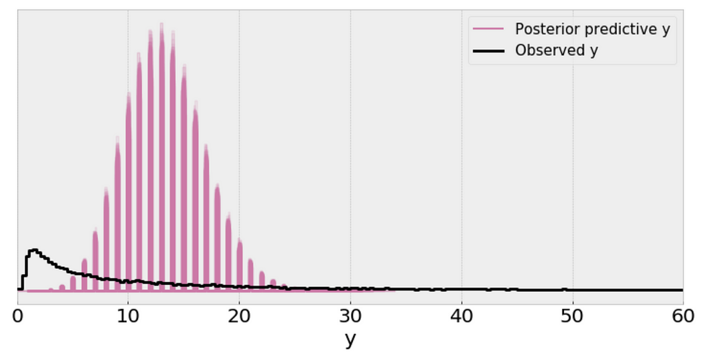
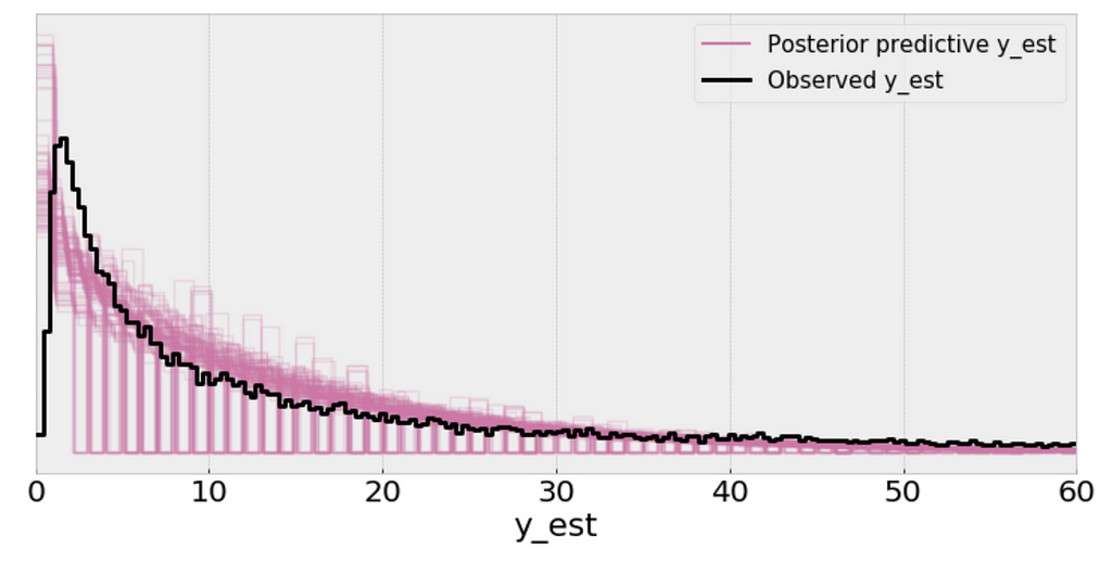
The single (black) line is a kernel density estimate (KDE) of the data and the many purple lines are KDEs computed from each one of the 100 posterior predictive samples. The purple lines reflect the uncertainty we have about the inferred distribution of the predicted data.
From the above plot, I can’t consider the scale of a Poisson distribution as a reasonable practical proxy for the standard deviation of the data even after removing outliers.
Posterior predictive check
ppc = pm.sample_posterior_predictive(trace_p, samples=1000, model=model_p)
_, ax = plt.subplots(figsize=(10, 5))
ax.hist([n.mean() for n in ppc['y']], bins=19, alpha=0.5)
ax.axvline(df['response_time'].mean())
ax.set(title='Posterior predictive of the mean', xlabel='mean(x)', ylabel='Frequency');
Figure 7
The inferred means to the actual sample mean are much closer than what we got from Student’s t-distribution. But still, there is a small gap.
The problem with using a Poisson distribution is that mean and variance are described by the same parameter. So one way to solve this problem is to model the data as a mixture of Poisson distribution with rates coming from a gamma distribution, which gives us the rationale to use the negative-binomial distribution.
Negative binomial distribution
Negative binomial distribution has very similar characteristics to the Poisson distribution except that it has two parameters (𝜇 and 𝛼) which enables it to vary its variance independently of its mean.
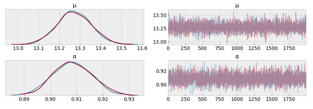
Using the Negative binomial distribution in our model leads to predictive samples that seem to better fit the data in terms of the location of the peak of the distribution and also its spread.
Posterior predictive check
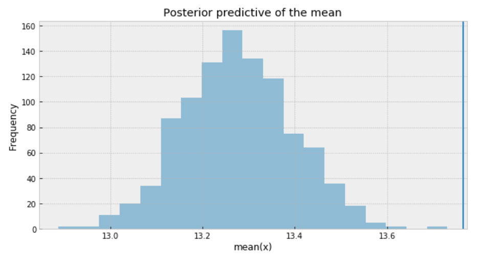
ppc = pm.sample_posterior_predictive(trace_n, samples=1000, model=model_n)
_, ax = plt.subplots(figsize=(10, 5))
ax.hist([n.mean() for n in ppc['y_est']], bins=19, alpha=0.5)
ax.axvline(df['response_time'].mean())
ax.set(title='Posterior predictive of the mean', xlabel='mean(x)', ylabel='Frequency');
Figure 10
To sum it up, the following are what we get for the measure of uncertainty and credible values of (𝜇):
Student t-distribution: 7.4 to 7.8 minutes
Poisson distribution: 13.22 to 13.34 minutes
Negative Binomial distribution: 13.0 to 13.6 minutes.
The posterior predictive distribution somewhat resembles the distribution of the observed data, suggesting that the Negative binomial model is a more appropriate fit for the underlying data.
Bayesian methods for hierarchical modeling
We want to study each airline as a separated entity. We want to build a model to estimate the response time of each airline and, at the same time, estimate the response time of the entire data. This type of model is known as a hierarchical model or multilevel model.
My intuition would suggest that different airline has different response time. The customer service twitter response from AlaskaAir might be faster than the response from AirAsia for example. As such, I decide to model each airline independently, estimating parameters μ and α for each airline.
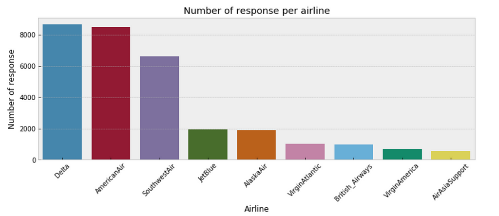
One consideration is that some airlines may have fewer customer inquiries from twitter than others. As such, our estimates of response time for airlines with few customer inquires will have a higher degree of uncertainty than airlines with a large number of customer inquiries. The below plot illustrates the discrepancy in sample size per airline.
plt.figure(figsize=(12,4))
sns.countplot(x="author_id_y", data=df, order = df['author_id_y'].value_counts().index)
plt.xlabel('Airline')
plt.ylabel('Number of response')
plt.title('Number of response per airline')
plt.xticks(rotation=45);
Figure 12
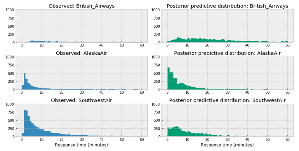
Bayesian modeling each airline with negative binomial distribution
Among the above three airlines, British Airways’ posterior predictive distribution vary considerably to AlaskaAir and SouthwestAir. The distribution of British Airways towards right.
This could accurately reflect the characteristics of its customer service twitter response time, means in general it takes longer for British Airways to respond than those of AlaskaAir or SouthwestAir.
Or it could be incomplete due to small sample size, as we have way more data from Southwest than from British airways.
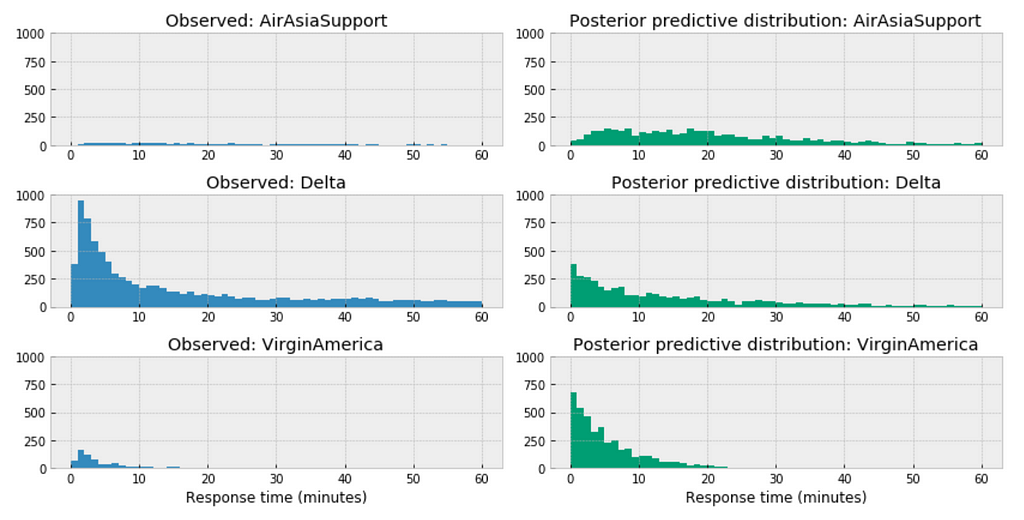
Similar here, among the above three airlines, the distribution of AirAsia towards right, this could accurately reflect the characteristics of its customer service twitter response time, means in general, it takes longer for AirAsia to respond than those of Delta or VirginAmerica. Or it could be incomplete due to small sample size.
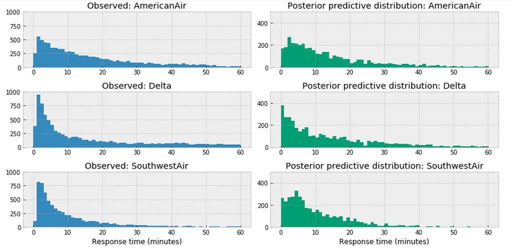
For the airlines we have relative sufficient data, for example, when we compare the above three large airlines in the United States, the posterior predictive distribution do not seem to vary significantly.
Bayesian Hierarchical Regression
The variables for the model:
df = df[['response_time', 'author_id_y', 'created_at_y_is_weekend', 'word_count']]
formula = 'response_time ~ ' + ' + '.join(['%s' % variable for variable in df.columns[1:]])
formula
In the following code snippet, we:
Convert categorical variables to integer.
Estimate a baseline parameter value 𝛽0 for each airline customer service response time.
Estimate all the other parameter across the entire population of the airlines in the data.
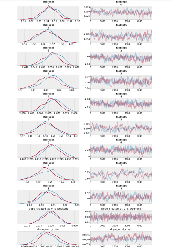
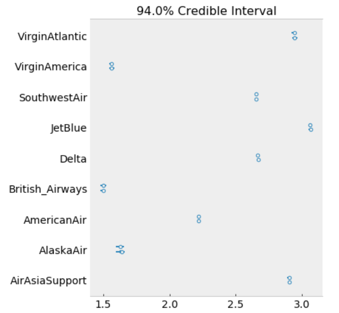
The model estimates the above β0 (intercept) parameters for every airline. The dot is the most likely value of the parameter for each airline. It look like our model has very little uncertainty for every airline.
The Goldman Sachs Group, Inc. is a leading global investment banking, securities and investment management firm that provides a wide range of financial services to a substantial and diversified client base that includes corporations, financial institutions, governments and individuals. Goldman Sachs makes key decisions by taking a calculated risk, based on data and evidence. As a Data Science practitioner, your analysis might have first hand impact to make millions of dollars. The FAST (Franchise Analytics Strategy and Technology) team at Goldman Sachs is a group of data scientists and engineers who are responsible for generating insights and creating products that turn big data into easily digestible takeaways. In essence, the FAST team is comprised of data experts who help other professionals at Goldman Sachs act on relevant insights.
The first step is the phone screen with hiring manager person. There is usually a hackerank/coderpad coding assignment involved for an ML/Data Engineer type of role. If that goes well, there is an onsite interview. The onsite interview is usually 4–6 people deep dive into analysis, probability and stats, coding and data science concepts.
How to treat missing and null values in a dataset?
Given N noodles in a bowl and randomly attaching ends. What is the expected number of loops you will have in the end?
How to remove duplicates without distinct from a database table?
When is value at risk inappropriate?
What is the Wiener process?
A = [-2 -1] [9 4]. What is A¹⁰⁰⁰?
Write an algorithm for a tree traversal.
Write a program for Levenshtein Distance calculation.
Count the total number of trees in the states.
Reflecting on the Questions
GS is one of the best places to work for because they really take care of their people. The questions reflect a mix of puzzles and analysis based questions which form the basis of financial investments in general. Thinking on your feet is very important as puzzles can get complicated. A great presence of mind and ample preparation can surely land you a job with one of the most prestigious investment banks in the world!
Subscribe to our Acing AI newsletter, I promise not to spam and its FREE!
Thanks for reading! 😊 If you enjoyed it, test how many times can you hit 👏 in 5 seconds. It’s great cardio for your fingers AND will help other people see the story.
Model evaluation is a very important aspect of data science. Evaluation of a Data Science Model provides more colour to our hypothesis and helps evaluate different models that would provide better results against our data.
What Big-O is to coding, validation and evaluation is to Data Science Models.
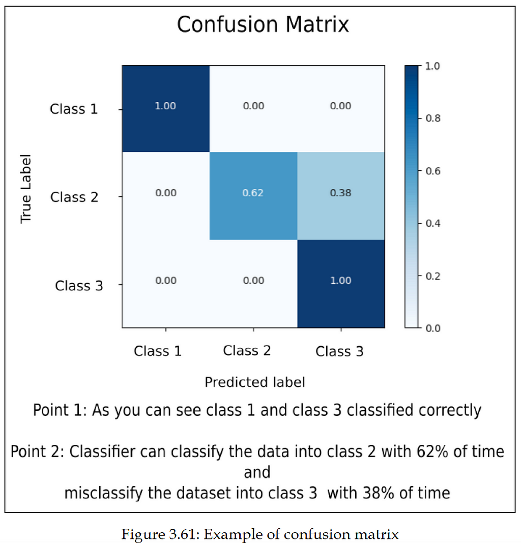
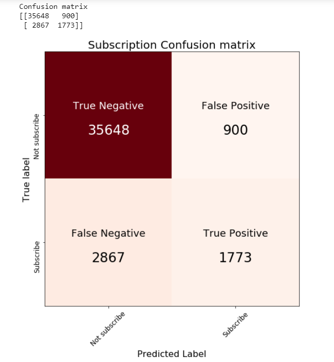
When we are implementing a multi-class classifier, we have multiple classes and the number of data entries belonging to all these classes is different. During testing, we need to know whether the classifier performs equally well for all the classes or whether there is bias towards some classes. This analysis can be done using the confusion matrix. It will have a count of how many data entries are correctly classified and how many are misclassified.
Let’s take an example. There is a total of ten data entries that belong to a class, and the label for that class is “Class 1”. When we generate the prediction from our ML model, we will check how many data entries out of the ten entries get the predicted label as “Class 1”. Suppose six data entries are correctly classified and get the label “Class 1”. In this case, for six entries, the predicted label and True(actual) label is the same, so the accuracy is 60%. For the remaining data entries (4 entries), the ML model misclassifies them. The ML model predicts class labels other than “Class 1”. From the preceding example, it is visible that the confusion matrix gives us an idea about how many data entries are classified correctly and how many are misclassified. We can explore the class-wise accuracy of the classifier.
Thanks for reading! 😊 If you enjoyed it, test how many times can you hit 👏 in 5 seconds. It’s great cardio for your fingers AND will help other people see the story.
How likely am I to subscribe a term deposit? Posterior probability, credible interval, odds ratio, WAIC
In this post, we will explore using Bayesian Logistic Regression in order to predict whether or not a customer will subscribe a term deposit after the marketing campaign the bank performed.
We want to be able to accomplish:
How likely a customer to subscribe a term deposit?
Experimenting of variables selection techniques.
Explorations of the variables so serves as a good example of Exploratory Data Analysis and how that can guide the model creation and selection process.
I am sure you are familiar with the dataset. We built a logistic regression model using standard machine learning methods with this dataset a while ago. And today we are going to apply Bayesian methods to fit a logistic regression model and then interpret the resulting model parameters. Let’s get started!
The Data
The goal of this dataset is to create a binary classification model that predicts whether or not a customer will subscribe a term deposit after a marketing campaign the bank performed, based on many indicators. The target variable is given as y and takes on a value of 1 if the customer has subscribed and 0 otherwise.
This is an imbalanced class problem because there are significantly more customers did not subscribe the term deposit than the ones did.
import pandas as pd
import numpy as np
import seaborn as sns
import matplotlib.pyplot as plt
import pymc3 as pm
import arviz as az
import matplotlib.lines as mlines
import warnings
warnings.filterwarnings('ignore')
from collections import OrderedDict
import theano
import theano.tensor as tt
import itertools
from IPython.core.pylabtools import figsize
pd.set_option('display.max_columns', 30)
from sklearn.metrics import accuracy_score, f1_score, confusion_matrix
df = pd.read_csv('banking.csv')
As part of EDA, we will plot a few visualizations.
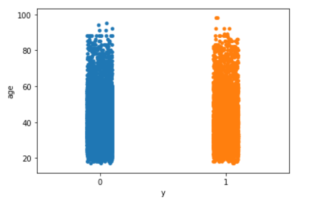
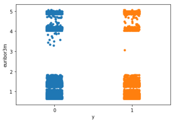
Explore the target variable versus customers’ age using the stripplot function from seaborn:
With the data in the right format, we can start building our first and simplest logistic model with PyMC3:
Centering the data can help with the sampling.
One of the deterministic variables θ is the output of the logistic function applied to the μ variable.
Another deterministic variables bd is the boundary function.
pm.math.sigmoid is the Theano function with the same name.
We are going to plot the fitted sigmoid curve and the decision boundary:
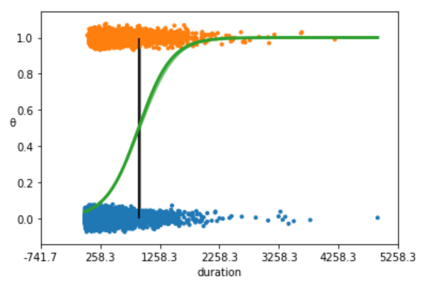
Figure 4
The above plot shows non subscription vs. subscription (y = 0, y = 1).
The S-shaped (green) line is the mean value of θ. This line can be interpreted as the probability of a subscription, given that we know that the last time contact duration(the value of the duration).
The boundary decision is represented as a (black) vertical line. According to the boundary decision, the values of duration to the left correspond to y = 0 (non subscription), and the values to the right to y = 1 (subscription).
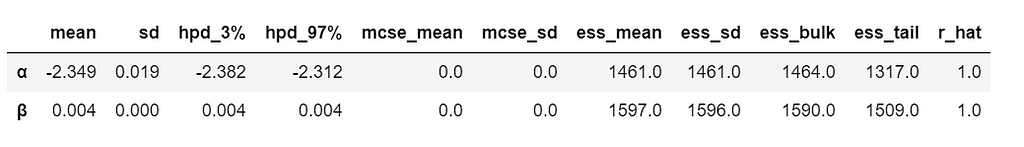
We summarize the inferred parameters values for easier analysis of the results and check how well the model did:
az.summary(trace_simple, var_names=['α', 'β'])
Table 1
As you can see, the values of α and β are very narrowed defined. This is totally reasonable, given that we are fitting a binary fitted line to a perfectly aligned set of points.
Let’s run a posterior predictive check to explore how well our model captures the data. We can let PyMC3 do the hard work of sampling from the posterior for us:
print('Accuracy of the simplest model:', accuracy_score(preds, data['outcome']))
print('f1 score of the simplest model:', f1_score(preds, data['outcome']))
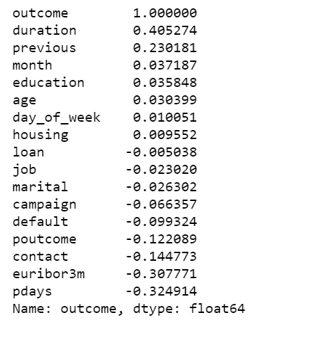
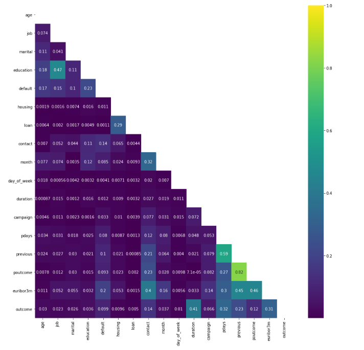
Correlation of the Data
We plot a heat map to show the correlations between each variables.
poutcome & previous have a high correlation, we can simply remove one of them, I decide to remove poutcome.
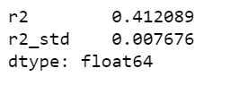
There are not many strong correlations with the outcome variable. The highest positive correlation is 0.41.
Define logistic regression model using PyMC3 GLM method with multiple independent variables
We assume that the probability of a subscription outcome is a function of age, job, marital, education, default, housing, loan, contact, month, day of week, duration, campaign, pdays, previous and euribor3m. We need to specify a prior and a likelihood in order to draw samples from the posterior.
The interpretation formula is as follows:
logit = β0 + β1(age) + β2(age)2 + β3(job) + β4(marital) + β5(education) + β6(default) + β7(housing) + β8(loan) + β9(contact) + β10(month) + β11(day_of_week) + β12(duration) + β13(campaign) + β14(campaign) + β15(pdays) + β16(previous) + β17(poutcome) + β18(euribor3m) and y = 1 if outcome is yes and y = 0 otherwise.
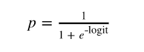
The log odds can then be converted to a probability of the output:
For our problem, we are interested in finding the probability a customer will subscribe a term deposit given all the activities:
With the math out of the way we can get back to the data. PyMC3 has a module glm for defining models using a patsy-style formula syntax. This seems really useful, especially for defining models in fewer lines of code.
We use PyMC3 to draw samples from the posterior. The sampling algorithm used is NUTS, in which parameters are tuned automatically.
We will use all these 18 variables and create the model using the formula defined above. The idea of adding a age2 is borrowed from this tutorial, and It would be interesting to compare models lately as well.
We will also scale age by 10, it helps with model convergence.
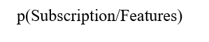
Figure 6
Above I only show part of the trace plot.
This trace shows all of the samples drawn for all of the variables. On the left we can see the final approximate posterior distribution for the model parameters. On the right we get the individual sampled values at each step during the sampling.
This glm defined model appears to behave in a very similar way, and finds the same parameter values as the conventionally-defined model we have created earlier.
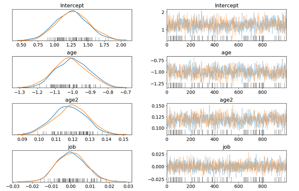
I want to be able to answer questions like:
How do age and education affect the probability of subscribing a term deposit? Given a customer is married
To answer this question, we will show how the probability of subscribing a term deposit changes with age for a few different education levels, and we want to study married customers.
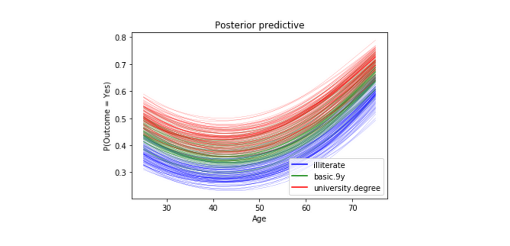
We will pass in three different linear models: one with education == 1 (illiterate), one with education == 5(basic.9y) and one with education == 8(university.degree).
Figure 7
For all three education levels, the probability of subscribing a term deposit decreases with age until approximately at age 40, when the probability begins to increase.
Every curve is blurry, this is because we are plotting 100 different curves for each level of education. Each curve is a draw from our posterior distribution.
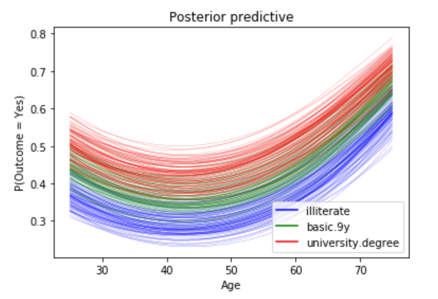
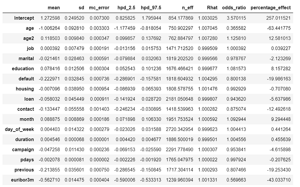
Odds Ratio
Does education of a person affects his or her subscribing to a term deposit? To do it we will use the concept of odds, and we can estimate the odds ratio of education like this:
b = trace['education']
plt.hist(np.exp(b), bins=20, normed=True)
plt.xlabel("Odds Ratio")
plt.show();
Figure 8
We are 95% confident that the odds ratio of education lies within the following interval.
We can interpret something along those lines: “With probability 0.95 the odds ratio is greater than 1.055 and less than 1.108, so the education effect takes place because a person with a higher education level has at least 1.055 higher probability to subscribe to a term deposit than a person with a lower education level, while holding all the other independent variables constant.”
We can estimate odds ratio and percentage effect for all the variables.
We can interpret percentage_effect along those lines: “ With a one unit increase in education, the odds of subscribing to a term deposit increases by 8%. Similarly, for a one unit increase in euribor3m, the odds of subscribing to a term deposit decreases by 43%, while holding all the other independent variables constant.”
Credible Interval
Figure 9
Its hard to show the entire forest plot, I only show part of it, but its enough for us to say that there’s a baseline probability of subscribing a term deposit. Beyond that, age has the biggest effect on subscribing, followed by contact.
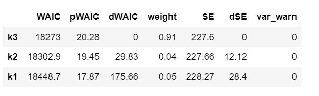
Compare models using Widely-applicable Information Criterion (WAIC)
If you remember, we added an age2 variable which is squared age. Now its the time to ask what effect it has on our model.
WAIC is a measure of model fit that can be applied to Bayesian models and that works when the parameter estimation is done using numerical techniques. Read this paper to learn more.
We’ll compare three models with increasing polynomial complexity. In our case, we are interested in the WAIC score.
Now loop through all the models and calculate the WAIC.
PyMC3 includes two convenience functions to help compare WAIC for different models. The first of this functions is compare which computes WAIC from a set of traces and models and returns a DataFrame which is ordered from lowest to highest WAIC.
model_trace_dict = dict()
for nm in ['k1', 'k2', 'k3']:
    models_lin[nm].name = nm
    model_trace_dict.update({models_lin[nm]: traces_lin[nm]})
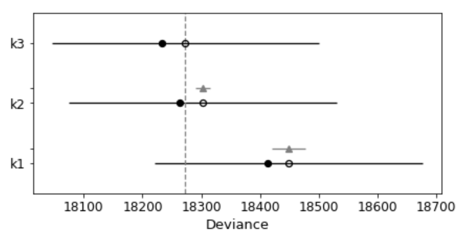
The second convenience function takes the output of compare and produces a summary plot.
pm.compareplot(dfwaic);
Figure 10
The empty circle represents the values of WAIC and the black error bars associated with them are the values of the standard deviation of WAIC.
The value of the lowest WAIC is also indicated with a vertical dashed grey line to ease comparison with other WAIC values.
The filled in black dots are the in-sample deviance of each model, which for WAIC is 2 pWAIC from the corresponding WAIC value.
For all models except the top-ranked one, we also get a triangle, indicating the value of the difference of WAIC between that model and the top model, and a grey error bar indicating the standard error of the differences between the top-ranked WAIC and WAIC for each model.
This confirms that the model that includes square of age is better than the model without.
Posterior predictive check
Unlike standard machine learning, Bayesian focused on model interpretability around a prediction. But I’am curious to know what we will get if we calculate the standard machine learning metrics.
We are going to calculate the metrics using the mean value of the parameters as a “most likely” estimate.
Figure 11
print('Accuracy of the full model: ', accuracy_score(preds, data['outcome']))
print('f1 score of the full model: ', f1_score(preds, data['outcome']))
Sounds like automatically categorize product description into its respective category (multi-class text classification problem). 300 classes sound too many, you may want to consolidate, or if the classes are imbalanced, you may want to take care of some more important classes first. Do you have other features, such as price or date time features, you may want to use them too.
Gaussian Inference, Posterior Predictive Checks, Group Comparison, Hierarchical Linear Regression
If you think Bayes’ theorem is counter-intuitive and Bayesian statistics, which builds upon Baye’s theorem, can be very hard to understand. I am with you.
So, this is my way of making it easier: Rather than too much of theories or terminologies at the beginning, let’s focus on the mechanics of Bayesian analysis, in particular, how to do Bayesian analysis and visualization with PyMC3 & ArviZ. Prior to memorizing the endless terminologies, we will code the solutions and visualize the results, and using the terminologies and theories to explain the models along the way.
PyMC3 is a Python library for probabilistic programming with a very simple and intuitive syntax. ArviZ, a Python library that works hand-in-hand with PyMC3 and can help us interpret and visualize posterior distributions.
And we will apply Bayesian methods to a practical problem, to show an end-to-end Bayesian analysis that move from framing the question to building models to eliciting prior probabilities to implementing in Python the final posterior distribution.
Before we start, let’s get some basic intuitions out of the way:
Bayesian models are also known as probabilistic models because they are built using probabilities. And Bayesian’s use probabilities as a tool to quantify uncertainty. Therefore, the answers we get are distributions not point estimates.
Bayesian Approach Steps
Step 1: Establish a belief about the data, including Prior and Likelihood functions.
Step 2, Use the data and probability, in accordance with our belief of the data, to update our model, check that our model agrees with the original data.
Step 3, Update our view of the data based on our model.
from scipy import stats
import arviz as az
import numpy as np
import matplotlib.pyplot as plt
import pymc3 as pm
import seaborn as sns
import pandas as pd
from theano import shared
from sklearn import preprocessing
print('Running on PyMC3 v{}'.format(pm.__version__))
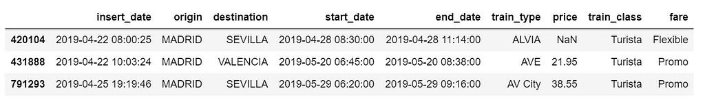
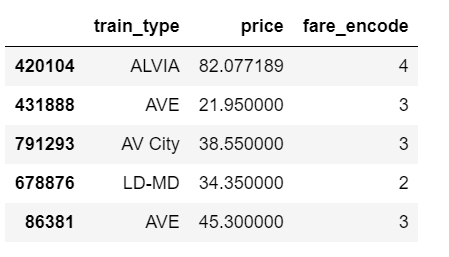
data = pd.read_csv('renfe.csv')
data.drop('Unnamed: 0', axis = 1, inplace=True)
data = data.sample(frac=0.01, random_state=99)
data.head(3)
Table 1
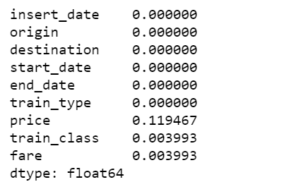
data.isnull().sum()/len(data)
Figure 1
There are 12% of values in price column are missing, I decide to fill them with the mean of the respective fare types. Also fill the other two categorical columns with the most common values.
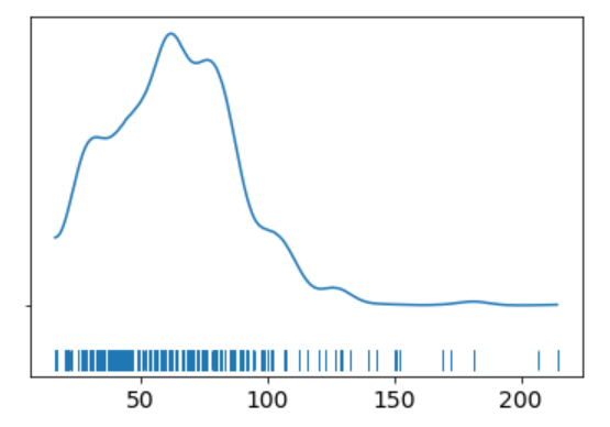
The KDE plot of the rail ticket price shows a Gaussian-like distribution, except for about several dozens of data points that are far away from the mean.
Let’s assume that a Gaussian distribution is a proper description of the rail ticket price. Since we do not know the mean or the standard deviation, we must set priors for both of them. Therefore, a reasonable model could be as follows.
Model
We will perform Gaussian inferences on the ticket price data. Here’s some of the modelling choices that go into this.
We would instantiate the Models in PyMC3 like this:
Model specifications in PyMC3 are wrapped in a with-statement.
Choices of priors:
μ, mean of a population. Normal distribution, very wide. I do not know the possible values of μ, I can set priors reflecting my ignorance. From experience I know that train ticket price can not be lower than 0 or higher than 300, so I set the boundaries of the uniform distribution to be 0 and 300. You may have different experience and set the different boundaries. That is totally fine. And if you have more reliable prior information than I do, please use it!
σ, standard deviation of a population. Can only be positive, therefore use HalfNormal distribution. Again, very wide.
Choices for ticket price likelihood function:
y is an observed variable representing the data that comes from a normal distribution with the parameters μ and σ.
Draw 1000 posterior samples using NUTS sampling.
Using PyMC3, we can write the model as follows:
The y specifies the likelihood. This is the way in which we tell PyMC3 that we want to condition for the unknown on the knows (data).
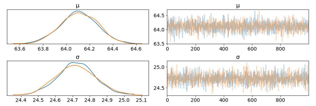
We plot the gaussian model trace. This runs on a Theano graph under the hood.
az.plot_trace(trace_g);
Figure 3
On the left, we have a KDE plot, — for each parameter value on the x-axis we get a probability on the y-axis that tells us how likely that parameter value is.
On the right, we get the individual sampled values at each step during the sampling. From the trace plot, we can visually get the plausible values from the posterior.
The above plot has one row for each parameter. For this model, the posterior is bi-dimensional, and so the above figure is showing the marginal distributions of each parameter.
There are a couple of things to notice here:
Our sampling chains for the individual parameters (left) seem well converged and stationary (there are no large drifts or other odd patterns).
The maximum posterior estimate of each variable (the peak in the left side distributions) is very close to the true parameters.
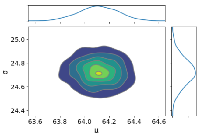
I don’t see any correlation between these two parameters. This means we probably do not have collinearityin the model. This is good.
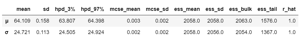
We can also have a detailed summary of the posterior distribution for each parameter.
az.summary(trace_g)
Table 2
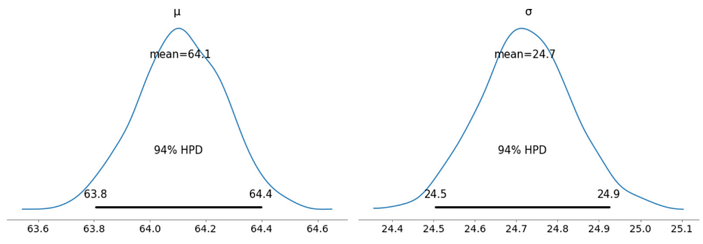
We can also see the above summary visually by generating a plot with the mean and Highest Posterior Density (HPD) of a distribution, and to interpret and report the results of a Bayesian inference.
Every time ArviZ computes and reports a HPD, it will use, by default, a value of 94%.
Please note that HPD intervals are not the same as confidence intervals.
Here we can interpret as such that there is 94% probability the belief is between 63.8 euro and 64.4 euro for the mean ticket price.
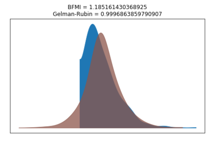
We can verify the convergence of the chains formally using the Gelman Rubin test. Values close to 1.0 mean convergence.
pm.gelman_rubin(trace_g)
bfmi = pm.bfmi(trace_g)
max_gr = max(np.max(gr_stats) for gr_stats in pm.gelman_rubin(trace_g).values())
(pm.energyplot(trace_g, legend=False, figsize=(6, 4)).set_title("BFMI = {}nGelman-Rubin = {}".format(bfmi, max_gr)));
Figure 6
Our model has converged well and the Gelman-Rubin statistic looks fine.
Posterior Predictive Checks
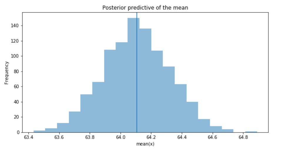
Posterior predictive checks (PPCs) are a great way to validate a model. The idea is to generate data from the model using parameters from draws from the posterior.
Now that we have computed the posterior, we are going to illustrate how to use the simulation results to derive predictions.
The following function will randomly draw 1000 samples of parameters from the trace. Then, for each sample, it will draw 25798 random numbers from a normal distribution specified by the values of μ and σ in that sample.
Now, ppc contains 1000 generated data sets (containing 25798 samples each), each using a different parameter setting from the posterior.
_, ax = plt.subplots(figsize=(10, 5))
ax.hist([y.mean() for y in ppc['y']], bins=19, alpha=0.5)
ax.axvline(data.price.mean())
ax.set(title='Posterior predictive of the mean', xlabel='mean(x)', ylabel='Frequency');
Figure 7
The inferred mean is very close to the actual rail ticket price mean.
Group Comparison
We may be interested in how price compare under different fare types. We are going to focus on estimating the effect size, that is, quantifying the difference between two fare categories. To compare fare categories, we are going to use the mean of each fare type. Because we are Bayesian, we will work to obtain a posterior distribution of the differences of means between fare categories.
We create three variables:
The price variable, representing the ticket price.
The idx variable, a categorical dummy variable to encode the fare categories with numbers.
And finally the groups variable, with the number of fare categories (6)
The model for the group comparison problem is almost the same as the previous model. the only difference is that μ and σ are going to be vectors instead of scalar variables. This means that for the priors, we pass a shape argument and for the likelihood, we properly index the means and sd variables using the idx variable:
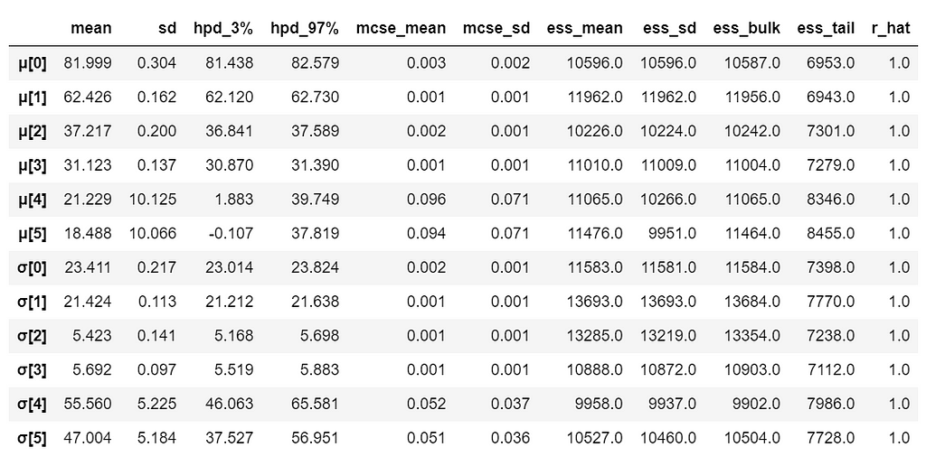
With 6 groups (fare categories), its a little hard to plot trace plot for μ and σ for every group. So, we create a summary table:
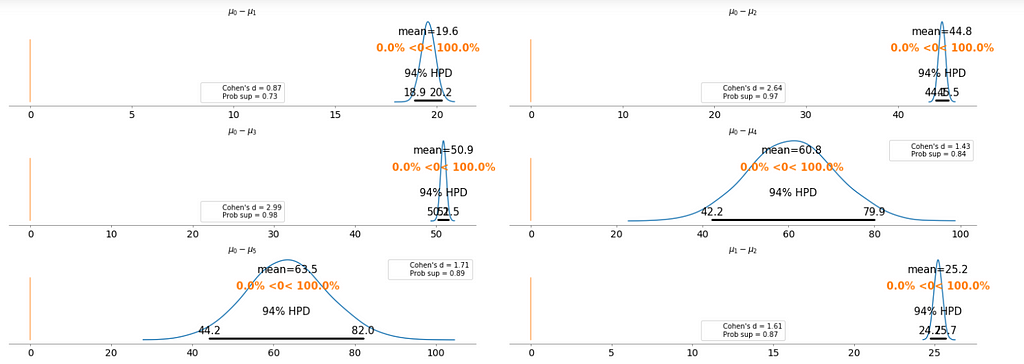
It is obvious that there are significant differences between groups (i.e. fare categories) on the mean.
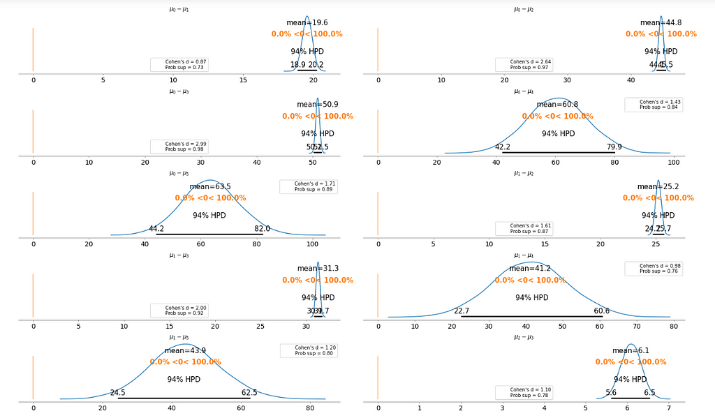
To make it clearer, we plot the difference between each fare category without repeating the comparison.
Cohen’s d is an appropriate effect size for the comparison between two means. Cohen’s d introduces the variability of each group by using their standard deviations.
probability of superiority (ps) is defined as the probability that a data point taken at random from one group has a larger value than one taken at random from another group.
Figure 8
Basically, the above plot tells us that none of the above comparison cases where the 94% HPD includes the reference value of zero. This means for all the examples, we can rule out a difference of zero. The average differences range of 6.1 euro to 63.5 euro are large enough that it can justify for customers to purchase tickets according to different fare categories.
Bayesian Hierarchical Linear Regression
We want to build a model to estimate the rail ticket price of each train type, and, at the same time, estimate the price of all the train types. This type of model is known as a hierarchical model or multilevel model.
Encoding the categorical variable.
The idx variable, a categorical dummy variable to encode the train types with numbers.
And finally the groups variable, with the number of train types (16)
Table 4
The relevant part of the data we will model looks as above. And we are interested in whether different train types affect the ticket price.
Hierarchical Model
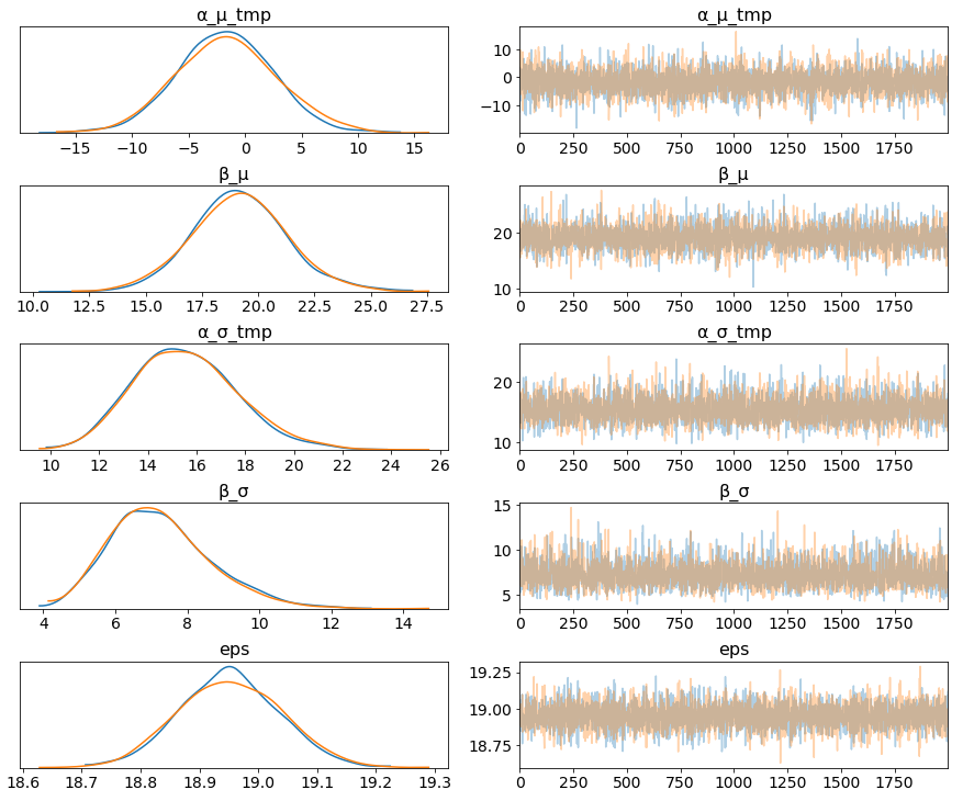
Figure 9
The marginal posteriors in the left column are highly informative, “α_μ_tmp” tells us the group mean price levels, “β_μ” tells us that purchasing fare category “Promo +” increases price significantly compare to fare type “Adulto ida”, and purchasing fare category “Promo” increases price significantly compare to fare type “Promo +”, and so on (no mass under zero).
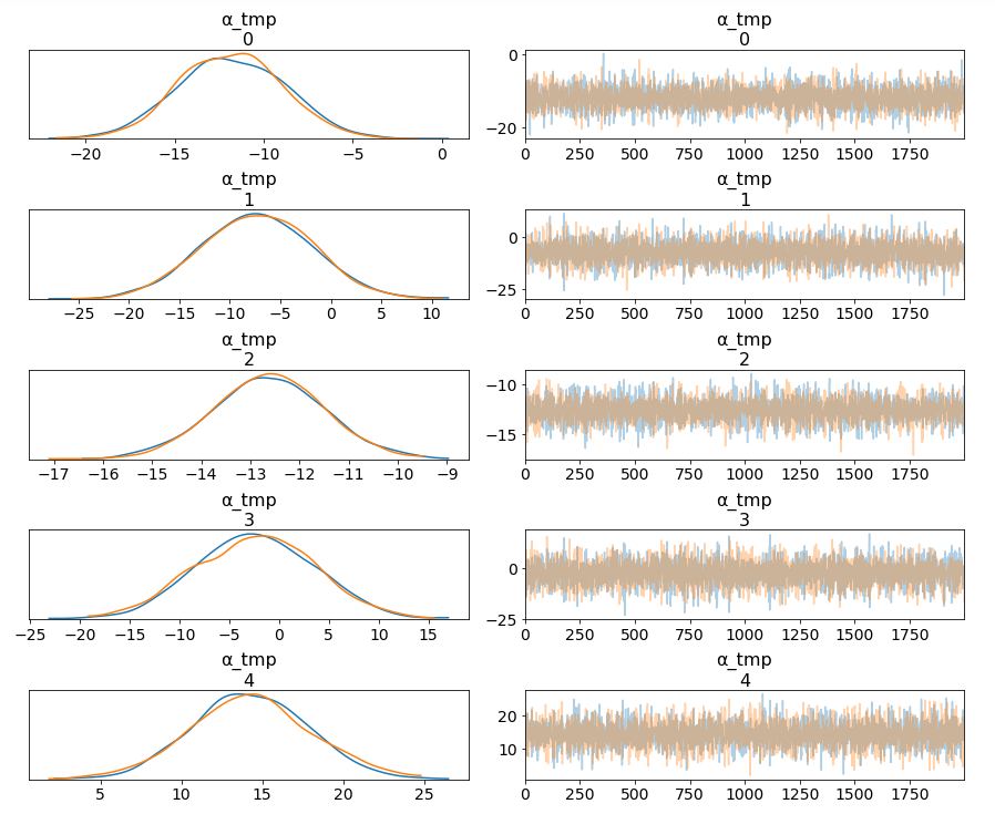
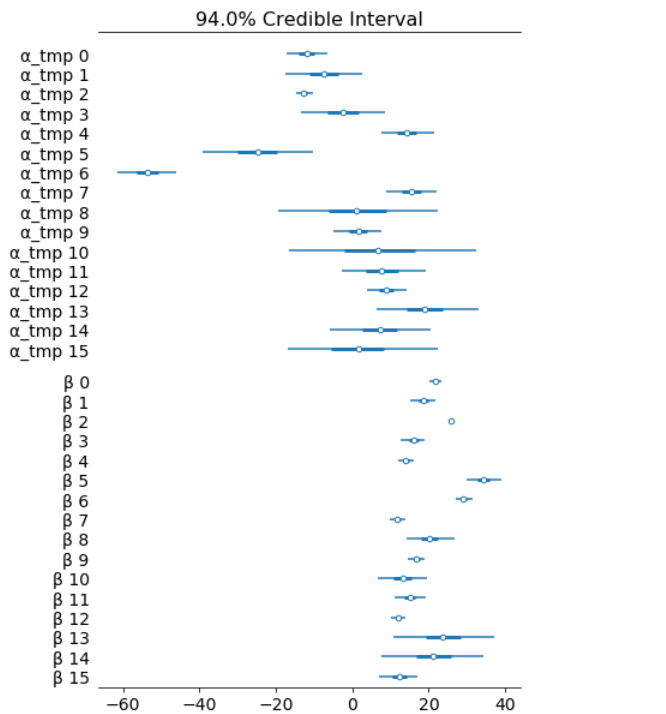
Among 16 train types, we may want to look at how 5 train types compare in terms of the ticket price. We can see by looking at the marginals for “α_tmp” that there is quite some difference in prices between train types; the different widths are related to how much confidence we have in each parameter estimate — the more measurements per train type, the higher our confidence will be.
Having uncertainty quantification of some of our estimates is one of the powerful things about Bayesian modelling. We’ve got a Bayesian credible interval for the price of different train types.
The objective of this post is to learn, practice and explain Bayesian, not to produce the best possible results from the data set. Otherwise, we would have gone with XGBoost directly.
Shopify powers 800,000 businesses in approximately 175 countries.
The first iteration of Shopify (before it was called that) was an online store that sold snowboards. Eventually, there was a pivot to becoming an e- commerce platform. It’s been named Canada’s “smartest” company, among myriad other well-earned accolades. Shopify was the third largest e-commerce CMS in 2018, with a market share of 10.03% in the first million websites. In 2018, Shopify platform did 1.5+ Billion $ in sales on Cyber Monday alone.
The first step is the phone screen with HR person. The next step is a three part in person interview (‘life story’ and technical interview). Once those are clear, there is an onsite interview which consists of two more technical interviews, and three more interviews before prospective team leads.
Go through a previously completed project and explain it. Why did you make the choices in the project that you did?
What’s the difference between Type I and Type II error?
Explain the difference between L1 and L2 regularization.
Write a program to solve a simulation of Conway’s game of life.
What is the difference between supervised and unsupervised machine learning?
What’s the difference between a generative and discriminative model?
What’s the F1 score? How would you use it?
What is your experience working on big data technologies?
Do you have experience with Spark or big data tools for machine learning?
How do you ensure you are not overfitting with a model?
Reflecting on the Question
The 800,000 businesses that Shopify powers generates massive amounts of data. The Data Science team at Shopify asks basic data science questions which are fundamental in nature. Sometimes, the questions revolve around your resume and the problems you have solved in your past career. Good grip on fundamentals can surely land you a job with the world’s largest e-commerce platform!
Subscribe to our Acing AI newsletter, I promise not to spam and its FREE!
Thanks for reading! 😊 If you enjoyed it, test how many times can you hit 👏 in 5 seconds. It’s great cardio for your fingers AND will help other people see the story.
The sole motivation of this blog article is to learn about Shopify and its technologies helping people to get into it. All data is sourced from online public sources. I aim to make this a living document, so any updates and suggested changes can always be included. Please provide relevant feedback.