How to effectively and creatively pre-process text data
A few months ago, we built a content based recommender system using a relative clean text data set. Because I collected the hotel descriptions my self, I made sure that the descriptions were useful for the goals we were going to accomplish. However, the real-world text data is never clean and there are different pre-processing ways and steps for different goals.
Topic modeling in NLP is rarely my final goal in an analysis, I use it often to either explore data or as a tool to make my final model more accurate. Let me show you what I meant.
The Data
We are still using the Seattle Hotel description data set I collected earlier, and I made it a bit more messier this time. We are going to skip all the EDA processes and I want to make recommendations as quickly as possible.
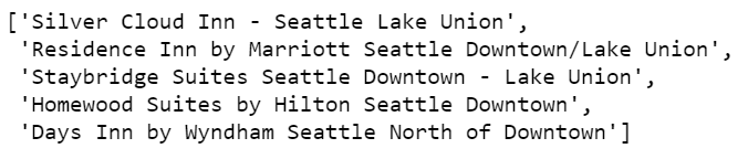
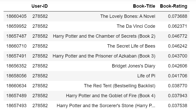
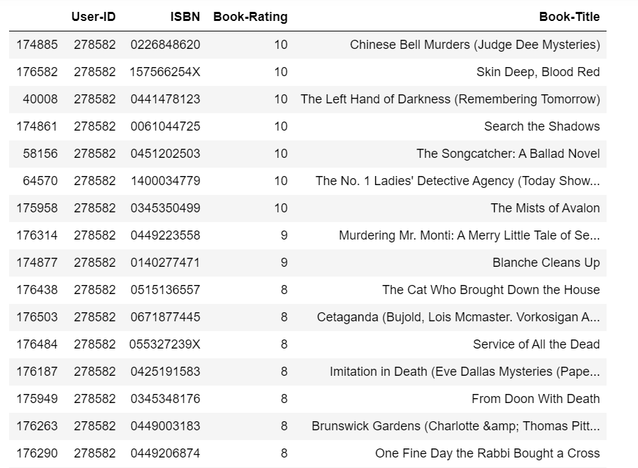
If you have read my previous post, I am sure you understand the following code script. Yes, we are looking for top 5 most similar hotels with “Hilton Garden Inn Seattle Downtown” (except itself), according to hotel description texts.
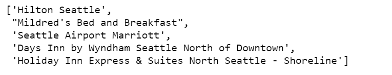
Our model returns the above 5 hotels and thinks they are top 5 most similar hotels to “Hilton Garden Inn Seattle Downtown”. I am sure you don’t agree, neither do I. Let’s say why the model thinks they are similar by looking at these descriptions.
df.loc['Hilton Garden Inn Seattle Downtown'].desc
df.loc["Mildred's Bed and Breakfast"].desc
df.loc["Seattle Airport Marriott"].desc
Found anything interesting? Yes, there are indeed somethings in common in these three hotel descriptions, they all have the same check in and check out time, and they all have the similar smoking policies. But are they important? Can we declare two hotels are similar just because they are all “non-smoking”? Of course not, these are not important characteristics and we shouldn’t measure similarity in vector space of these texts.
We need to find a way to safely remove these texts programmatically, while not removing any other useful characteristics.
Topic modeling comes to our rescue. But before that, we need to wrangle the data to make it in the right shape.
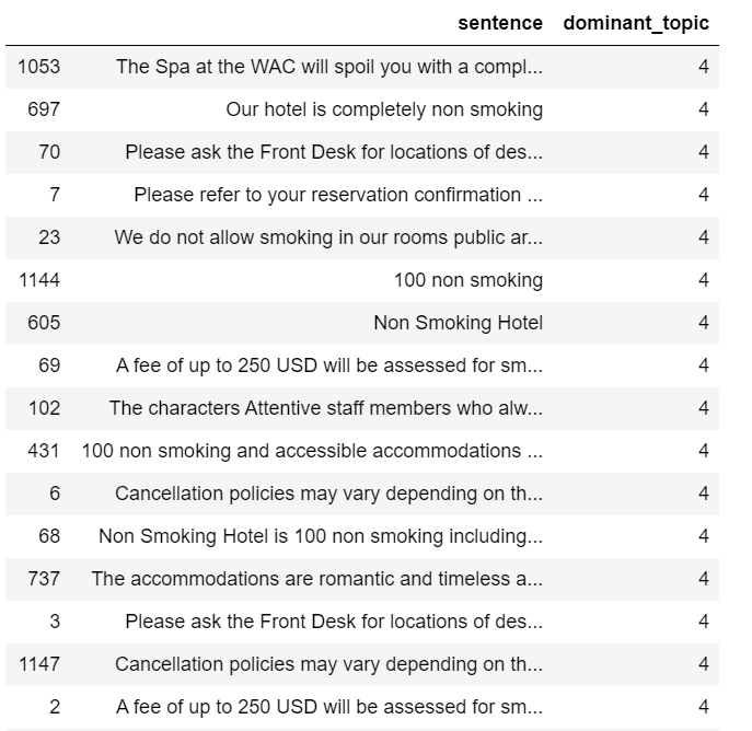
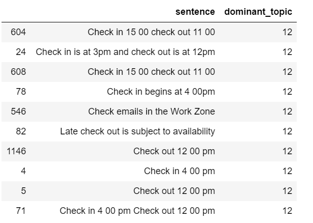
Split each description into sentences. Hilton Garden Seattle Downtown’s entire description will be split into 7 sentences.
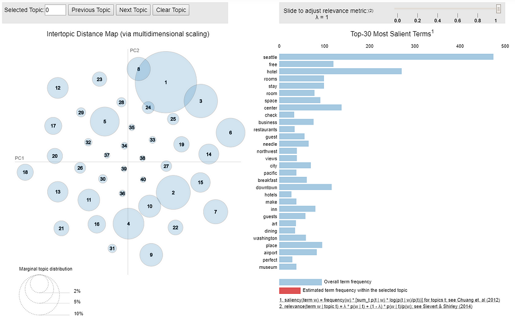
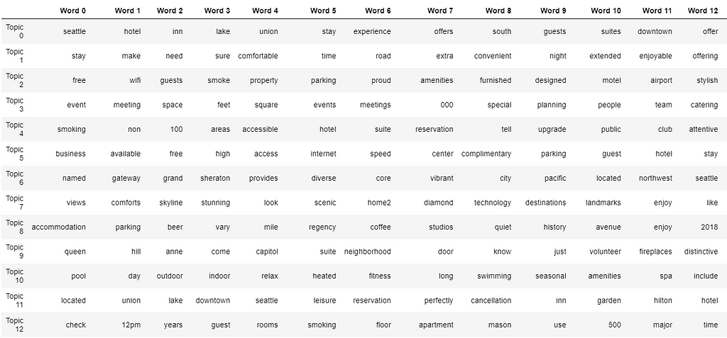
We shall have 40 topics, and each topic shows 20 keywords. Its very hard to print out the entire table, I will only show a small part of it.
Table 2
By staring at the table, we can guess that at least topic 12 should be one of the topics we would like to dismiss, because it contains several words that meaningless for our purpose.
In the following code scripts, we:
Create document-topic matrix.
Create a data frame where each document is a row, and each column is a topic.
The weight of each topic is assigned to each document.
The last column is the dominant topic for that document, in which it carries the most weight.
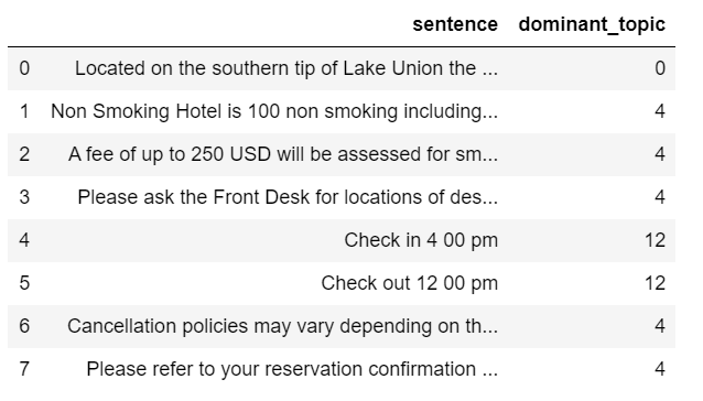
When we merge this data frame to the previous sentence data frame. We are able to find the the weight of each topic in every sentence, and the dominant topic for each sentence.
After reviewing the above two tables, I decided to remove all the sentences that have topic 4 or topic 12 as their dominant topic.
print('There are', len(df_sent_topic.loc[df_sent_topic['dominant_topic'] == 4]), 'sentences that belong to topic 4 and we will remove')
print('There are', len(df_sent_topic.loc[df_sent_topic['dominant_topic'] == 12]), 'sentences that belong to topic 12 and we will remove')
Let’s see what left for our “Hilton Garden Inn Seattle Downtown”
df_description['sentence'][45]
There is only one sentence left and it is about the location of the hotel and this is what I had expected.
Make Recommendations
Using the same cosine similarity measurement, we are going to find the top 5 most similar hotels with “Hilton Garden Inn Seattle Downtown” (except itself), according to the cleaned hotel description texts.
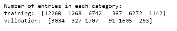
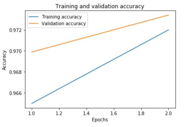
print('Number of entries in each category:')
print('training: ', y_train.sum(axis=0))
print('validation: ', y_val.sum(axis=0))
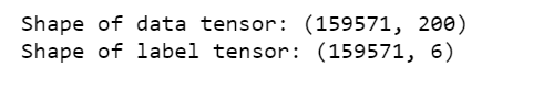
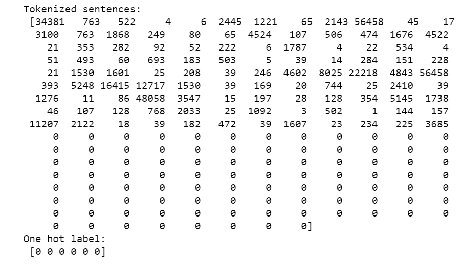
This is what the data looks like:
print('Tokenized sentences: n', data[10])
print('One hot label: n', labels[10])
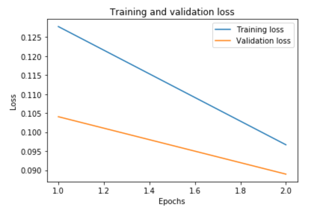
Figure 1
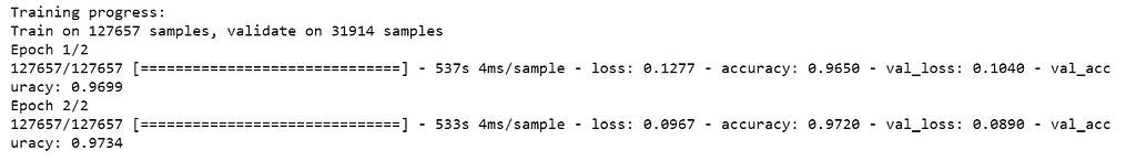
Create the model
We will use pre-trained GloVe vectors from Stanford to create an index of words mapped to known embeddings, by parsing the data dump of pre-trained embeddings.
Then load word embeddings into an embeddings_index
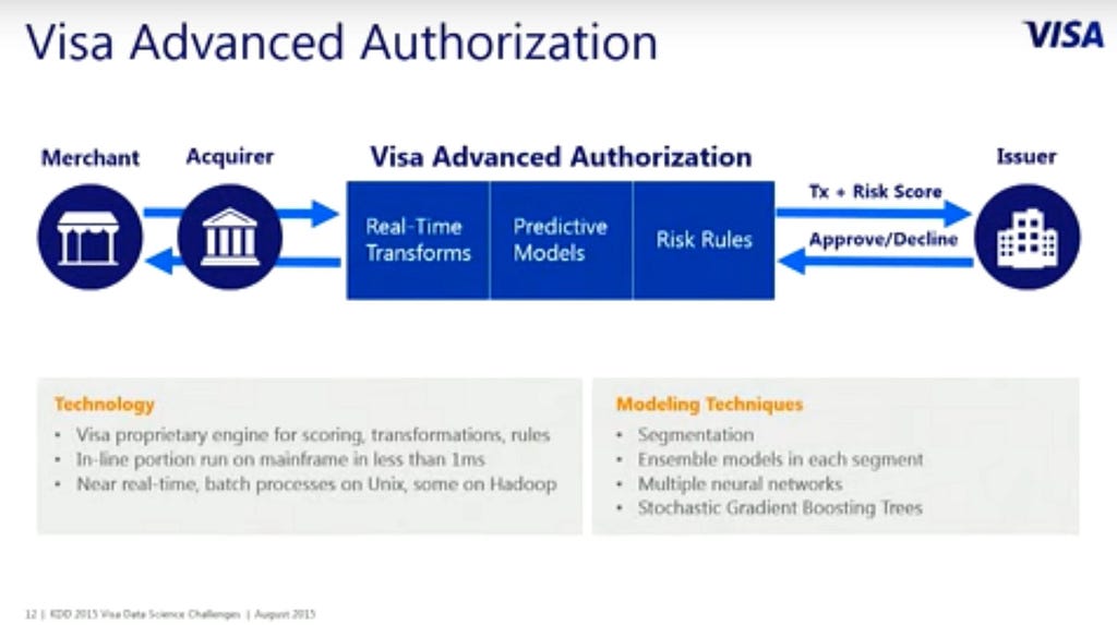
In 2015, the Nilson Report, a publication that tracks the credit card industry, found that Visa’s global network (known as VisaNet) processed 100 billion transactions during 2014 with a total volume of US$6.8 trillion. VisaNet data centers can handle up to 30,000 simultaneous transactions and up to 100 billion computations every second. Visa is a very household name all over the world. If you ever owned a credit card, you will surely know what Visa is. With a 100 billion transactions, the scale of data in the company is beyond compare. It could be a highlight of a Data professionals’ career.
A senior data scientist from the team reaches out for the first telephonic interview after the resume is selected. The interview involves resume based questions, SQL, and or a business case study. After the first round, there is another telephonic technical interview. Eventually, there are five on-site interviews. On-site interviews are with top level personnel, directors and VPs. Each of those interviews is 45 minutes long.
How do you estimate a customer’s location based on Visa transaction data?
Write a code for a Fibonacci sequence.
What functions can I perform using a spreadsheet?
Who would be your first line of contact to report a missing data you’re keeping record of?
Give the top three employee salaries in each department in a company.
What is Node.js?
What is MVC?
What is synchronous vs asynchronous Javascript?
Reflecting on the Interviews
The data science interview at Visa, Inc. is a rigorous process which involves many different interviews. The team is top notch and they are looking for similar candidates to hire. Most interviews look for fundamentals in SQL, coding, probability and statistics as well as ML. A decent amount of hard work can surely get you a job with the world’s largest credit transaction processing company!
Subscribe to our Acing AI newsletter, I promise not to spam and its FREE!
Thanks for reading! 😊 If you enjoyed it, test how many times can you hit 👏 in 5 seconds. It’s great cardio for your fingers AND will help other people see the story.
The sole motivation of this blog article is to learn about Visa Inc. and its technologies and help people to get into it. All data is sourced from online public sources. I aim to make this a living document, so any updates and suggested changes can always be included. Please provide relevant feedback.
Visa, Inc. Data Science Interviews was originally published in Acing AI on Medium, where people are continuing the conversation by highlighting and responding to this story.
Collaborative Filtering is a technique widely used by recommender systems when you have a decent size of user — item data. It makes recommendations based on the content preferences of similar users.
Therefore, collaborative filtering is not a suitable model to deal with cold start problem, in which it cannot draw any inference for users or items about which it has not yet gathered sufficient information.
But once you have relative large user — item interaction data, then collaborative filtering is the most widely used recommendation approach. And we are going to learn how to build a collaborative filtering recommender system using TensorFlow.
The Data
We are again using booking crossing dataset that can be found here. The data pre-processing steps does the following:
Merge user, rating and book data.
Remove unused columns.
Filtering books that have had at least 25 ratings.
Filtering users that have given at least 20 ratings. Remember, collaborative filtering algorithms often require users’ active participation.
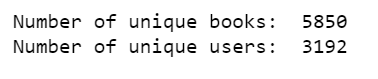
So, our final dataset contains 3,192 users for 5,850 books. And each user has given at least 20 ratings and each book has received at least 25 ratings. If you do not have a GPU, this would be a good size.
The collaborative filtering approach focuses on finding users who have given similar ratings to the same books, thus creating a link between users, to whom will be suggested books that were reviewed in a positive way. In this way, we look for associations between users, not between books. Therefore, collaborative filtering relies only on observed user behavior to make recommendations — no profile data or content data is necessary.
Our technique will be based on the following observations:
Users who rate books in a similar manner share one or more hidden preferences.
Users with shared preferences are likely to give ratings in the same way to the same books.
Because TensorFlow uses computational graphs for its operations, placeholders and variables must be initialized before they have values. So in the following code, we initialize the variables, then create an empty data frame to store the result table, which will be top 10 recommendations for every user.
We split training data into batches, and we feed the network with them.
We train our model with vectors of user ratings, each vector represents a user and each column a book, and entries are ratings that the user gave to books.
After a few trials, I discovered that training model for 100 epochs with a batch size of 35 would be consuming enough memories. This means that the entire training set will feed our neural network 100 times, every time using 35 users.
At the end, we must make sure to remove user’s ratings in the training set. That is, we must not recommend books to a user in which he (or she) has already rated.
Breaking down data science interview questions by category
tl;dr: Unless the data science role is nuanced, most data science roles require fundamental knowledge about the basics of data science. (SQL, Coding, Probability and Stats, Data Analysis)
We analyzed hundreds of data science interview questions to find trends, patterns and topics that are the core of a data science interview.
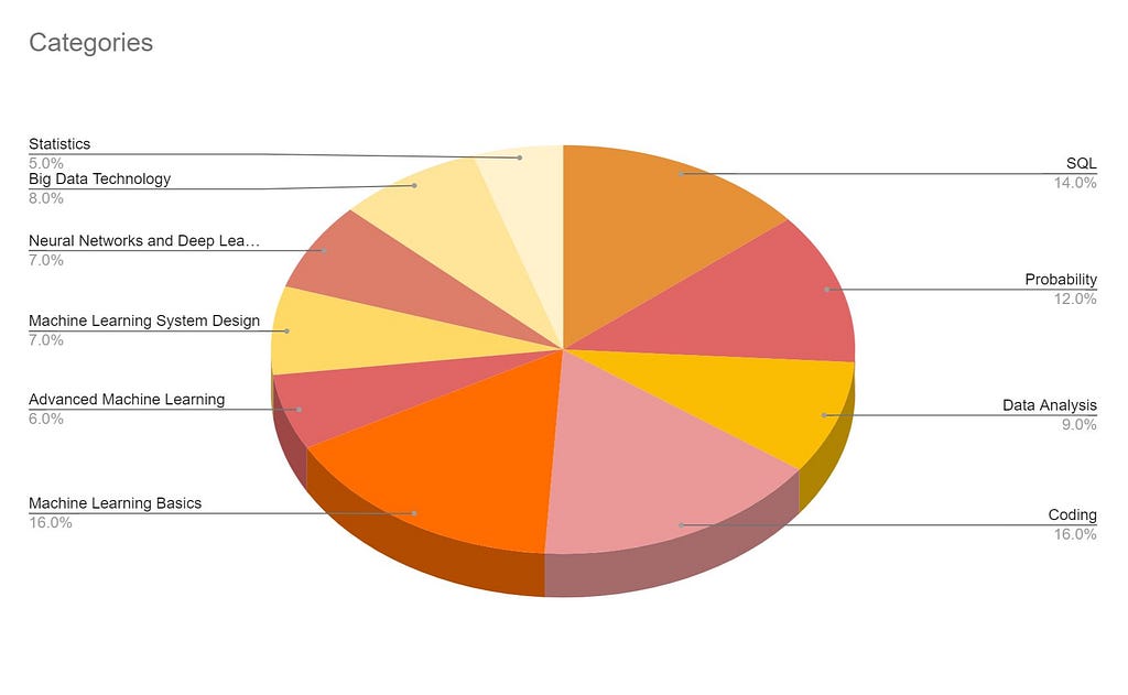
At a high level, we divided these questions into different categories. We added a weight to each category. Weight of a category is simply the number of times we found a question occurring or repeating in the bucket from a random corpus of 100 questions.
From the pie chart above, categories like SQL, coding are non ambiguous. Machine learning basics consists of Linear/Logistic regression and related ML algorithms. Advanced ML consists of comparisons between multiple approaches, algorithms and nuanced techniques. Big Data technology includes big data concepts such as Hadoop, Spark and may include the infrastructure side/data engineering/deployment side of data science models. In essence, data science fundamentals are asked 70% of the time in a data science interview.
While SQL and coding based questions might be part of the initial online assessment, data analysis questions tend to be a take-home assessment. The remaining categories are usually covered during the phone/in-person interview and vary based on the role, company, years of experience and team composition.
Considering all this data, we designed a data science interview course to help people Ace Data Science Interviews. All the categories mentioned above will be covered in this course. The current cohort starts September 16, 2019. It will be a small group of 15 people. Sign up here!
According to Indeed, there is a 344% increase in demand for data scientists year over year.
In January 2018, I started the Acing AI blog with a goal to help people get into data science. My first article was about “The State of Autonomous Transportation”. As I wrote more, I realized people were interested in acing data scienceinterviews. This led me to start my articles covering various companies’ data science interview questions and processes. The Acing AI blog will continue to have interesting articles as always. This journey continues with today’s exciting announcements.
First, we are launching the Acing Data Science/Acing AI newsletter. This newsletter will always be free. We will be sharing interesting data science articles, interview tips and more via the newsletter. Some of you are already subscribed to this newsletter and will continue to get emails on it.
Through my first newsletter, I also wanted to share the next evolution of the Acing AI blog, Acing Data Science Interviews.
I partnered with Johnny to come up with an amazing course to help people ace data science interviews. Everything we have learned from conducting interviews, giving interviews, writing these blogs and learning from the best people in the data science, we packaged that into this course. Think about the collective six plus years of learning condensed into a three month course. That would be Acing Data Science Interviews.
At a high level, we will cover different topics from a data science interview perspective. These include SQL, coding, probability and statistics, data analysis, machine learning algorithms, advanced machine learning, machine learning system design, deep learning, neural networks, big-data concepts and finally approaching a data science interviews. The first few topics provide the foundation aspects of data science. They are followed by the data science application topics. Collectively, all these should encompass everything that could be asked in a data science interview.
The first sessions will start in the second half of September 2019. We are aiming to have a small group of 15 people. The original course will be only 199$. We are focused on quality and would like to provide the best experience and hence, we want to keep the small group size.
Acing Data Science Interviews was originally published in Acing AI on Medium, where people are continuing the conversation by highlighting and responding to this story.
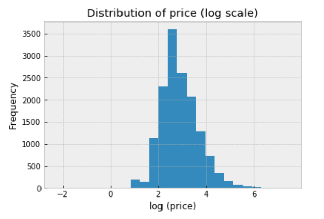
If you remember, the purpose of the data set is to build a model that automatically suggests the right price for any given product for Mercari website sellers. I am here to attempt to see whether we can solve this problem by Bayesian statistical methods, using PyStan.
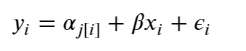
In this analysis, we will estimate parameters for individual product price that exist within categories. And the measured price is a function of the shipping condition (buyer pays shipping or seller pays shipping), and the overall price.
At the end, our estimate of the parameter of product price can be considered a prediction.
Simply put, the independent variables we are using are: category_name & shipping. And the dependent variable is: price.
from scipy import stats
import arviz as az
import numpy as np
import matplotlib.pyplot as plt
import pystan
import seaborn as sns
import pandas as pd
from theano import shared
from sklearn import preprocessing
plt.style.use('bmh')
To make things more interesting, I will model all of these 689 product categories. If you want to produce better results quicker, you may want to model the top 10 or top 20 categories, to start.
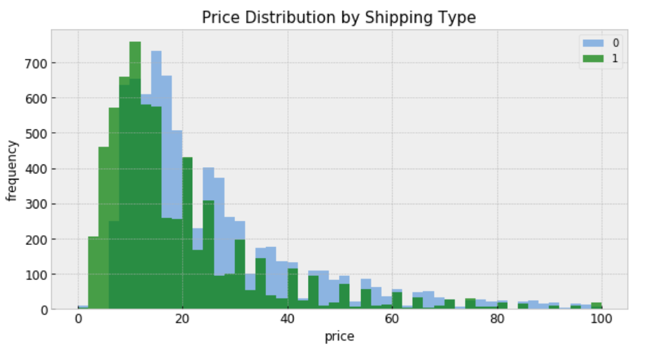
“shipping = 0” means shipping fee paid by buyer, and “shipping = 1” means shipping fee paid by seller. In general, price is higher when buyer pays shipping.
Modeling
For construction of a Stan model, it is convenient to have the relevant variables as local copies — this aids readability.
category: index code for each category name
price: price
category_names: unique category names
categories: number of categories
log_price: log price
shipping: who pays shipping
category_lookup: index categories with a lookup dictionary
There are two conventional approaches to modeling price represent the two extremes of the bias-variance tradeoff:
Complete pooling:
Treat all categories the same, and estimate a single price level, with the equation:
To specify this model in Stan, we begin by constructing the data block, which includes vectors of log-price measurements (y) and who pays shipping covariates (x), as well as the number of samples (N).
Once the fit has been run, the method extract and specifying permuted=True extracts samples into a dictionary of arrays so that we can conduct visualization and summarization.
We are interested in the mean values of these estimates for parameters from the sample.
b0 = alpha = mean price across category
m0 = beta = mean variation in price with change on who pays shipping
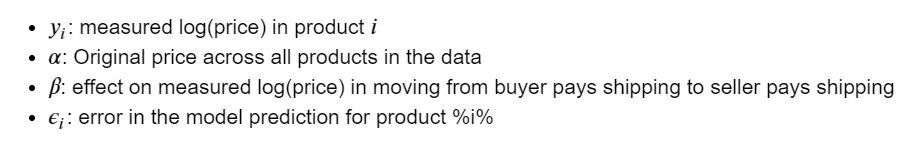
We can now visualize how well this pooled model fits the observed data.
The fitted line runs through the centre of the data, and it describes the trend.
However, the observed points vary widely about the fitted model, and there are multiple outliers indicating that the original price varies quite widely.
We might expect different gradients if we chose different subsets of the data.
Unpooling
When unpooling, we model price in each category independently, with the equation:
When running the unpooled model in Stan, We again map Python variables to those used in the Stan model, then pass the data, parameters and the model to Stan. We again specify 1000 iterations of 2 chains.
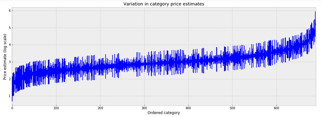
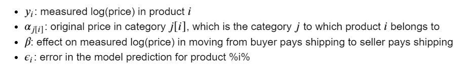
To inspect the variation in predicted price at category level, we plot the mean of each estimate with its associated standard error. To structure this visually, we’ll reorder the categories such that we plot categories from the lowest to the highest.
plt.figure(figsize=(18, 6))
plt.scatter(range(len(unpooled_estimates)), unpooled_estimates[order])
for i, m, se in zip(range(len(unpooled_estimates)), unpooled_estimates[order], unpooled_se[order]):
    plt.plot([i,i], [m-se, m+se], 'b-')
    plt.xlim(-1,690);
plt.ylabel('Price estimate (log scale)');plt.xlabel('Ordered category');plt.title('Variation in category price estimates');
Figure 4
Observations:
There are multiple categories with relatively low predicted price levels, and multiple categories with a relatively high predicted price levels. Their distance can be large.
A single all-category estimate of all price level could not represent this variation well.
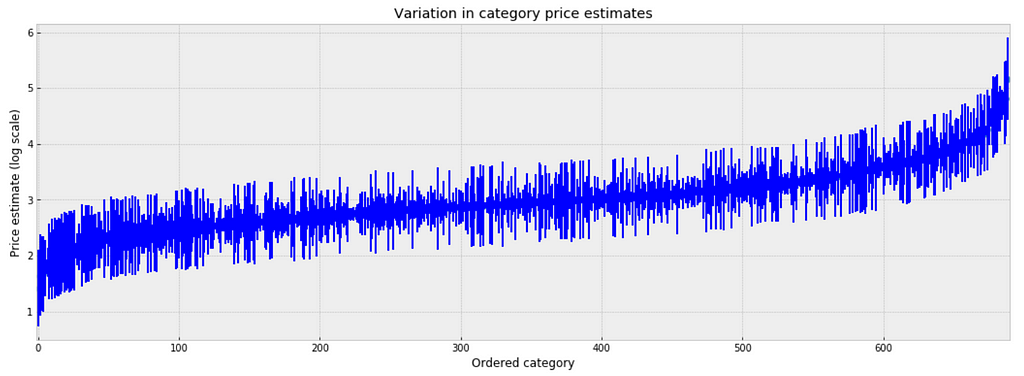
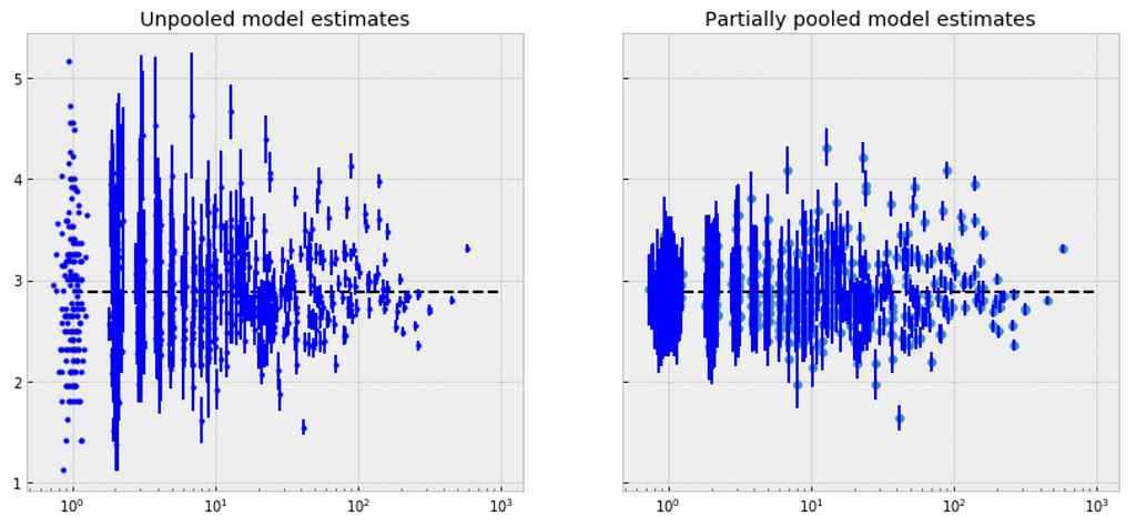
Comparison of pooled and unpooled estimates
We can make direct visual comparisons between pooled and unpooled estimates for all categories, and we are going to show several examples, and I purposely select some categories with many products, and other categories with very few products.
Let me try to explain what the above visualizations tell us:
The pooled models (red dashed line) in every category are the same, meaning all categories are modeled the same, indicating pooling is useless.
For categories with few observations, the fitted estimates track the observations very closely, suggesting that there has been overfitting. So that we can’t trust the estimates produced by models using few observations.
Multilevel and Hierarchical Models
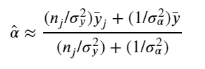
Partial Pooling — simplest
The simplest possible partial pooling model for the e-commerce price data set is one that simply estimates prices, with no other predictors (i.e. ignoring the effect of shipping). This is a compromise between pooled (mean of all categories) and unpooled (category-level means), and approximates a weighted average (by sample size) of unpooled category estimates, and the pooled estimates, with the equation:
Now we have two standard deviations, one describing the residual error of the observations, and another describing the variability of the category means around the average.
There are significant differences between unpooled and partially-pooled estimates of category-level price, The partially pooled estimates looks way less extreme.
Partial Pooling — Varying Intercept
Simply put, the multilevel modeling shares strength among categories, allowing for more reasonable inference in categories with little data, with the equation:
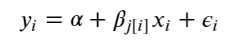
There is no way to visualize all of these 689 categories together, so I will visualize 20 of them.
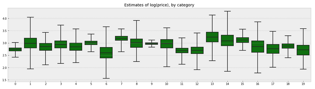
a_sample = pd.DataFrame(varying_intercept_fit['a'])
plt.figure(figsize=(20, 5))
g = sns.boxplot(data=a_sample.iloc[:,0:20], whis=np.inf, color="g")
# g.set_xticklabels(df.category_name.unique(), rotation=90)  # label counties
g.set_title("Estimates of log(price), by category")
g;
Figure 7
Observations:
There are quite some variations in prices by category, and we can see that for example, category Beauty/Fragrance/Women (index at 9) with a large number of samples (225) also has one of the tightest range of estimated values.
While category Beauty/Hair Care/Shampoo Plus Conditioner (index at 16) with the smallest number of sample (one only) also has one of the widest range of estimates.
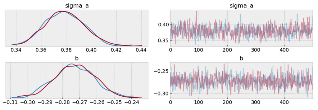
We can visualize the distribution of parameter estimates for 𝜎 and β.
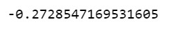
The estimate for the shipping coefficient is approximately -0.27, which can be interpreted as products which shipping fee paid by seller at about 0.76 of (exp(−0.27)=0.76) the price of those shipping paid by buyer, after accounting for category.
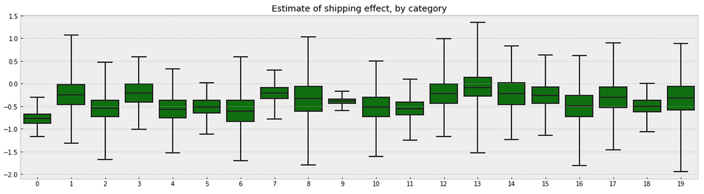
Visualize the fitted model
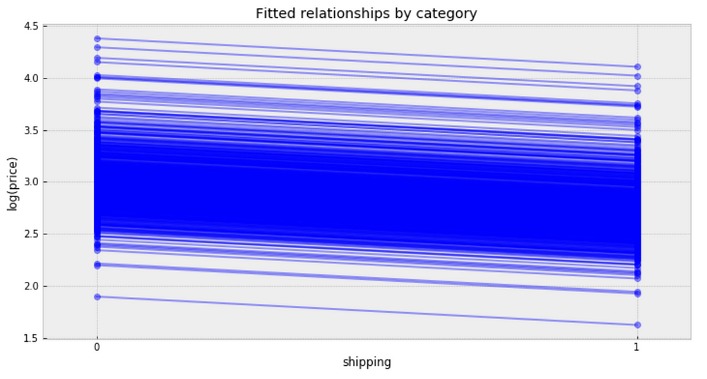
plt.figure(figsize=(12, 6))
xvals = np.arange(2)
bp = varying_intercept_fit['a'].mean(axis=0) # mean a (intercept) by category
mp = varying_intercept_fit['b'].mean()      # mean b (slope/shipping effect)
for bi in bp:
    plt.plot(xvals, mp*xvals + bi, 'bo-', alpha=0.4)
plt.xlim(-0.1,1.1)
plt.xticks([0, 1])
plt.title('Fitted relationships by category')
plt.xlabel("shipping")
plt.ylabel("log(price)");
Figure 9
Observations:
It is clear from this plot that we have fitted the same shipping effect to each category, but with a different price level in each category.
There is one category with very low fitted price estimates, and several categories with relative lower fitted price estimates.
There are multiple categories with relative higher fitted price estimates.
The bulk of categories form a majority set of similar fits.
We can see whether partial pooling of category-level price estimate has provided more reasonable estimates than pooled or unpooled models, for categories with small sample sizes.
Partial Pooling — Varying Slope model
We can also build a model that allows the categories to vary according to shipping arrangement (paid by buyer or paid by seller) influences the price. With the equation:
Following the process earlier, we will visualize 20 categories.
b_sample = pd.DataFrame(varying_slope_fit['b'])
plt.figure(figsize=(20, 5))
g = sns.boxplot(data=b_sample.iloc[:,0:20], whis=np.inf, color="g")
# g.set_xticklabels(df.category_name.unique(), rotation=90)  # label counties
g.set_title("Estimate of shipping effect, by category")
g;
Figure 10
Observations:
From the first glance, we may not see any difference between these two boxplots. But if you look deeper, you will find that the variation in median estimates between categories in varying slope model becomes smaller than those in varying intercept model, though the range of uncertainty is still greatest in the categories with fewest products, and least in the categories with the most products.
Visualize the fitted model:
plt.figure(figsize=(10, 6))
xvals = np.arange(2)
b = varying_slope_fit['a'].mean()
m = varying_slope_fit['b'].mean(axis=0)
for mi in m:
    plt.plot(xvals, mi*xvals + b, 'bo-', alpha=0.4)
plt.xlim(-0.2, 1.2)
plt.xticks([0, 1])
plt.title("Fitted relationships by category")
plt.xlabel("shipping")
plt.ylabel("log(price)");
Figure 11
Observations:
It is clear from this plot that we have fitted the same price level to every category, but with a different shipping effect in each category.
There are two categories with very small shipping effects, but the majority bulk of categories form a majority set of similar fits.
Partial Pooling — Varying Slope and Intercept
The most general way to allow both slope and intercept to vary by category. With the equation:
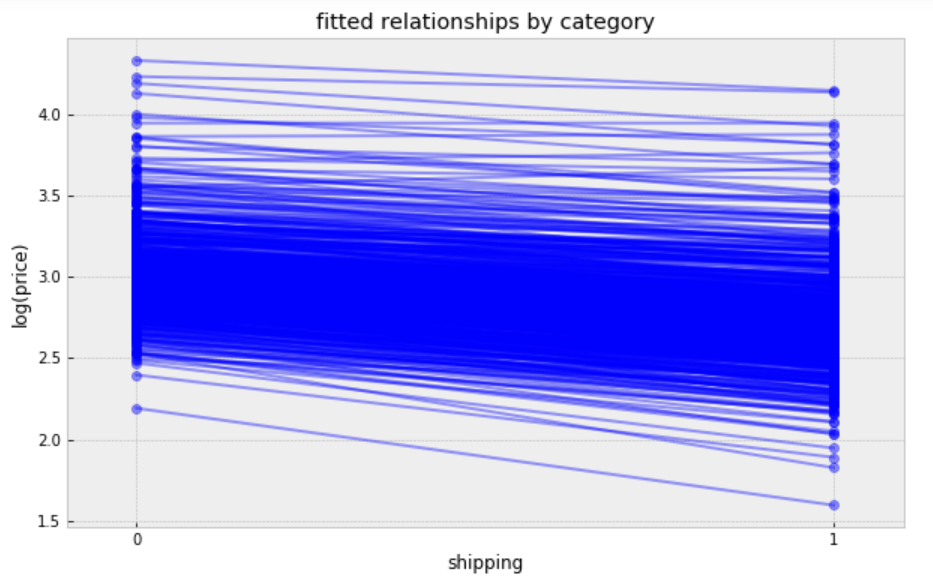
plt.figure(figsize=(10, 6))
xvals = np.arange(2)
b = varying_intercept_slope_fit['a'].mean(axis=0)
m = varying_intercept_slope_fit['b'].mean(axis=0)
for bi,mi in zip(b,m):
    plt.plot(xvals, mi*xvals + bi, 'bo-', alpha=0.4)
plt.xlim(-0.1, 1.1);
plt.xticks([0, 1])
plt.title("fitted relationships by category")
plt.xlabel("shipping")
plt.ylabel("log(price)");
Figure 12
While these relationships are all very similar, we can see that by allowing both shipping effect and price to vary, we seem to be capturing more of the natural variation, compare with varying intercept model.
Contextual Effects
In some instances, having predictors at multiple levels can reveal correlation between individual-level variables and group residuals. We can account for this by including the average of the individual predictors as a covariate in the model for the group intercept.
we wanted to make a prediction for a new product in “Women/Athletic Apparel/Pants, Tights, Leggings” category, which shipping paid by seller, we just need to sample from the model with the appropriate intercept.
The mean value sampled from this fit is ≈3, so we should expect the measured price in a new product in “Women/Athletic Apparel/Pants, Tights, Leggings” category, when shipping paid by seller, to be ≈exp(3) ≈ 20.09, though the range of predicted values is rather wide.