Time Series Analysis, Visualization & Forecasting with LSTM

Statistics normality test, Dickey–Fuller test for stationarity, Long short-term memory
The title says it all.
Without further ado, let’s roll!
The Data
The data is the measurements of electric power consumption in one household with a one-minute sampling rate over a period of almost 4 years that can be downloaded from here.
Different electrical quantities and some sub-metering values are available. However, we are only interested in Global_active_power variable.
import numpy as np
import matplotlib.pyplot as plt
import pandas as pd
pd.set_option('display.float_format', lambda x: '%.4f' % x)
import seaborn as sns
sns.set_context("paper", font_scale=1.3)
sns.set_style('white')
import warnings
warnings.filterwarnings('ignore')
from time import time
import matplotlib.ticker as tkr
from scipy import stats
from statsmodels.tsa.stattools import adfuller
from sklearn import preprocessing
from statsmodels.tsa.stattools import pacf
%matplotlib inline
import math
import keras
from keras.models import Sequential
from keras.layers import Dense
from keras.layers import LSTM
from keras.layers import Dropout
from keras.layers import *
from sklearn.preprocessing import MinMaxScaler
from sklearn.metrics import mean_squared_error
from sklearn.metrics import mean_absolute_error
from keras.callbacks import EarlyStopping
df=pd.read_csv('household_power_consumption.txt', delimiter=';')
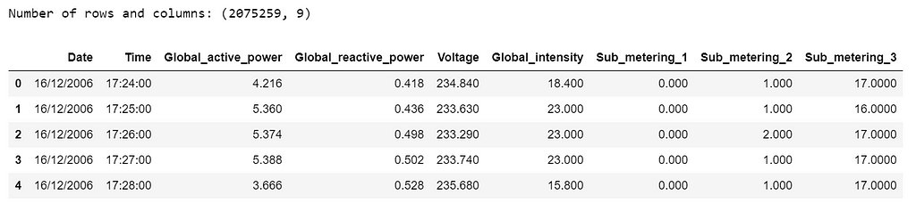
print('Number of rows and columns:', df.shape)
df.head(5)
The following data pre-processing and feature engineering steps need to be done:
- Merge Date & Time into one column and change to datetime type.
- Convert Global_active_power to numeric and remove missing values (1.2%).
- Create year, quarter, month and day features.
- Create weekday feature, “0” is weekend and “1” is weekday.
df['date_time'] = pd.to_datetime(df['Date'] + ' ' + df['Time'])
df['Global_active_power'] = pd.to_numeric(df['Global_active_power'], errors='coerce')
df = df.dropna(subset=['Global_active_power'])
df['date_time']=pd.to_datetime(df['date_time'])
df['year'] = df['date_time'].apply(lambda x: x.year)
df['quarter'] = df['date_time'].apply(lambda x: x.quarter)
df['month'] = df['date_time'].apply(lambda x: x.month)
df['day'] = df['date_time'].apply(lambda x: x.day)
df=df.loc[:,['date_time','Global_active_power', 'year','quarter','month','day']]
df.sort_values('date_time', inplace=True, ascending=True)
df = df.reset_index(drop=True)
df["weekday"]=df.apply(lambda row: row["date_time"].weekday(),axis=1)
df["weekday"] = (df["weekday"] < 5).astype(int)
print('Number of rows and columns after removing missing values:', df.shape)
print('The time series starts from: ', df.date_time.min())
print('The time series ends on: ', df.date_time.max())
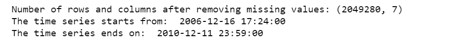
After removing the missing values, the data contains 2,049,280 measurements gathered between December 2006 and November 2010 (47 months).
The initial data contains several variables. We will here focus on a single value : a house’s Global_active_power history, that is, household global minute-averaged active power in kilowatt.
Statistical Normality Test
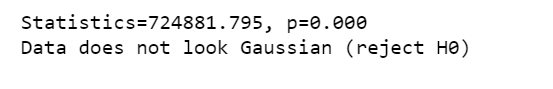
There are several statistical tests that we can use to quantify whether our data looks as though it was drawn from a Gaussian distribution. And we will use D’Agostino’s K² Test.
In the SciPy implementation of the test, we will interpret the p value as follows.
- p <= alpha: reject H0, not normal.
- p > alpha: fail to reject H0, normal.
stat, p = stats.normaltest(df.Global_active_power)
print('Statistics=%.3f, p=%.3f' % (stat, p))
alpha = 0.05
if p > alpha:
    print('Data looks Gaussian (fail to reject H0)')
else:
    print('Data does not look Gaussian (reject H0)')
We can also calculate Kurtosis and Skewness, to determine if the data distribution departs from the normal distribution.
sns.distplot(df.Global_active_power);
print( 'Kurtosis of normal distribution: {}'.format(stats.kurtosis(df.Global_active_power)))
print( 'Skewness of normal distribution: {}'.format(stats.skew(df.Global_active_power)))
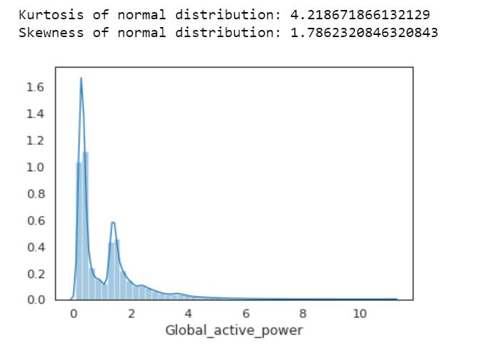
Kurtosis: describes heaviness of the tails of a distribution
Normal Distribution has a kurtosis of close to 0. If the kurtosis is greater than zero, then distribution has heavier tails. If the kurtosis is less than zero, then the distribution is light tails. And our Kurtosis is greater than zero.
Skewness: measures asymmetry of the distribution
If the skewness is between -0.5 and 0.5, the data are fairly symmetrical. If the skewness is between -1 and — 0.5 or between 0.5 and 1, the data are moderately skewed. If the skewness is less than -1 or greater than 1, the data are highly skewed. And our skewness is greater than 1.
First Time Series Plot
df1=df.loc[:,['date_time','Global_active_power']]
df1.set_index('date_time',inplace=True)
df1.plot(figsize=(12,5))
plt.ylabel('Global active power')
plt.legend().set_visible(False)
plt.tight_layout()
plt.title('Global Active Power Time Series')
sns.despine(top=True)
plt.show();

Apparently, this plot is not a good idea. Don’t do this.
Box Plot of Yearly vs. Quarterly Global Active Power
plt.figure(figsize=(14,5))
plt.subplot(1,2,1)
plt.subplots_adjust(wspace=0.2)
sns.boxplot(x="year", y="Global_active_power", data=df)
plt.xlabel('year')
plt.title('Box plot of Yearly Global Active Power')
sns.despine(left=True)
plt.tight_layout()
plt.subplot(1,2,2)
sns.boxplot(x="quarter", y="Global_active_power", data=df)
plt.xlabel('quarter')
plt.title('Box plot of Quarterly Global Active Power')
sns.despine(left=True)
plt.tight_layout();
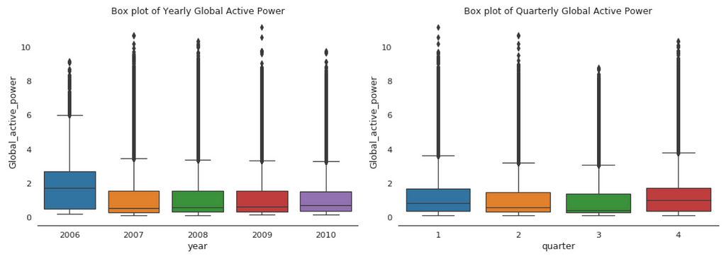
When we compare box plot side by side for each year, we notice that the median global active power in 2006 is much higher than the other years’. This is a little bit misleading. If you remember, we only have December data for 2006. While apparently December is the peak month for household electric power consumption.
This is consistent with the quarterly median global active power, it is higher in the 1st and 4th quarters (winter), and it is the lowest in the 3rd quarter (summer).
Global Active Power Distribution
plt.figure(figsize=(14,6))
plt.subplot(1,2,1)
df['Global_active_power'].hist(bins=50)
plt.title('Global Active Power Distribution')
plt.subplot(1,2,2)
stats.probplot(df['Global_active_power'], plot=plt);
df1.describe().T
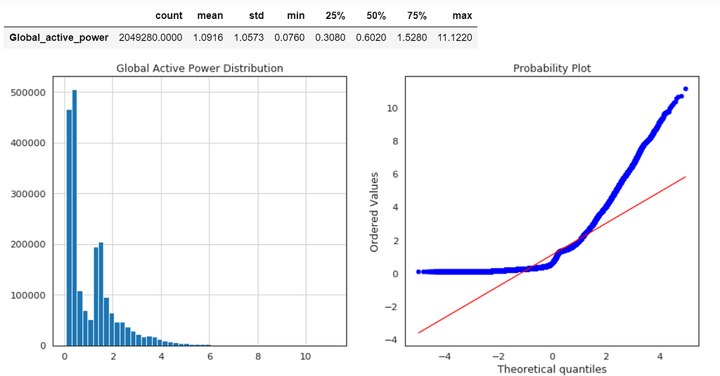
Normal probability plot also shows the data is far from normally distributed.
Average Global Active Power Resampled Over Day, Week, Month, Quarter and Year
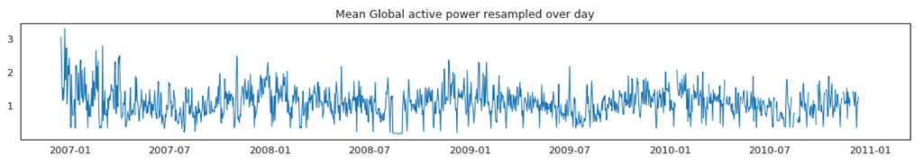
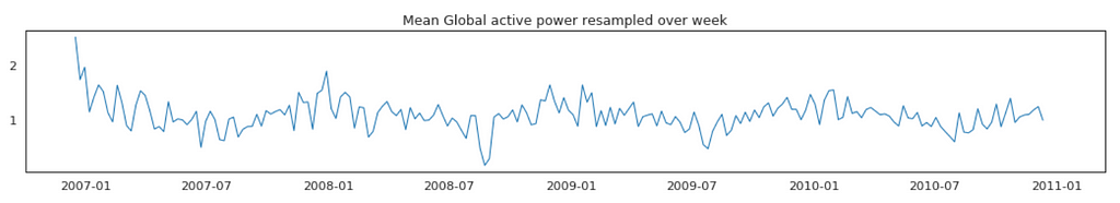
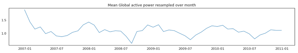
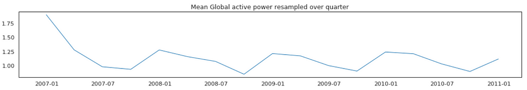

In general, our time series does not have a upward or downward trend. The highest average power consumption seems to be prior to 2007, actually it was because we had only December data in 2007 and that month was a high consumption month. In another word, if we compare year by year, it has been steady.
Plot Mean Global Active Power Grouped by Year, Quarter, Month and Day
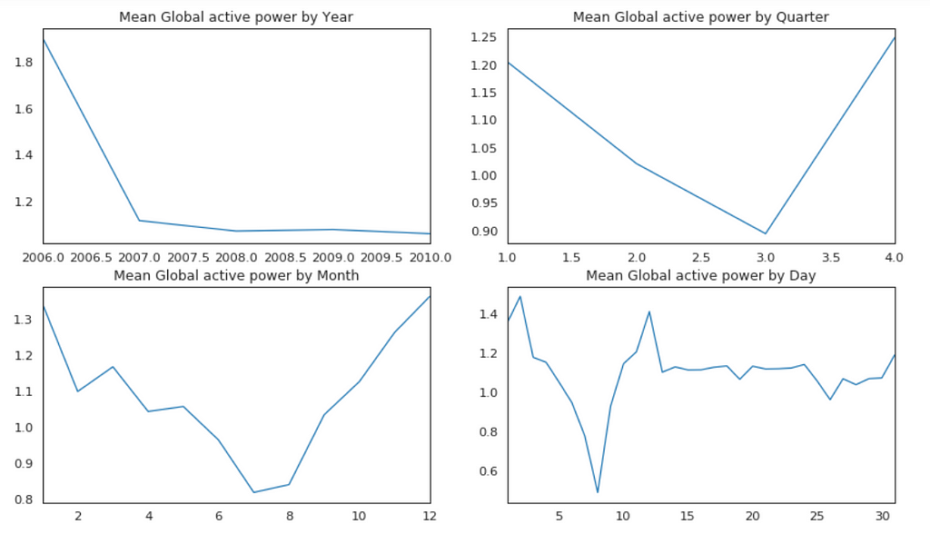
The above plots confirmed our previous discoveries. By year, it was steady. By quarter, the lowest average power consumption was in the 3rd quarter. By month, the lowest average power consumption was in July and August. By day, the lowest average power consumption was around 8th of the month (don’t know why).
Global Active Power by Years
This time, we remove 2006.
pd.pivot_table(df.loc[df['year'] != 2006], values = "Global_active_power",
               columns = "year", index = "month").plot(subplots = True, figsize=(12, 12), layout=(3, 5), sharey=True);
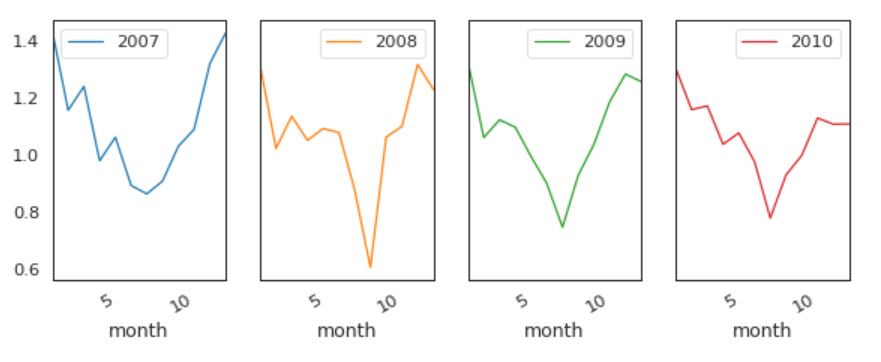
The pattern is similar every year from 2007 to 2010.
Global Active Power Consumption in Weekdays vs. Weekends
dic={0:'Weekend',1:'Weekday'}
df['Day'] = df.weekday.map(dic)
a=plt.figure(figsize=(9,4))
plt1=sns.boxplot('year','Global_active_power',hue='Day',width=0.6,fliersize=3,
                    data=df)
a.legend(loc='upper center', bbox_to_anchor=(0.5, 1.00), shadow=True, ncol=2)
sns.despine(left=True, bottom=True)
plt.xlabel('')
plt.tight_layout()
plt.legend().set_visible(False);
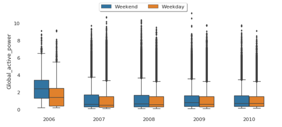
The median global active power in weekdays seems to be lower than the weekends prior to 2010. In 2010, they were identical.
Factor Plot of Global Active Power by Weekday vs. Weekend
plt1=sns.factorplot('year','Global_active_power',hue='Day',
                    data=df, size=4, aspect=1.5, legend=False)
plt.title('Factor Plot of Global active power by Weekend/Weekday')
plt.tight_layout()
sns.despine(left=True, bottom=True)
plt.legend(loc='upper right');

Both weekdays and weekends follow the similar pattern over year.
In principle we do not need to check for stationarity nor correct for it when we are using an LSTM. However, if the data is stationary, it will help with better performance and make it easier for the neural network to learn.
Stationarity
In statistics, the Dickey–Fuller test tests the null hypothesis that a unit root is present in an autoregressive model. The alternative hypothesis is different depending on which version of the test is used, but is usually stationarity or trend-stationarity.
Stationary series has constant mean and variance over time. Rolling average and the rolling standard deviation of time series do not change over time.
Dickey-Fuller test
Null Hypothesis (H0): It suggests the time series has a unit root, meaning it is non-stationary. It has some time dependent structure.
Alternate Hypothesis (H1): It suggests the time series does not have a unit root, meaning it is stationary. It does not have time-dependent structure.
p-value > 0.05: Accept the null hypothesis (H0), the data has a unit root and is non-stationary.
p-value <= 0.05: Reject the null hypothesis (H0), the data does not have a unit root and is stationary.

From the above results, we will reject the null hypothesis H0, the data does not have a unit root and is stationary.
LSTM
The task here will be to predict values for a time series given the history of 2 million minutes of a household’s power consumption. We are going to use a multi-layered LSTM recurrent neural network to predict the last value of a sequence of values.
If you want to reduce the computation time, and also get a quick result to test the model, you may want to resample the data over hour. I will keep it is in minute.
The following data pre-processing and feature engineering need to be done before construct the LSTM model.
- Create the dataset, ensure all data is float.
- Normalize the features.
- Split into training and test sets.
- Convert an array of values into a dataset matrix.
- Reshape into X=t and Y=t+1.
- Reshape input to be 3D (num_samples, num_timesteps, num_features).
Model Architecture
- Define the LSTM with 100 neurons in the first hidden layer and 1 neuron in the output layer for predicting Global_active_power. The input shape will be 1 time step with 30 features.
- Dropout 20%.
- Use the MSE loss function and the efficient Adam version of stochastic gradient descent.
- The model will be fit for 20 training epochs with a batch size of 70.
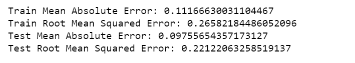
Make Predictions
train_predict = model.predict(X_train)
test_predict = model.predict(X_test)
# invert predictions
train_predict = scaler.inverse_transform(train_predict)
Y_train = scaler.inverse_transform([Y_train])
test_predict = scaler.inverse_transform(test_predict)
Y_test = scaler.inverse_transform([Y_test])
print('Train Mean Absolute Error:', mean_absolute_error(Y_train[0], train_predict[:,0]))
print('Train Root Mean Squared Error:',np.sqrt(mean_squared_error(Y_train[0], train_predict[:,0])))
print('Test Mean Absolute Error:', mean_absolute_error(Y_test[0], test_predict[:,0]))
print('Test Root Mean Squared Error:',np.sqrt(mean_squared_error(Y_test[0], test_predict[:,0])))
Plot Model Loss
plt.figure(figsize=(8,4))
plt.plot(history.history['loss'], label='Train Loss')
plt.plot(history.history['val_loss'], label='Test Loss')
plt.title('model loss')
plt.ylabel('loss')
plt.xlabel('epochs')
plt.legend(loc='upper right')
plt.show();

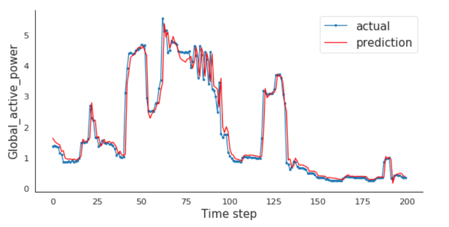
Compare Actual vs. Prediction
For me, every time step is one minute. If you resampled the data over hour earlier, then every time step is one hour for you.
I will compare the actual and predictions for the last 200 minutes.
aa=[x for x in range(200)]
plt.figure(figsize=(8,4))
plt.plot(aa, Y_test[0][:200], marker='.', label="actual")
plt.plot(aa, test_predict[:,0][:200], 'r', label="prediction")
# plt.tick_params(left=False, labelleft=True) #remove ticks
plt.tight_layout()
sns.despine(top=True)
plt.subplots_adjust(left=0.07)
plt.ylabel('Global_active_power', size=15)
plt.xlabel('Time step', size=15)
plt.legend(fontsize=15)
plt.show();
LSTMs are amazing!
Jupyter notebook can be found on Github. Enjoy the rest of the week!
Reference:
Multivariate Time Series Forecasting with LSTMs in Keras
Time Series Analysis, Visualization & Forecasting with LSTM was originally published in Towards Data Science on Medium, where people are continuing the conversation by highlighting and responding to this story.