Dropbox has over 500 million users. It has users in over 200 countries and supports over 20 languages. This explains the scale of data within the company. 4000 files are edited every second on Dropbox. All this contributes to gigantic amounts of data. The syncing of data and keeping everything up to date for so many files is a daunting task in itself and Dropbox manages all this very efficiently. Another interesting thing within Dropbox is the heavy use of Python which is the language of choice when it comes to Data Science. The product itself uses Python which makes it even better when it comes to building data science applications. This is great for any Data Scientist to build on top of. Dropbox promises an ML heavy inclination for a Data Scientist which maybe very interesting for many of them.
The interview process starts with a recruiter screen. This interview goes through your resume and a chat over the phone by the recruiter to determine if you are a fit for the role. This is followed by a phone interview with the hiring manager. If you clear this interview, the next round is an onsite interview with team members. The onsite interviews might be ML heavy depending on your team and composition of the interview panel.
How would you set up a propensity model for the SMB team looking at companies between 5–200 employees?
How will you up-sell to a customer based on data?
Find out which employee reports to which manager using SQL?
How will you maintain a data metric?
Given a table with a series of values how will you determine if there are missing values and what are those?
Given a root directory, return all file paths grouped by duplicate files.
Describe how MD5 algorithm works.
From a user perspective how can you determine that the search experience is good or bad?
How can you analyze order data to determine churn?
Reflecting on the Questions
The data science team at at Dropbox is working in two areas. One on the BI analytics space to help improve renewal rate and reduce churn by using data. The second area is to improve the product itself like trying to know what file will be accessed next. The interview questions reflect this dichotomy with Dropbox. A data scientist should decide where he would fit and interview accordingly. Deep ML knowledge or knowledge of how to improve customer retention via data can help you land a job with one of the world’s largest document database!
Subscribe to our Acing AI newsletter, I promise not to spam and its FREE!
Thanks for reading! 😊 If you enjoyed it, test how many times can you hit 👏 in 5 seconds. It’s great cardio for your fingers AND will help other people see the story.
The sole motivation of this blog article is to learn about Dropbox and its technologies helping people to get into it. All data is sourced from online public sources. I aim to make this a living document, so any updates and suggested changes can always be included. Please provide relevant feedback.
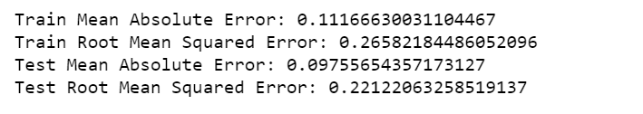
Overfitting is where test error is high and training error is low. Mine is opposite. In addition, they are not far apart 0.00062 vs. 0.00040. It is possible because of the dropout layer. However, it is not overfitting.
Statistics normality test, Dickey–Fuller test for stationarity, Long short-term memory
The title says it all.
Without further ado, let’s roll!
The Data
The data is the measurements of electric power consumption in one household with a one-minute sampling rate over a period of almost 4 years that can be downloaded from here.
Different electrical quantities and some sub-metering values are available. However, we are only interested in Global_active_power variable.
import numpy as np
import matplotlib.pyplot as plt
import pandas as pd
pd.set_option('display.float_format', lambda x: '%.4f' % x)
import seaborn as sns
sns.set_context("paper", font_scale=1.3)
sns.set_style('white')
import warnings
warnings.filterwarnings('ignore')
from time import time
import matplotlib.ticker as tkr
from scipy import stats
from statsmodels.tsa.stattools import adfuller
from sklearn import preprocessing
from statsmodels.tsa.stattools import pacf
%matplotlib inline
import math
import keras
from keras.models import Sequential
from keras.layers import Dense
from keras.layers import LSTM
from keras.layers import Dropout
from keras.layers import *
from sklearn.preprocessing import MinMaxScaler
from sklearn.metrics import mean_squared_error
from sklearn.metrics import mean_absolute_error
from keras.callbacks import EarlyStopping
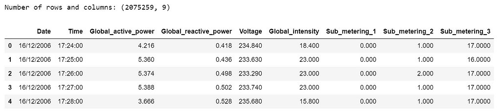
df=pd.read_csv('household_power_consumption.txt', delimiter=';')
print('Number of rows and columns:', df.shape)
df.head(5)
Table 1
The following data pre-processing and feature engineering steps need to be done:
Merge Date & Time into one column and change to datetime type.
Convert Global_active_power to numeric and remove missing values (1.2%).
Create year, quarter, month and day features.
Create weekday feature, “0” is weekend and “1” is weekday.
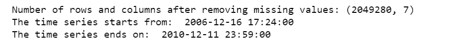
print('Number of rows and columns after removing missing values:', df.shape)
print('The time series starts from: ', df.date_time.min())
print('The time series ends on: ', df.date_time.max())
After removing the missing values, the data contains 2,049,280 measurements gathered between December 2006 and November 2010 (47 months).
The initial data contains several variables. We will here focus on a single value : a house’s Global_active_power history, that is, household global minute-averaged active power in kilowatt.
Statistical Normality Test
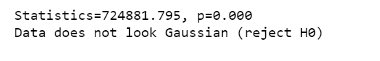
There are several statistical tests that we can use to quantify whether our data looks as though it was drawn from a Gaussian distribution. And we will use D’Agostino’s K² Test.
In the SciPy implementation of the test, we will interpret the p value as follows.
p <= alpha: reject H0, not normal.
p > alpha: fail to reject H0, normal.
stat, p = stats.normaltest(df.Global_active_power)
print('Statistics=%.3f, p=%.3f' % (stat, p))
alpha = 0.05
if p > alpha:
    print('Data looks Gaussian (fail to reject H0)')
else:
    print('Data does not look Gaussian (reject H0)')
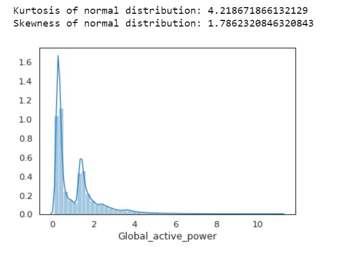
We can also calculate Kurtosis and Skewness, to determine if the data distribution departs from the normal distribution.
sns.distplot(df.Global_active_power);
print( 'Kurtosis of normal distribution: {}'.format(stats.kurtosis(df.Global_active_power)))
print( 'Skewness of normal distribution: {}'.format(stats.skew(df.Global_active_power)))
Figure 1
Kurtosis: describes heaviness of the tails of a distribution
Normal Distribution has a kurtosis of close to 0. If the kurtosis is greater than zero, then distribution has heavier tails. If the kurtosis is less than zero, then the distribution is light tails. And our Kurtosis is greater than zero.
Skewness: measures asymmetry of the distribution
If the skewness is between -0.5 and 0.5, the data are fairly symmetrical. If the skewness is between -1 and — 0.5 or between 0.5 and 1, the data are moderately skewed. If the skewness is less than -1 or greater than 1, the data are highly skewed. And our skewness is greater than 1.
First Time Series Plot
df1=df.loc[:,['date_time','Global_active_power']]
df1.set_index('date_time',inplace=True)
df1.plot(figsize=(12,5))
plt.ylabel('Global active power')
plt.legend().set_visible(False)
plt.tight_layout()
plt.title('Global Active Power Time Series')
sns.despine(top=True)
plt.show();
Figure 2
Apparently, this plot is not a good idea. Don’t do this.
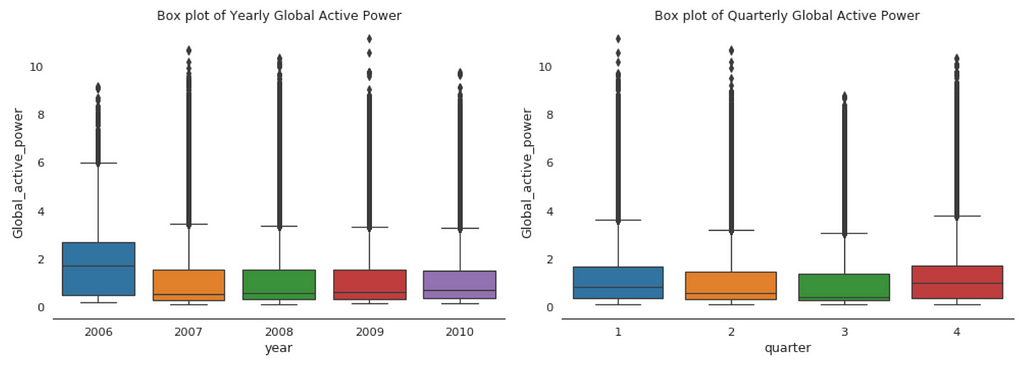
Box Plot of Yearly vs. Quarterly Global Active Power
plt.figure(figsize=(14,5))
plt.subplot(1,2,1)
plt.subplots_adjust(wspace=0.2)
sns.boxplot(x="year", y="Global_active_power", data=df)
plt.xlabel('year')
plt.title('Box plot of Yearly Global Active Power')
sns.despine(left=True)
plt.tight_layout()
plt.subplot(1,2,2)
sns.boxplot(x="quarter", y="Global_active_power", data=df)
plt.xlabel('quarter')
plt.title('Box plot of Quarterly Global Active Power')
sns.despine(left=True)
plt.tight_layout();
Figure 3
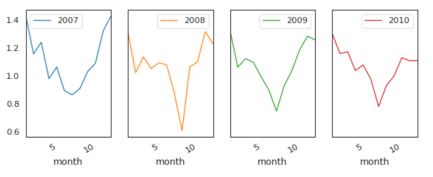
When we compare box plot side by side for each year, we notice that the median global active power in 2006 is much higher than the other years’. This is a little bit misleading. If you remember, we only have December data for 2006. While apparently December is the peak month for household electric power consumption.
This is consistent with the quarterly median global active power, it is higher in the 1st and 4th quarters (winter), and it is the lowest in the 3rd quarter (summer).
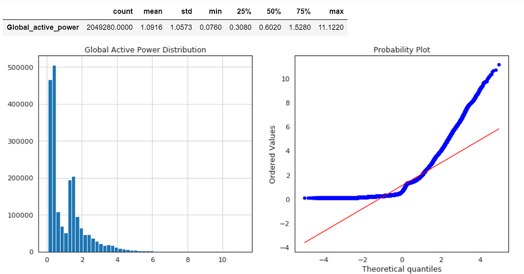
Global Active Power Distribution
plt.figure(figsize=(14,6))
plt.subplot(1,2,1)
df['Global_active_power'].hist(bins=50)
plt.title('Global Active Power Distribution')
Normal probability plot also shows the data is far from normally distributed.
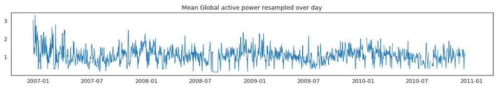
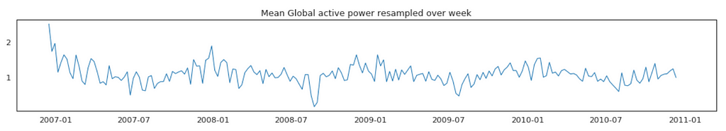
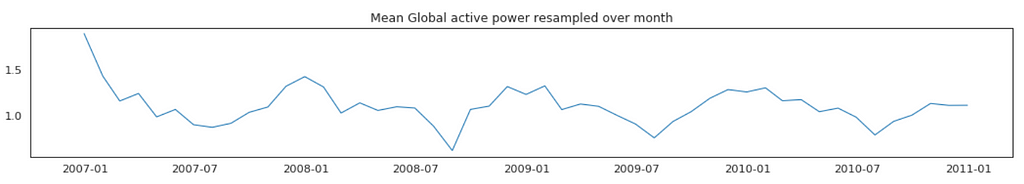
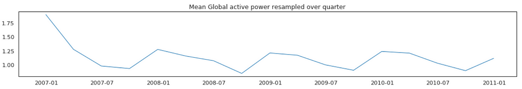
Average Global Active Power Resampled Over Day, Week, Month, Quarter and Year
Figure 5
In general, our time series does not have a upward or downward trend. The highest average power consumption seems to be prior to 2007, actually it was because we had only December data in 2007 and that month was a high consumption month. In another word, if we compare year by year, it has been steady.
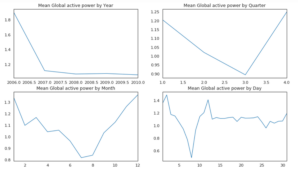
Plot Mean Global Active Power Grouped by Year, Quarter, Month and Day
Figure 6
The above plots confirmed our previous discoveries. By year, it was steady. By quarter, the lowest average power consumption was in the 3rd quarter. By month, the lowest average power consumption was in July and August. By day, the lowest average power consumption was around 8th of the month (don’t know why).
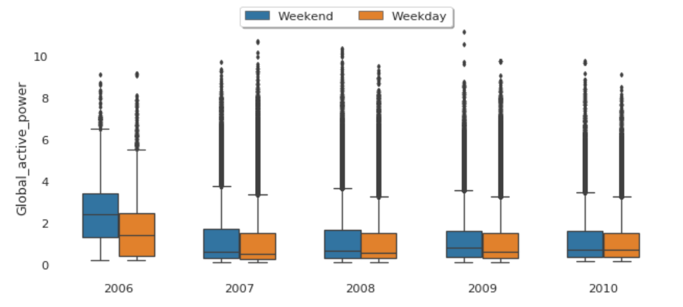
The median global active power in weekdays seems to be lower than the weekends prior to 2010. In 2010, they were identical.
Factor Plot of Global Active Power by Weekday vs. Weekend
plt1=sns.factorplot('year','Global_active_power',hue='Day',
                    data=df, size=4, aspect=1.5, legend=False)
plt.title('Factor Plot of Global active power by Weekend/Weekday')
plt.tight_layout()
sns.despine(left=True, bottom=True)
plt.legend(loc='upper right');
Figure 9
Both weekdays and weekends follow the similar pattern over year.
In principle we do not need to check for stationarity nor correct for it when we are using an LSTM. However, if the data is stationary, it will help with better performance and make it easier for the neural network to learn.
Stationarity
In statistics, the Dickey–Fuller test tests the null hypothesis that a unit root is present in an autoregressive model. The alternative hypothesis is different depending on which version of the test is used, but is usually stationarity or trend-stationarity.
Stationary series has constant mean and variance over time. Rolling average and the rolling standard deviation of time series do not change over time.
Dickey-Fuller test
Null Hypothesis (H0): It suggests the time series has a unit root, meaning it is non-stationary. It has some time dependent structure.
Alternate Hypothesis (H1): It suggests the time series does not have a unit root, meaning it is stationary. It does not have time-dependent structure.
p-value > 0.05: Accept the null hypothesis (H0), the data has a unit root and is non-stationary.
p-value <= 0.05: Reject the null hypothesis (H0), the data does not have a unit root and is stationary.
Figure 10
From the above results, we will reject the null hypothesis H0, the data does not have a unit root and is stationary.
LSTM
The task here will be to predict values for a time series given the history of 2 million minutes of a household’s power consumption. We are going to use a multi-layered LSTM recurrent neural network to predict the last value of a sequence of values.
If you want to reduce the computation time, and also get a quick result to test the model, you may want to resample the data over hour. I will keep it is in minute.
The following data pre-processing and feature engineering need to be done before construct the LSTM model.
Create the dataset, ensure all data is float.
Normalize the features.
Split into training and test sets.
Convert an array of values into a dataset matrix.
Reshape into X=t and Y=t+1.
Reshape input to be 3D (num_samples, num_timesteps, num_features).
Model Architecture
Define the LSTM with 100 neurons in the first hidden layer and 1 neuron in the output layer for predicting Global_active_power. The input shape will be 1 time step with 30 features.
Dropout 20%.
Use the MSE loss function and the efficient Adam version of stochastic gradient descent.
The model will be fit for 20 training epochs with a batch size of 70.
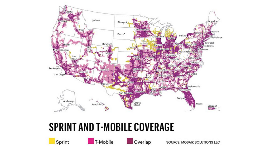
Sprint Corporation headquarters are located in Overland Park, Kansas. The company is widely recognized for developing, engineering and deploying innovative technologies, including the first wireless 4G service from a national carrier in the United States. The American Customer Satisfaction Index rated Sprint as the most improved company in customer satisfaction, across all 47 industries, during the last five years. The merger of T-Mobile and Sprint, the third- and fourth-largest carriers in the U.S happened in 2018. The combined company would have more than 126 million customers. One cannot imagine the amount of data that resides within a telecom company let alone two companies after merging. Sprint established subsidiary Pinsight Media to investigate ways of capitalizing on that data. Since then it has gone from serving zero to six billion ad impressions per month, based on “authenticated first party data” which it alone has access to. This kind of data is a huge advantage for any Data Scientist and provide a tremendous potential to grow their career.
The interview process with an HR interview. The next interview is a take home ML and Coding assessment. The assessment is statistics heavy and requires in depth knowledge about probability distributions and ML Algorithms. The assessment is followed a case study around predictions. The case study provides a problem statement and requires to come up with predictions based on the dataset provided in the case study. The case study is followed by the technical interview and finally a hiring manager interview. The interview process is intense consisting of five rounds but the company is well worth it.
Explain SVMs and how they could be used in telecom.
What are the differences between RDBMS and NoSQL?
What are the different Data Structures used in Spark?
Which Data Structure is apt for Geolocation Analysis?
What is standard deviation? Why do we need it?
Given n samples from a uniform distribution[0,d]. How do you estimate d?
In an A/B test, how can you check if assignment to the various buckets was truly random?
How do you optimize model parameters during model building?
How does regularization reduce over fitting?
Reflecting on the Questions
The data science team at Sprint which is now merged with T-Mobile has some of the best data sets in the world. Their stack is hadoop and spark based. Their questions reflect the kind of work they do where data insights could be employed for ads. A decent knowledge of how ML can be applied to Telecom can surely land you a job with one of the world’s largest Telecom giant!
Subscribe to our Acing AI newsletter, I promise not to spam and its FREE!
Thanks for reading! 😊 If you enjoyed it, test how many times can you hit 👏 in 5 seconds. It’s great cardio for your fingers AND will help other people see the story.
The sole motivation of this blog article is to learn about Sprint and its technologies helping people to get into it. All data is sourced from online public sources. I aim to make this a living document, so any updates and suggested changes can always be included. Please provide relevant feedback.
Citicorp and Travelers’ Group has total assets of $1.7 trillion.
In America, Citibank is one of the four main firms that accounts for half of the nation’s total mortgages, and two-thirds of the total credit cards. Although this institution isn’t necessarily the largest in America, it is often considered to be the largest banking facility across the globe. Citibank serves a mass number of over 200 million customers across a span of 160 countries. Its main location functions through Citibank Europe, stationed in the Czech Republic. The Spend Tracker which is quite common at banks all over the world today was started by Citibank first. Citibank which provides such heterogeneous financial products showcases a wide variety of information on its spend tracker for its customers from sign-on bonuses, bonus amounts and expiration dates, bonus miles, and even how much you have to spend in order to get certain rewards. Such varied information across multiple products and across 200 million customers makes it one of the best companies for Data Scientists to work at.
The interview process starts with a phone interview. The phone interview is a basic Data Science Q&A interview. The phone interview is followed by an onsite interview. The onsite interview consists of interview with team leads, team members and SVPs. There may or may not be an online SQL assessment before the onsite. The SQL assessment is usually a difficult one.
Given a list of integers, find all combinations that sum to a given integer.
Segment a long string into a set of valid words using a dictionary. Return false if the string cannot be segmented. What is the complexity of your solution?
Write a SQL query to find the repeated items in a column.
How do you use the Q data structure to maintain the state in Spark.
Design a Trading system with high throughput and low latency.
How do you describe a financial planning process?
What would you prefer, being attacked by a giant chicken or 100 small ones?
What problems did you encounter in your project(resume based) and what are the solutions you did?
Explain your thesis in layman’s terms.
Find the second maximum value of a column in a Database table.
Reflecting on the Questions
The data science team at Citigroup uses Hadoop and Spark. They have a geographical diverse team located in the US, Europe and India. Their questions are a mix of questions related to coding, SQL, Systems Design, Hadoop and Spark. They are based on foundational and deep aspects of Data Science. If you work hard on your basics, you can surely land a job at one of the largest banks of the world!
Subscribe to our Acing AI newsletter, I promise not to spam and its FREE!
Thanks for reading! 😊 If you enjoyed it, test how many times can you hit 👏 in 5 seconds. It’s great cardio for your fingers AND will help other people see the story.
The sole motivation of this blog article is to learn about Citibank and its technologies helping people to get into it. All data is sourced from online public sources. I aim to make this a living document, so any updates and suggested changes can always be included. Please provide relevant feedback.
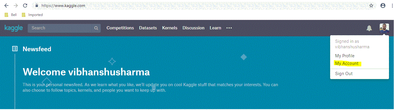
Data scientists often practices their skills on Kaggle datasets, its always trickier to download and manage the datasets an easier way is using the Google Colab . Colab provides an easier integration with Kaggle using couple of simple command lines. Let’s dive in!!!
Open kaggle home, go to your account by clicking your profile picture at top right hand corner …
Kaggle Account
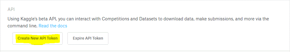
Now scroll down to the API section and click on “Create new API token”
get kaggle API key
You will get a kaggle.json file, save it somewhere in your PC. Now bring up google colab make sure to sign in with your google account.
Your first Colab notebook(rename notebook to whatever you want)
You can always choose the python version and your choice of hardware (GPU/TPU) by clicking ‘change runtime type’ under ‘runtime tab’.
Next is to install kaggle library in your environment, just type below command . Note that Colab needs an ! at the starting on every command that you may not need when you work in your PC(command prompt or Anaconda).
!pip install kaggle
All unix commands like ls, cd, mkdir, unzip & pip works directly on Colab with a prefixed “!”. Once you install it create a directory named Kaggle.
!mkdir .kaggle
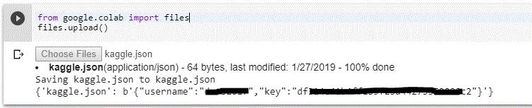
Now you’ve to use the kaggle.json file that you’ve downloaded to connect your Colab notebook with Kaggle. Use the below command to upload you json file. once you type it, you will automatically prompted to upload your file.
upload your kaggle.json by clicking choose files and display of your username and key will notify that you’ve uploaded it correctly.
Move this uploaded file into kaggle directory and give proper permissions.
You are good to go now !!!
Basic Kaggle commands
I am listing the most useful kaggle commands that you’ll need to work on kaggle datasets.
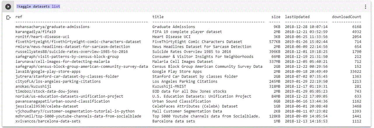
Browsing Kaggle datasets: This command will list the datasets available in kaggle.
!kaggle datasets list
Others information like size of the dataset and download count is also available in the details
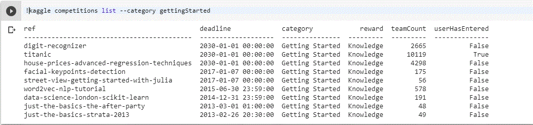
To search any specific competition you can use below command e.g beginners competitions can be listed using
!kaggle competitions list — category gettingStarted.
2. Checking leader board of any competition : By using below command you can check leader board of any competition you want.
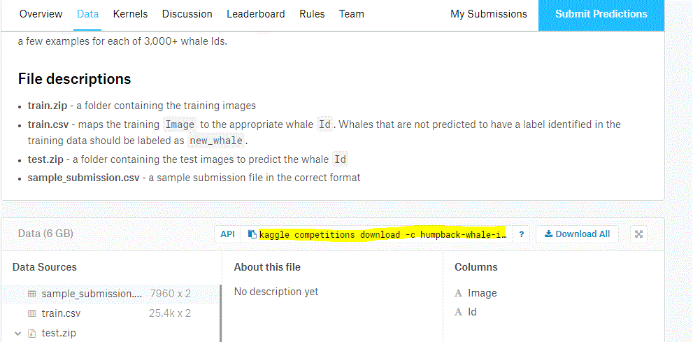
3. Downloading datasets for a competition : By using the below command you can download dataset for any competition. Go to kaggle → chose the competition → go the data tab and copy the API link.
You can directly run this command to download dataset.
It’s good to create 2 separate directories Train and Test, move the respective zip files in the folder and unzip it.
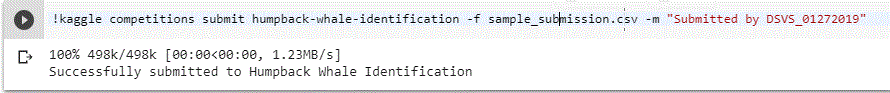
4. Submission for a competition : Every competition ask you to upload the submission file in csv which contains the predictions done by your code. you can directly submit from colab using below command.
!kaggle competitions submit humpback-whale-identification -f sample_submission.csv -m “Submitted by DSVS_01272019”
Pro-tip : You can create a small shell script for automated submissions but remember kaggle will except only 5 submissions per day.
Conclusion : You can use above commands to make your kaggling journey easier for you using Google Colab. If you like this article please share it with other kagglers and data scientists. Do clap, if you find this useful. I’ll be covering important concepts in more interesting way in my next posts. Thanks for reading….
I’ve been learning and applying end to end data science concepts from past 2 and half years, Below is the list of resources and MOOC’s which I used to learn. If you work fast paced you can complete this in 4 months(investing 3–4 hours everyday), 2 points you need to consider for completing this course is discipline and consistency. I recommend you to watch the videos at 1.5x – 2x(try different speeds and see what suits you best).
Month 1 — Python basics and its implementation in data science
Week 4– This week you’ll learn the intermediate by below course provided by university of Michigan https://www.coursera.org/specializations/data-science-python. Suggestion for this course restore your browser and python editor such both are visible on the screen at a time so that you can listen to the course and do the coding side by side.
Month 2— Mathematics basics and its implementation in data science.
This whole month we are on a journey of understanding mathematics. Will divide this month learn 4 main mathematics concepts. Linear Algebra, Calculus, Probability & Statistics. Divide your study hours in such a way that you’ll visit one lecture from Math of Intelligence by Siraj( https://www.youtube.com/watch?v=xRJCOz3AfYY&list=PL2-dafEMk2A7mu0bSksCGMJEmeddU_H4D) everyday as you progress on this journey.
Week 1– Linear Algebra course by MIT, I recommend to listen it on 2.5x-3x. First listen all the concepts from the video then write it on a paper(I’ll share those concepts in my next post). 3blue1brown should be on your subscription list, Essence of Linear Algebra ( https://www.youtube.com/watch?v=kjBOesZCoqc&index=1&list=PLZHQObOWTQDPD3MizzM2xVFitgF8hE_ab) should be your next course, prefer a weekend for this course and spend 4–5 hours to finish it in one go.
Week 3– Introduction to Probability, this course will take more than a week(utilize remaining calculus week 2) https://courses.edx.org/courses/course-v1:MITx+6.041x_4+1T2017/course/ By this time you may be frustrated but do not loose your cool and do not apply to any job as you have not achieve what is required for the post of Machine learning engineer or a Data Scientist.
Month 3- Machine Learning basics and related algorithms.
This month you will learn all the machine learning algorithms.
Week 1– This course by Udemy will help you understanding machine learning line by line, it is designed using scikit-learn and Keras (both best libraries for academia) https://www.udemy.com/machinelearning/, you will find implementation in both R and Python, i suggest keep R videos for later as you’ve already invested learning python so in each section you can skip half videos and excel this course. Also this course contains deep- learning lectures as one separate section park that aside too.
Week 3– Now there is something which may seem unfair to you and let you think why do I need to repeat the same course from a different provider. but believe me as both black and white pawns are important in a chess game as they complement each other being in opposite team the below mentioned course will also complement the one you’ve learnt in week 2 and you will learn all the missing components that too using TensorFlow. (https://classroom.udacity.com/courses/ud120). Believe you can easily skim through this course and you already know the concepts but order of doing these course is important.
Week 4– Now its the time to apply your knowledge to some real world problem and create you resume. Take part in any kaggle competition which involves categorization or regression and complete it till end and submit your solution(the confidence you’ll get by doing this is something no univ. degree can give you).
Month 4- Deep Learning basics from beginner to advance.
This month you’ll be applying all your knowledge to learn advance concepts, taking part in kaggle competitions and start applying for the jobs.
Week 1– Again, I’ll ask you to revisit Udemy for A-Z Deep Leaning course (https://www.udemy.com/deeplearning), don’t forget to add each code to your github profile as you keep progressing throughout this month.
Week 2 & 3 – Revisiting the same concept again will reinforce that concept and you’ll never forget it as it will be imprinted on your brain. Udacity’s deep learning nanodegree is such course (take its certificate that will help you finding new career opportunities)
Week 4– This week you’ll be finalizing your concepts and start fulfilling your dreams. I recommend to go through fast.ai course (http://course.fast.ai/) and a brilliant course and story telling by Edx (https://www.edx.org/course/analytics-storytelling-impact-1) . Genuinely both can’t be completed in a week’s time but try to complete as soon as you can.
Conclusion : Till this point you’ve learnt enough concepts and have a good github profile to showcase potential recruiters. Keep posting your work on github as you proceed throughout the course. I’ll post detailed concepts in my next posts so that you don’t have to carry your notes. All the best and keep learning till you die.
Neural networks learn by iteratively updating their weights.
This is usually not a problem — an amount based on the gradient of the error is back-propagated through the network, weights are updated and progress is made. All is peaceful for the AI.
Occasionally, however, the neural network can enter an area where the loss function has an immense sharp gradient. This amount, when propagated back through the network, destroys the delicate patterns found in earlier steps and the damage seriously sets back training and the performance of the model.
Drawing an analogy to the Sun, the Sun allows for life to evolve on Earth, and at the same time we have a magnetosphere that protects the planet from the occasional massive solar flare. In the same way, neural networks need a magnetosphere.
One approach is to cap extreme gradients by just clipping them, setting a maximum limit to the gradient. However this has a couple drawbacks — the first is that it is challenging to find an appropriate limit (an extra hyperparameter to worry about), and secondly, the neural network loses information about the magnitude of the gradient if it is beyond that limit.
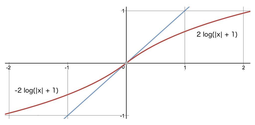
Instead, what if we just scaled the gradient to its logarithm? In that case, each order of magnitude increase in the gradient only adds a constant amount to the back-propagated signal. This is the magnetosphere for your neural network. It can handle massive gradients with ease.
Specifically, we join the two logarithmic functions below at the origin to create a smooth monotonic scale that we use to dampen the gradient, and, in doing so, we protect the network.
Instead of sending back the value itself (represented by the y=x blue line) we send back the the logarithm of it (+1) instead.
In TensorFlow, the gradient of the loss function can be dampened as follows, before sending it back through the network:
You can use this technique with any optimizer but often one of the best is the AdamOptimizer. Extending it in this simple way gives us the LogAdamOptimizer.
Does it work? Absolutely! I am using this approach in a 46-layer GAN to generate flowers, here are some samples from around iteration 140k where all gradients are ‘log-dampened’ gradients (i.e. using a LogAdam optimizer):
Enjoy, happy training.
I’ll have more to post about GAN training — follow if you are interested in learning more about them!