In this blog post we’re going to walk you through an example situation where you’ve just built a machine learning system that labels your data at volume and you want to perform manual quality assurance (QA) on some of the labels. How can you do so without overwhelming your limited resources? We’ll show you how, by using an Amazon SageMaker Ground Truth custom labeling job.
Rather than asking your workers to validate items one at a time, you’ll accomplish custom labeling by presenting a small batch of already-labeled items that have been assigned the same label. You’ll ask the worker to mark any that aren’t correct. In this way, a workforce is able to quickly assess a much larger quantity of data than they could label from scratch in the same time.
Use case tasks that might require quality assurance include:
- Requiring subject matter expert review and approval of labels before using them for sensitive use cases.
- Reviewing the labels to test the quality of the label-producing model.
- Identifying and counting mislabeled items, correcting them, and feeding them back into the training set.
- Analyzing label correctness versus confidence levels assigned by the model.
- Understanding whether a single threshold can be applied to all label classes, or whether using different thresholds for different classes is more appropriate.
- Exploring the use of a simpler model to label some initial data, then improving the model by using QA to validate the results and retrain.
In this blog post, you’ll walk through an example that addresses these use cases.
Background and solution overview
Amazon SageMaker Ground Truth offers easy access to public and private human labelers and provides them with built-in workflows and interfaces for common labeling tasks. In this blog post, you leverage and extend a Ground Truth Custom Labeling Workflow to support another time-consuming part of an overall system or business process: quality assurance of labels that have been applied, either via machine learning or by human labelers.
The input in this sample case is a list of labeled images to be validated by your private workforce. A worker sees a batch of images with a single label presented on a single screen, so they can validate a set of labels at a time. They can quickly scan the entire set and mark any that are not correctly labeled, picking out the ones that don’t “fit.” The validated results are stored in an Amazon DynamoDB table. Note that the volume of items in a batch should be chosen appropriately for the task, depending on their complexity and ability to be displayed for easy comparison and review. For our example, the batch size was chosen as 25 (configurable in the template) to balance cognitive load with the volume of images to be reviewed.
Anatomy of an Amazon SageMaker Ground Truth custom labeling job
An Amazon SageMaker Ground Truth custom labeling workflow consists of the following components:
- A workforce, to perform the labeling tasks. You can choose from a public workforce (for example, by using Amazon Mechanical Turk), or a private workforce.
- A JSON manifest file. The manifest tells Ground Truth where to find the job inputs. Each line item is a single object and corresponds to a single task. In our example, each object is a custom labeling input that points to a batch of images with the same label that will be presented to the worker at the same time for QA.
- A pre-labeling task AWS Lambda function. Before a labeling task is sent to the worker, your AWS Lambda pre-labeling function will be sent a JSON-formatted request to provide details. This JSON request must contain all the details the function will need in order to pass to the custom labeling job template.
- A custom labeling task template. The template defines what will be shown to the worker during the labeling task. The inputs to the task are made available to the template by the pre-labeling task Lambda function.
- A post-labeling task Lambda function. When the worker has completed the task, Ground Truth will send the results to your post-labeling task Lambda function. This Lambda function is generally used for annotation consolidation. The actual annotation data will be stored in a file designated by the s3Uri string in the payload object.
After these components are set up, you can create a Ground Truth labeling job that specifies these components. Ground Truth takes care of sending the individual labeling tasks to the workers and consolidating the outputs.
Solution overview
For the use case described in this blog post, the input to this process is images that have already been labeled by a machine learning model such as Amazon Rekognition, with a label and the confidence score the model had in assigning the label.
In this example, you’ll use a subset of the CalTech 101[i] dataset from AWS Open Datasets for image classification, which we’ve prelabeled for you. A corpus input file has been provided that specifies the subset of images to use and their labels. For example, our model had taken the following images and labeled them as “Crawdad”:
images/crayfish-image_0002.jpg,Crawdad,99.73238372802734
images/crayfish-image_0003.jpg,Crawdad,94.8296127319336
images/crayfish-image_0004.jpg,Crawdad,99.267822265625
Now, you’re interested in assessing the quality of the labels that have been applied.
The following diagram shows the overall process flow.
- In steps 1, 2 and 3, users identify images and upload them.
- In step 4, a model analyzes the images and labels them (step 5).
- In step 6, labels and images are aggregated and Ground Truth labeling jobs created.
- A workforce of labelers reviews the labels in step 7.
- In step 8a, the results are sent back to the model for retraining.
- In step 8b, the results are analyzed by data scientists to better understand model behavior, and by the business to understand how the model’s inferences in the production system should be best used.
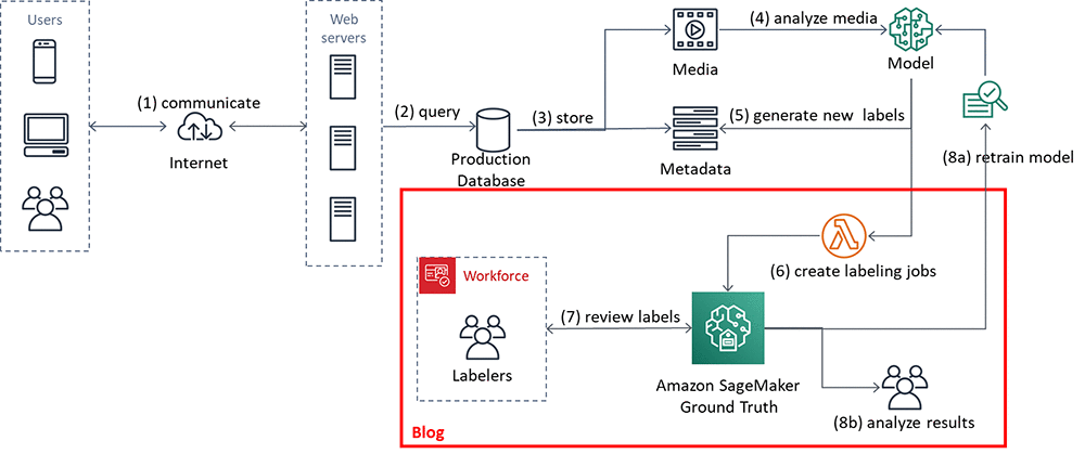
In the remainder of this blog post, we’ll walk you through an implementation that focuses on steps 6 and 7. You’ll also look at the results, step 8b.
Using the Amazon SageMaker Ground Truth custom labeling job for QA
In this section you’ll set up and execute the implementation components, shown in the figure that follows. The solution implementation uses two major components:
- An Amazon SageMaker Ground Truth custom labeling workflow.
- An Amazon DynamoDB table, used to store the results of the labeling task.
For ease of use, a Lambda function prepopulates an Amazon S3 bucket and an Amazon DynamoDB table for you.
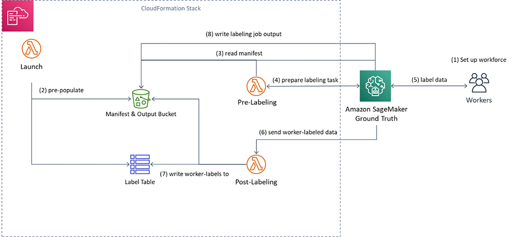
You’ll execute the following steps:
- First, you’ll create a private workforce (1), using the AWS Management Console.
- Then, you’ll execute a provided AWS CloudFormation stack to set up resources: the Amazon S3 bucket containing job inputs, a DynamoDB table to hold the results, and the Pre-Labeling and Post-Labeling Lambda functions for use by Ground Truth. The stack will also run a Lambda function (Launch) to pre-populate the job manifests (2).
- You’ll create a Ground Truth labeling job that reads the manifest (3).
- Ground Truth then prepares the labeling tasks by sending them to the pre-labeling Lambda function and sends them to the workers (4).
- You’ll perform the label quality assurance step (5), acting as the private workforce (5).
- Ground Truth will send the worker-labeled data to the post-labeling Lambda function (6), which writes the worker-assigned labels to the DynamoDB label table (7)
- Lastly, you’ll review the results of the labeling task.
Here are the details. You can also see the source code here.
Create a private workforce
To set up your private workforce, use the AWS Management Console. Choose the Region us-east-1 (the workforce must be created in the Region where the code resides). Follow the instructions under “Creating a workforce using the console” under Managing a Private Workforce, using any of the three options presented. This step also creates a labeling portal sign-in URL. You’ll need this URL later.
Create a new team, called bulkQA. Add one worker: yourself. Add your email, and complete the registration step.
Set up resources
To see this solution in operation in us-west-2, choose the Launch Stack button that follows.
Cost: Note that the total solution costs around $1.00 to run. Remember to delete the CloudFormation stack when you’ve finished with the solution.

Choose Next. Check that the parameters shown in the following screenshot will work for your environment.
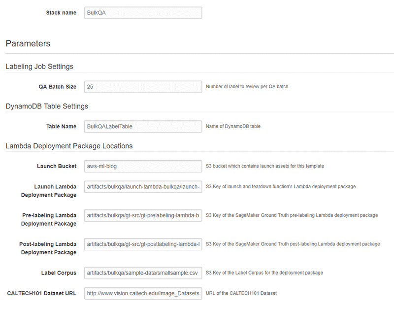
Finally, review all the settings on the next page. Select the box marked I acknowledge that AWS CloudFormation might create IAM resources (this is required since the script creates IAM resources), then choose Create.
Wait until the stack launch is complete, and look at the stack Outputs tab.

You’ll see the stack has created the following resources:
- An Amazon Simple Storage Service (S3)bucket (key = BulkQABucket). This bucket now contains:
- A JSON file, manifest.json, that has been generated for you. This file contains a list of the custom labeling inputs. Each of these custom labeling inputs will become a separate Ground Truth labeling task within the overall labeling job.
- A series of folders containing images. These folders contain a batch of images that have been copied from the CalTech 101 dataset, for use during this labeling project.
- A folder called custom_labeling_inputs. This folder contains a set of JSON files that have been generated for you. Each file contains a batch of images that have been assigned the same label, along with the confidence the model had in that label, and the S3 location of the source image. For example:
[{"s3_image_url": "s3://bulkqa-rbulkqas3bucket-13skff6csrdy9/images/dalmatian-image_0001.jpg", "label": "Dog", "confidence": "87.27241516113281"}, {"s3_image_url": "s3://bulkqa-rbulkqas3bucket-13skff6csrdy9/images/dalmatian-image_0002.jpg", "label": "Dog", "confidence": "93.71725463867188"}, {"s3_image_url": "s3://bulkqa-rbulkqas3bucket-13skff6csrdy9/images/dalmatian-image_0003.jpg", "label": "Dog", "confidence": "93.47685241699219"}, {"s3_image_url": "s3://bulkqa-rbulkqas3bucket-13skff6csrdy9/images/dalmatian-image_0004.jpg", "label": "Dog", "confidence": "93.66221618652344"}, {"s3_image_url": "s3://bulkqa-rbulkqas3bucket-13skff6csrdy9/images/dalmatian-image_0006.jpg", "label": "Dog", "confidence": "93.04904174804688"}]
Each custom labeling input will become a single task in Ground Truth (subject to the chosen batch size) that shows all images listed in the array along with the label to the worker for confirmation.
- An AWS Identity and Access Management (IAM) role (key = SageMakerRoleARN), to be used by the Ground Truth custom labeling job.
- A DynamoDB table (key = DynamoDBLabelTableName). The table has been preloaded with the list of images on S3, the label, and the label confidence assigned by the source labeling model. These are the labels that you want to confirm.

In addition, the stack has created three Lambda functions. They are:
- rLambdaLaunchFunction. This Lambda function is run one time during the CloudFormation stack launch, to set up the environment for this use case. It takes as input a CSV file that contains three columns: image filename, label, and confidence. For each line item, it copies the image file to S3. It also creates an entry for that line item in DynamoDB, and creates the manifest files.
- rLambdaGTPreLabelingFunction. This Lambda function is run at the beginning of each custom labeling task. As input, it receives from Ground Truth the S3 URI of one of the custom labeling inputs. It reads the manifest from S3 and passes the contents to Ground Truth, wrapped in a JSON object:
{ "taskInput": { "sourceRef" : custom_labeling_input} }
- rLambdaGTPostLabelingFunction. This Lambda function is run after a labeling task has been completed and consolidates the worker’s annotations. In this case, it simply reads the worker’s annotations and updates them in the DynamoDB table.

Now that these components have been created, you’re ready to create the custom labeling job.
Create the custom labeling job
In the AWS Management Console, go to the Amazon SageMaker console. In the left navigation bar, choose Ground Truth, then choose Labeling Jobs. Choose Create Labeling Job.
- Name the job “BulkQATestJob”
- The input dataset is at s3://<BULKQA-BUCKET>/manifest.json
- Set your output dataset location to s3://<BULKQA-BUCKET>/output/
- For the IAM Role, choose to enter a custom Role ARN. Copy the ARN for the SageMakerExecutionRole generated by CFN here.

- Scroll down. Under Task Type, choose Custom.

- Choose Next.
On the Select workers and configure tool page:
- Under Workers, choose worker type of Private.
- Under Private teams, choose the team you set up previously.

Scroll down. Under Custom labeling task setup:
- Choose a template type of Custom.
- Copy and paste the full text of the bulkqa html template shown below.
<script src="https://assets.crowd.aws/crowd-html-elements.js"></script>
<style>
.center {    text-align: center;
  border: 3px solid white;
}
.row {    display: flex;
  flex-wrap: wrap;
  padding: 0 4px;
}
/* Create five equal columns that sits next to each other */
.column {    flex: 18%;
  padding: 0 4px;
}
</style>
<crowd-form>
<div class="center">
<h1> Confirm that each image is correctly labelled as "{{ task.input.sourceRef[0].label }}"</h1>
</div>
<div class="row">
{% assign length = task.input.sourceRef.size | minus: 1 %}
{% for i in (0..length) %}
<div class="column">
<crowd-card
 image="{{ task.input.sourceRef[i].s3_image_url | grant_read_access }}">
 <div class="center">Confirm <crowd-checkbox checked="true" name="{{ task.input.sourceRef[i].label }}-{{i}}" value="Confirmed" /></div>
</crowd-card>
</div>
{% endfor %}
</div>
</crowd-form>
The code here is just a few lines in length. The crowd-form tag wraps the custom task code. It reads the label for this set from task.input.sourceRef[0].label and uses that text to create the page instruction. A for-loop then creates a crowd-card for each image listed in the input custom_labeling_input this task received as input, and places a pre-checked check box under each image.
- Under Pre-labeling task Lambda function, choose the LambdaGTPreLabelingFunction from the drop-down list.
- Under Post-labeling task Lambda function, choose the LambdaGTPostLabelingFunction from the drop-down list.

- Choose Submit.
Ground Truth now shows the job status as In progress, with a no (blank) labeled objects/total.

Wait for a few minutes while Ground Truth validates that your job works. After a few minutes, the Labeled objects/total column in the UI should change to contain a count, such as: 0 / 9. The total is the number of Ground Truth custom labeling inputs that your workers will QA. Here, each class label may be one or more images, depending on the size you chose for the QA batch size.
Now your workforce should start receiving labeling tasks within a few minutes.
Confirming the image labels
In the AWS Management Console left navigation bar, choose Ground Truth Labeling workforces. Choose the Private tab. Under the Private workforce summary, choose the Labeling portal sign-in URL.
Sign in with your workforce user name and password. You should see a job listed. If you don’t, wait a few more minutes and refresh the page. Repeat until the data labeling job becomes available.
Choose Start Working.
For each assigned task, the worker web page presents a set of images, each of which has been assigned the same label. In the first example image below, it is cat, in the second, crab. Each image has a Confirm check box below the image. These check boxes are checked by default.
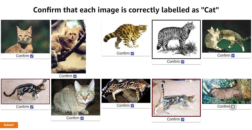
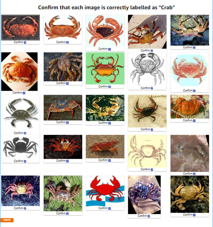
Review the images. For any image that does not match the label, uncheck the check box. When you’ve reviewed all the images on the page, choose Submit.
Behind the scenes, the post-labeling Lambda function runs. This Lambda function updates the DynamoDB table with the results. It adds up to two fields to each row: WorkerConfirmCount and WorkerDisconfirmCount. These columns are updated with the number of reviewers who have confirmed or disconfirmed each individual image.
Continue until all tasks have been completed. Ground Truth will batch the tasks, and then wait before assigning the next batch. If there are more than 10 tasks you will probably need to wait before the next batch becomes available to you.
Assessing the results
After all the tasks have been completed, the final results are ready for review in the DynamoDB table. In the AWS Management Console, navigate to the Amazon DynamoDB console. Under Tables, choose the BulkQALabelTable created earlier. Choose the Items tab, and review the table along with the worker confirmations.
In the screenshot of the DynamoDB console that follows, you can see that one worker has disconfirmed two of the images and has confirmed a third.
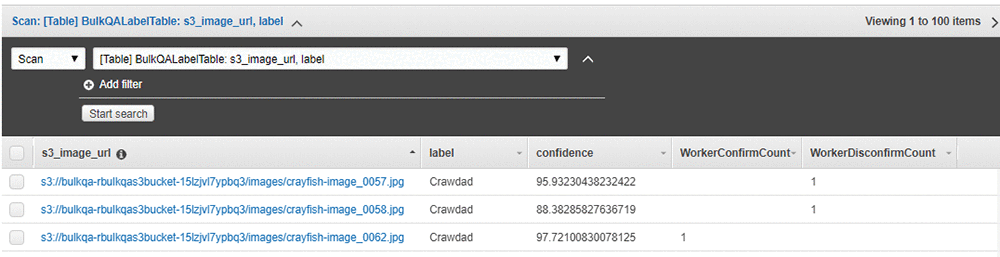
Having a single worker confirm the results might be reasonable if the worker is highly trained or otherwise considered an authoritative source of truth. Alternatively, for a sensitive use case or where your workers are less authoritative, you might want to have a larger number of workers – say, three – validate the results, and only use the ones that all have confirmed as correct.
Cleanup
After you have finished reviewing the results of this test, remember to delete the CloudFormation template. Doing so will remove the DynamoDB table and created S3 bucket, and prevent continuing charges.
Acting on the results
In this section we show you results from a specific assessment of the two larger samples. These were assessments from specific “experts,” so your results might vary. The two sample files are provided, and can be run by replacing bulkqa/smallsample.csv with their names in the CloudFormation template:
- bulkqa/sample.csv contains 10 classes and 510 images
- bulkqa/shellfish.csv contains 5 classes of shellfish, and 245 images.
These samples have more classes and more images, so they will take longer to assess. Ground Truth will send objects to your workers in batches. That is, it will assign some number of tasks – often 10 – to a worker, and then take a break before assigning the next set.
This method identifies false positives in any group. False negatives (images that should have been assigned to this class but were not) are not identified by this approach. You could add identifying the correct class (for example, out of a list of possible classes) to this method, at the cost of slowing down the QA process and potentially slowing down how quickly correctly classified items become available for use by the business. Alternatively, you could chain a separate process step that assigns the correct class for each misclassified item, for example by using the Ground Truth classification workflow. Whether this is appropriate depends on the reason for the QA process.
The now-labeled-and-confirmed data can be fed back into the model and used for retraining. In the cases where this gives you a more accurate model, this is the preferred approach. However, it is also possible that the existing model is already optimal, or that adding additional training examples does not improve overall model performance but merely moves the errors to a different class.
Another scenario is when you are interested in differences between the classes, beyond the accuracy of individual label or the average performance across the model. The following table shows a simple bucketing of the images by class and confidence score obtained by running the provided sample.csv input. Any images where the workers were split is treated as Incorrect in the bucketing. Note that only images with a confidence score of 80 or higher were passed into the QA process; in essence, the input process uses a base threshold of 80.
|
Total |
80-85 Confidence |
85-90 Confidence |
90-95 Confidence |
95-100 Confidence |
| Label |
Total |
Confirmed |
Disconfirm |
Split |
%Correct |
Total |
Incorrect |
%Correct |
Total |
Incorrect |
%Correct |
Total |
Incorrect |
%Correct |
Total |
Incorrect |
%Correct |
| Beaver |
28 |
27 |
1 |
1 |
96.43% |
2 |
1 |
50.00% |
3 |
0 |
100.00% |
13 |
0 |
100.00% |
10 |
0 |
100.00% |
| Cat |
10 |
9 |
1 |
3 |
90.00% |
1 |
1 |
0.00% |
0 |
0 |
0.00% |
5 |
0 |
100.00% |
4 |
0 |
100.00% |
| Crawdad |
68 |
35 |
33 |
4 |
51.47% |
1 |
1 |
0.00% |
10 |
8 |
20.00% |
10 |
6 |
40.00% |
47 |
19 |
59.57% |
| Dinosaur |
65 |
62 |
3 |
5 |
95.38% |
4 |
0 |
100.00% |
10 |
1 |
90.00% |
12 |
1 |
91.67% |
39 |
1 |
97.44% |
| Dog |
68 |
67 |
1 |
6 |
98.53% |
1 |
0 |
100.00% |
5 |
1 |
80.00% |
34 |
0 |
100.00% |
28 |
1 |
96.43% |
| Saxophone |
40 |
38 |
1 |
7 |
95.00% |
1 |
0 |
100.00% |
2 |
1 |
50.00% |
22 |
1 |
95.45% |
15 |
0 |
100.00% |
| Sea Turtle |
86 |
84 |
1 |
8 |
97.67% |
5 |
1 |
80.00% |
8 |
1 |
87.50% |
13 |
0 |
100.00% |
60 |
0 |
100.00% |
| Soccer Ball |
87 |
69 |
18 |
11 |
79.31% |
8 |
5 |
37.50% |
7 |
5 |
28.57% |
9 |
6 |
33.33% |
63 |
2 |
96.83% |
| Stop sign |
58 |
58 |
0 |
12 |
100.00% |
6 |
0 |
100.00% |
9 |
0 |
100.00% |
12 |
0 |
100.00% |
31 |
0 |
100.00% |
| TOTALS |
510 |
449 |
59 |
57 |
88.04% |
29 |
9 |
68.97% |
54 |
17 |
68.52% |
130 |
14 |
89.23% |
297 |
23 |
92.26% |
| Class Average |
|
|
|
|
89.31% |
|
|
63.06% |
|
|
61.79% |
|
|
84.49% |
|
|
94.47% |
Some interesting patterns are immediately visible, and raise questions for further analysis and assessment.
The classes Cat and Beaver are underrepresented in the input. Is this because they are under-represented in the original model input, or are they receiving confidence scores lower than 80 and thus not coming to the QA process? Or, are these rare cases in the source of the model input? (In the case of Cat, this seems intuitively unlikely.)
There are large differences between the percentage correct at different confidence levels across the classes. For example, all stop signs are correct, whereas even at confidence scores between 95 and 100, around half of crawdads are incorrect. An initial hypothesis is that some classes may be more easily confused. For example, saxophones are more distinctive than crawdads versus crabs, which may be harder for a human or a non-expert to correctly identify. To test this hypothesis a second assessment, using shellfish.csv, is shown in the following table.
|
Total |
80-85 Confidence |
85-90 Confidence |
90-95 Confidence |
95-100 Confidence |
| Label |
Total |
Confirmed |
Disconfirm |
Split |
%Correct |
Total |
Incorrect |
%Correct |
Total |
Incorrect |
%Correct |
Total |
Incorrect |
%Correct |
Total |
Incorrect |
%Correct |
| Crab |
45 |
45 |
0 |
0 |
100.00% |
4 |
0 |
100.00% |
7 |
0 |
100.00% |
11 |
0 |
100.00% |
23 |
0 |
100.00% |
| Crawdad |
68 |
16 |
32 |
20 |
23.53% |
1 |
0 |
100.00% |
10 |
8 |
20.00% |
10 |
8 |
20.00% |
47 |
36 |
23.40% |
| Lobster |
53 |
40 |
11 |
2 |
75.47% |
4 |
4 |
0.00% |
10 |
4 |
60.00% |
11 |
3 |
72.73% |
28 |
2 |
92.86% |
| Scorpion |
77 |
72 |
3 |
2 |
93.51% |
8 |
3 |
62.50% |
6 |
2 |
66.67% |
27 |
0 |
100.00% |
36 |
0 |
100.00% |
| Shrimp |
2 |
0 |
1 |
1 |
0.00% |
0 |
0 |
0.00% |
1 |
1 |
0.00% |
0 |
0 |
0.00% |
1 |
1 |
0.00% |
| TOTALS |
245 |
173 |
47 |
25 |
70.61% |
17 |
7 |
58.82% |
34 |
15 |
55.88% |
59 |
11 |
81.36% |
135 |
39 |
71.11% |
| Class Average |
|
|
|
|
58.50% |
|
|
52.50% |
|
|
49.33% |
|
|
58.55% |
|
|
63.25% |
Interestingly, this assessment shows that all crabs are correctly identified, almost all scorpions were correctly identified, whereas no shrimp (of the 2) were correctly identified. The model appears to be having particular difficulty with crawdads. Perhaps a second, more specific model needs to be trained to specifically focus on crawdads and the classes it frequently misidentifies. All images classified as crawdads by the initial model could then be pipelined to the second model for reclassification.
Perhaps the input images for these classes have systemic differences, such as underwater shots or poor lighting for crawdads. Or perhaps the model has classification biases. Since the model was originally built via transfer learning, perhaps the model that was transferred was trained on a significantly different corpus, and some additional training is warranted.
In a setting where class differences or bias matter (for example, see Corbett and Davies, The Measure and Mismeasure of Fairness), using a global threshold (such as the ‘80’ used here) might not be appropriate.
For example, say the business wishes to ensure that they have classification parity for each class. That is, they wish to have approximately the same error rate (the same ratio of false positives to true positives) for items above each class’ threshold. Clearly, given the previous data, using the same threshold for crawdads, lobsters, and stop signs will not achieve this goal. Say that they estimate the costs associated with processing a false positive are 10 times that of processing a true positive. To achieve this, you need to identify an appropriate threshold for each class. Intuitively, since all stop signs were correctly identified, the global threshold of 80 is appropriate for the stop sign class. For crawdads, closer inspection reveals that even above a confidence of 99.5, there are too many errors. The pipeline method described above should be applied before sending any crawdad-labeled images to the business.
One approach to identifying an appropriate threshold for these classes is the following. Begin with the rightmost bucket. If the ratio of incorrectly classified images is lower than the business will accept, move to the next-left bucket and repeat. If not – stop and use the high side of the current bucket as the threshold. For the 1:10 ratio and the class of cat (overlooking the small size of this class for now), this gives a class threshold of 85. See On Calibration of Modern Neural Networks for alternate approaches and deeper analysis.
Conclusion
In this blog post you’ve seen how to use Amazon SageMaker Ground Truth custom labeling workflows to easily perform bulk quality assurance of your labels. Using this approach, you can quickly validate the prior labels assigned, and feed the results back to improve the quality of your model. Or, you can use this approach to validate labels for sensitive business use cases.
You’ve also seen how to use this approach to study whether a single threshold is appropriately used across all of the label classes your model assigns, or whether some classes should have a higher threshold assigned to achieve classification parity.
By using these approaches, you can improve the quality of your models, and use your models with confidence in a wider range of business use cases. Enjoy!
[i] L. Fei-Fei, R. Fergus and P. Perona. Learning generative visual models from few training examples: an incremental Bayesian approach tested on 101 object categories. IEEE. CVPR 2004, Workshop on Generative-Model Based Vision. 2004
About the Authors
 Veronika Megler is a Principal Consultant, Big Data, Analytics & Data Science, for AWS Professional Services. She holds a PhD in Computer Science, with a focus on spatio-temporal data search. She specializes in technology adoption, helping customers use new technologies to solve new problems and to solve old problems more efficiently and effectively.
 Chris Ghyzel is a Data Engineer for AWS Professional Services. Currently, he is working with customers to integrate machine learning solutions on AWS into their production pipelines.





 Rakesh Vasudevan is a Software Development Engineer with AWS Deep Learning.He is passionate about building scalable deep learning systems. In spare time, he enjoys gaming, cricket and hanging out with friends and family.
 Denis Davydenko is an Engineering Manager with AWS Deep Learning. He focuses on building Deep Learning tools that enable developers and scientists to build intelligent applications. In his spare time he enjoys spending time with his family, playing poker and video games.
 Sam Skalicky is a Software Engineer with AWS Deep Learning and enjoys building heterogeneous high performance computing systems. He is an avid coffee enthusiast and avoids hiking at all costs.